A Beer Color Meter for Windows and Android with Uno Platform

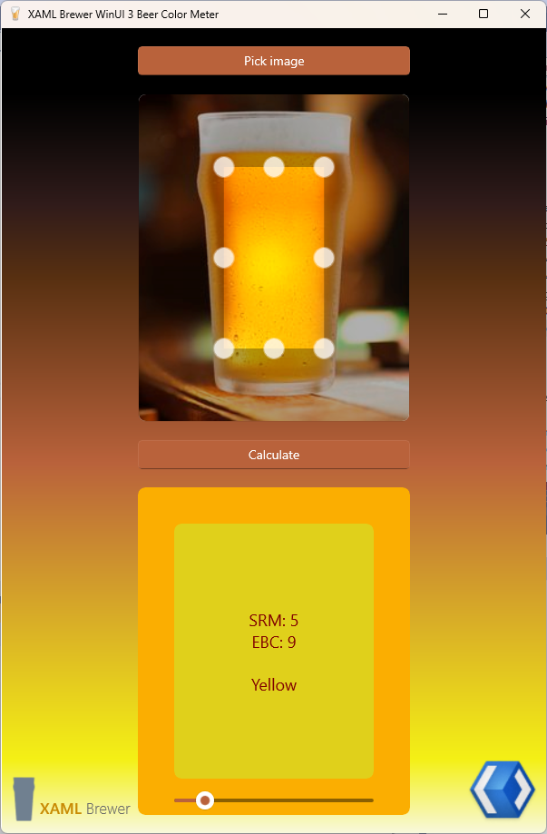
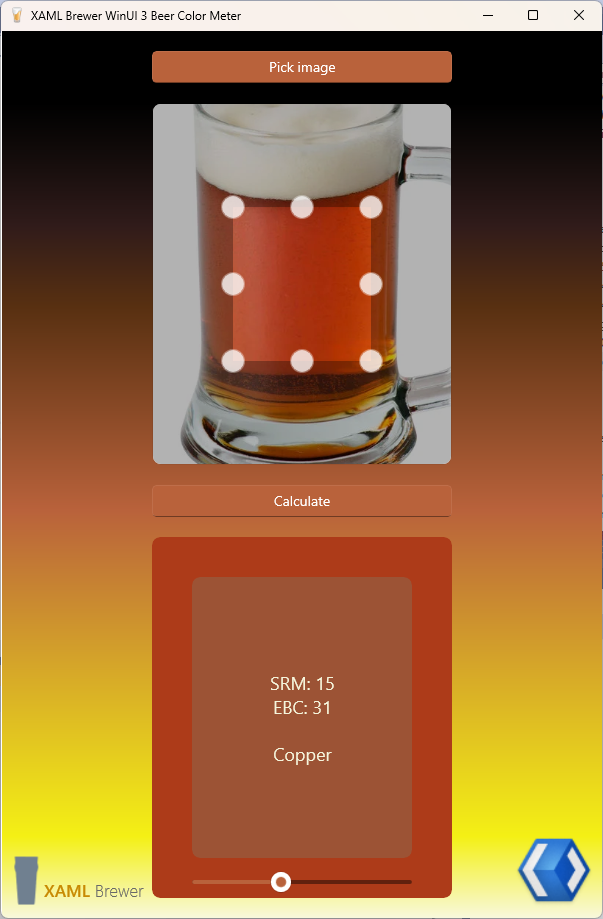
In this article we present an Android and Windows Desktop app written on the Uno Platform. The app allows you to

  • pick whatever image – but preferably one with a glass of beer in it,
  • calculate the average color of the image’s pixels,
  • find the nearest official beer color to that image, and
  • visually validate the result with a slider.

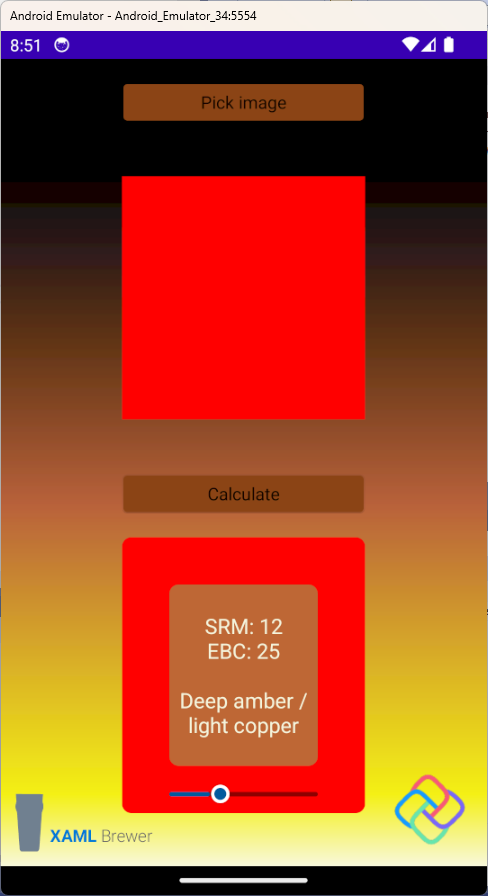
The app is appropriately called Beer Color Meter and it looks like this on my old phone:

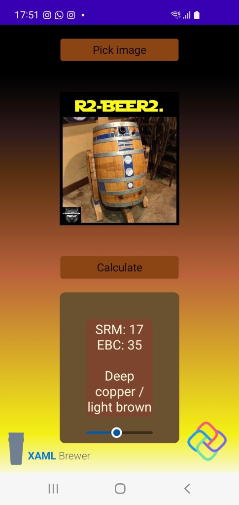
Don’t worry if you have a déjà-vu when reading this: the app is a cross-platform version of the WinUI app from our previous blog post. We’re porting the source this native Windows app to several cross-platform, XAML-based development ecosystems. Our first choice is Uno Platform, because it uses WinUI for its user interface and we have some experience in that area.

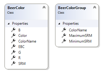
Beer Color Meter’s concepts, Model, and Data Access Layer are identical to the WinUI version. If Windows Community’s Toolkit ImageCropper would be Uno-compatible, then even the View could have been entirely reused.

Getting started with Uno Platform

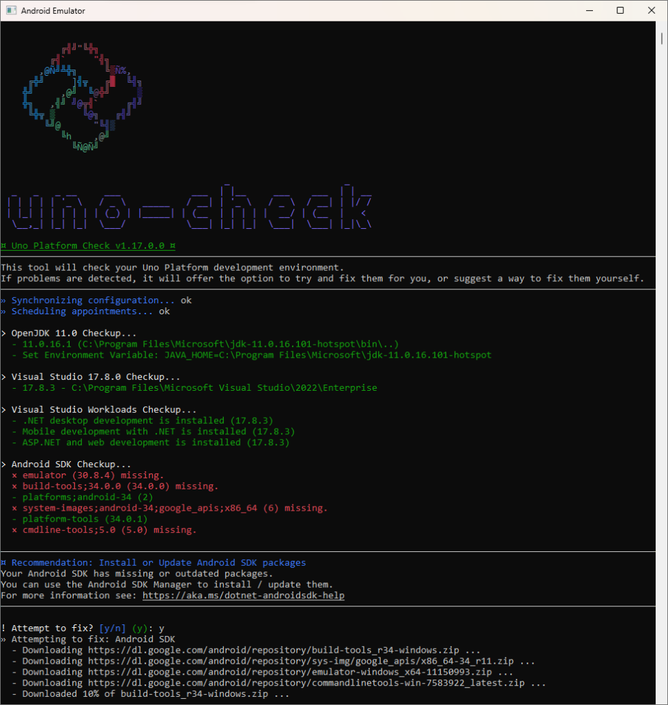
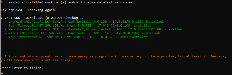
This is our first project with Uno Platform, allow us to explain how we got started. The procedure to install Uno Platform on your development machine is very well documented right here:

  • Ensure that you have Visual Studio with the necessary workloads.
  • Run the (magnificent) Uno Check Tool to help you configure your machine.
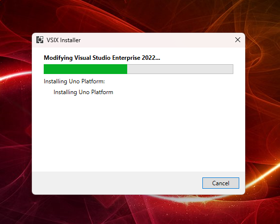
  • Install the Uno Platform VSIX extension to get the project templates.
  • Whenever you encounter trouble, update and run that Uno Check Tool again.

Here’s how that will look like on your machine:

Uno Platform comes with excellent documentation, a rich set of samples, their staff are (hyper)active on all developer forums, and they host a busy Discord server.

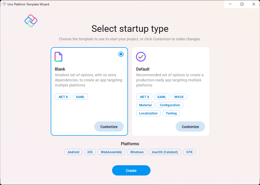
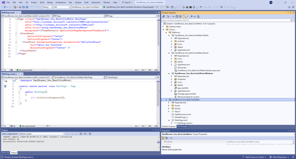
The Uno Platform Template Wizard in Visual Studio helps you to set up your project correctly. We went for a lean solution for Android and Windows – no hard feelings against Apple, we just have no hardware to test on:

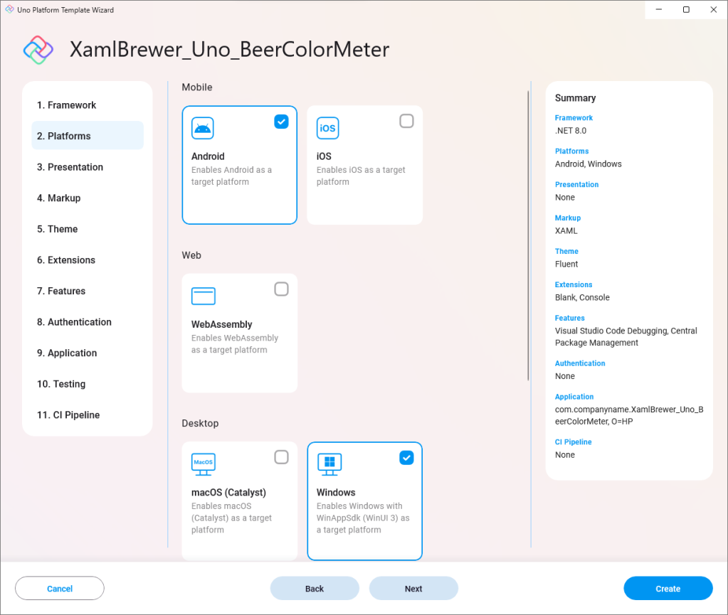
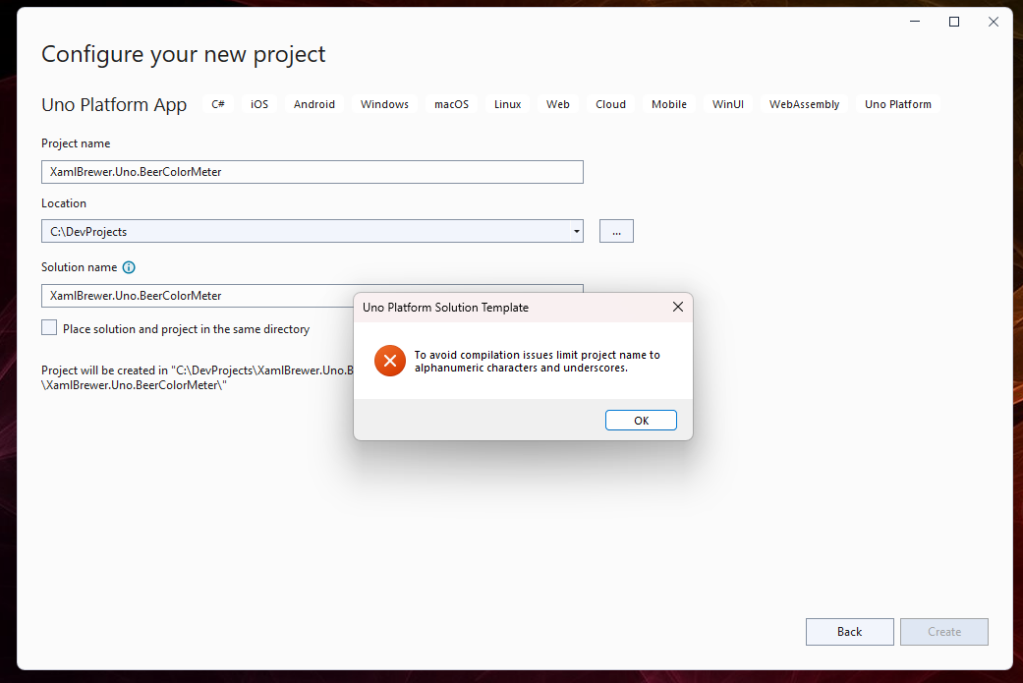
Uno Platform doesn’t like dots in the project name, so we had to break some habits. Underscores are fine though:

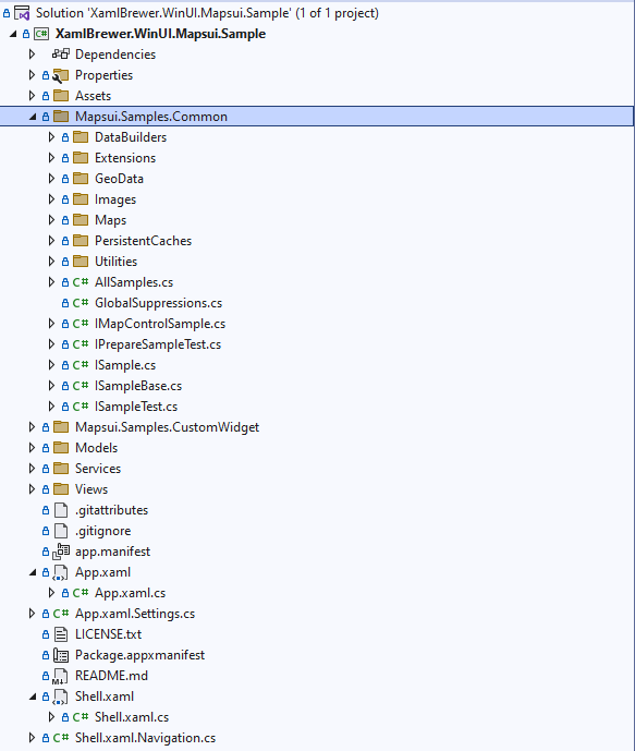
The template wizard created a solution with a main project holding the cross-platform WinUI-based code, together with three platform projects (Mobile, Windows, and Shared):

As far as we remember, we did not change anything in the platform projects – standard settings and tiles were good enough to start with.

Running your code

The Android Device Manager inside Visual Studio allows you to configure different virtual devices that can run your app via the Android Emulator:

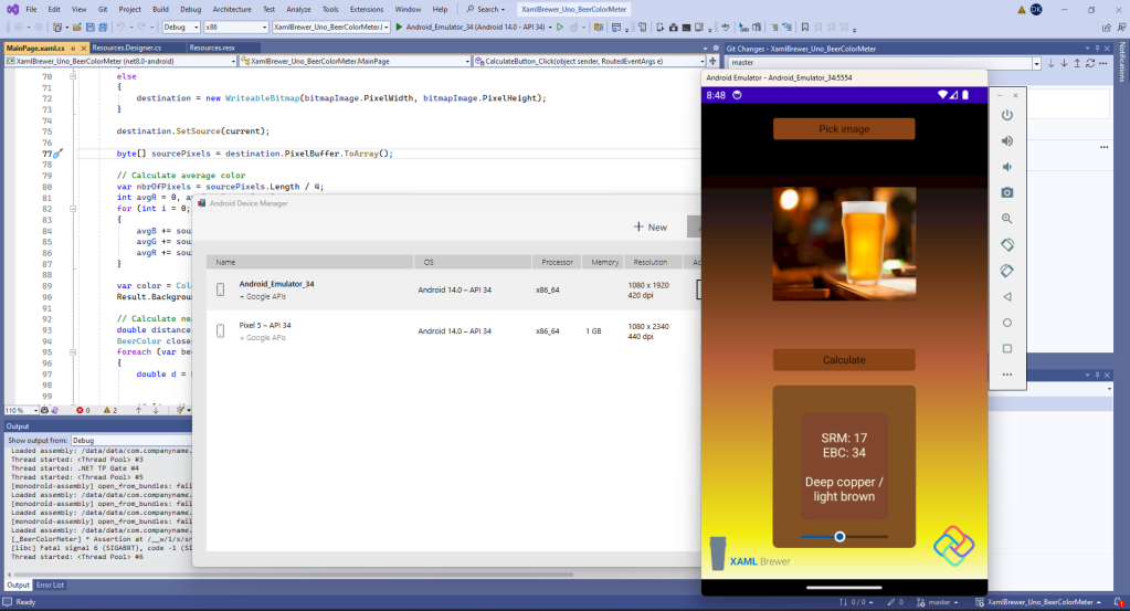
We remember from the Xamarin age that this emulator was extremely slow. Unfortunately today it still is incredibly sluggish, even on our high end development box. Anyway, the emulator allows you to test your app on different devices, resolutions, and OS versions. During development it is much more comfortable to take a real device, put it in developer mode, and hook it to your machine:

Porting the WinUI code

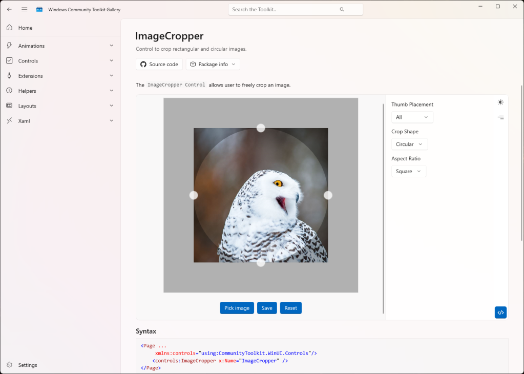
Unsurprisingly, we started with copying the sources from our original WinUI version into the main Uno Platform project. Then we needed to apply a few modifications. Our original project used the Windows Community Toolkit’s ImageCropper and some Windows-specific bitmap related helper classes, like BitmapDecoder and PixelDataProvider. These are not Uno Platform compatible (yet).

We pragmatically replaced the image cropper by a plain image:

<Image x:Name="FullImage"
        Source="Beer.jpg"
        VerticalAlignment="Stretch"
        HorizontalAlignment="Stretch"
        Grid.Row="1"
        Grid.Column="1" />

Since there’s no user action on the image anymore, we could have removed the ‘Calculate’ button and immediately show the result after opening an image. But we wanted to stay as close as possible to our original concept. The button is still there.

The code to pick an image is almost identical to the original one. It feels odd that in WinUI you need to fetch a Window handle just to use a FileOpenPicker – even when your main target is Android:

private async Task PickImage()
{
    // Create a file picker
    var openPicker = new FileOpenPicker();
    var hWnd = WinRT.Interop.WindowNative.GetWindowHandle((Application.Current as App).MainWindow);
    WinRT.Interop.InitializeWithWindow.Initialize(openPicker, hWnd);

    // Set options
    openPicker.ViewMode = PickerViewMode.Thumbnail;
    openPicker.SuggestedStartLocation = PickerLocationId.PicturesLibrary;
    openPicker.FileTypeFilter.Add(".bmp");
    openPicker.FileTypeFilter.Add(".jpg");
    openPicker.FileTypeFilter.Add(".jpeg");
    openPicker.FileTypeFilter.Add(".png");

    // Open the picker
    var file = await openPicker.PickSingleFileAsync();
    await OpenFile(file);
}

Accessing image pixels

Our original WinUI app had no problem accessing the pixels of the selected image: they were handed by the image cropper control. In this new version of the app we have to get to these pixels ourselves, and that was quite a challenge. The only class we discovered that exposes its pixels is WriteableBitmap. Unfortunately there’s no way to transform an existing Source of an Image, or a BitmapImage, or a RenderTargetBitmap (and we tried many more candidates) into a WriteableBitmap in a way that is supported by Uno Platform.

Our Plan B was to rely on some SkiaSharp magic, but that plan wasn’t needed. We found a work-around. After the Source of an Image control is assigned, the pixels are locked. We decided to intercept these pixels before handing them to the Image control. When the user opens an image file, we cache its content in a IRandomAccessStream before populating the image:

IRandomAccessStream? current;

private async Task OpenFile(StorageFile file)
{
    if (file != null)
    {
        IBuffer buffer = await FileIO.ReadBufferAsync(file);
        current = buffer.AsStream().AsRandomAccessStream();
        FullImage.Source = new BitmapImage(new Uri(file.Path));
    }
}

This way of working involves some memory overhead, but it does the job – except for the initial image. We did not find a way to properly read the source file of the default image (Beer.jpg) on startup or in the Calculate click event handler – probably just because we’re newbies on the Uno Platform. As an alternative we defined the image as a Resource of the byte array type:

internal class Resources {
        
    // ...

    internal static byte[] Beer {
        get {
            object obj = ResourceManager.GetObject("Beer", resourceCulture);
            return ((byte[])(obj));
        }
    }
}

When the user hits the Calculate button, we reconstruct the displayed image as a WriteableBitmap by creating a new instance with the same size and applying our cached Source file content, or the bytes of the default image from the Resource. The PixelBuffer returns the pixels for further processing:

WriteableBitmap destination;

current ??= Properties.Resources.Beer.AsBuffer().AsStream().AsRandomAccessStream();

current.Seek(0);
var bitmapImage = FullImage.Source as BitmapImage;
if (bitmapImage == null)
{
    // The legendary 'should not happen'
    destination = new WriteableBitmap((int)FullImage.ActualWidth, (int)FullImage.ActualHeight);
}
else
{
    destination = new WriteableBitmap(bitmapImage.PixelWidth, bitmapImage.PixelHeight);
}

destination.SetSource(current);

byte[] sourcePixels = destination.PixelBuffer.ToArray();

We didn’t need to adapt the code for iterating through the pixels and calculating the average color:

// Calculate average color
var nbrOfPixels = sourcePixels.Length / 4;
int avgR = 0, avgG = 0, avgB = 0;
for (int i = 0; i < sourcePixels.Length; i += 4)
{
    avgB += sourcePixels[i];
    avgG += sourcePixels[i + 1];
    avgR += sourcePixels[i + 2];
}

var color = Color.FromArgb(255, (byte)(avgR / nbrOfPixels), (byte)(avgG / nbrOfPixels), (byte)(avgB / nbrOfPixels));
Result.Background = new SolidColorBrush(color);

That’s a surprise because nowhere in the source code did we attempt to manage the encoding. Apparently Uno Platform internally takes care of this (👏). We provided different image types from Windows and Android and added some mono color images for reference, but they were all interpreted correctly:

Conclusion

We had much fun developing our first app for the Uno Platform. We were able to port a small but non-trivial Windows app to Android, with minimal effort. Beer Color Meter has room for improvement -especially in the user interface- but we wanted to stick as close as possible to our initial winUI project. Although some useful helpers from Windows SDK and Windows Community Toolkit are not available, we observe that our Uno Platform version has … less source code than the original one.

Our Uno Platform Beer Color Meter for Windows and Android lives here on GitHub.

Enjoy!

A Beer Color Meter for Windows in WinUI 3

In this article we present a WinUI 3 Desktop app that allows you to

  • pick whatever image – but preferably one with a glass of beer in it,
  • select an area inside it via an image cropper,
  • calculate the average color of the selected area’s pixels,
  • look up the nearest official beer color for that average color, and
  • visually validate the result with a slider.

The app is appropriately called Beer Color Meter and it looks like this:

Beer color is generally measured in Standard Reference Method (SRM) or European Brewery Convention (EBC) units. In a laboratory this would involve

  • measuring the attenuation of light with a wavelength of 430 nm when passing through 1 cm of the beer,
  • expressing the attenuation as an absorption, and
  • scaling the absorption by a constant, being 12.7 for SRM and 25 for EBC.

It turns out we don’t have such a laboratory at home, instead we built an app 😉.

The Model

An SRM value corresponds to a color, so it should not come as a surprise that our BeerColor class hosts a Color struct. It has properties to hold red (R), green (G), and blue (B) components. A BeerColorGroup gives a name to a range of colors – e.g. beers with a color of 5 or 6 SRM are called ‘Gold’.

Here’s a class diagram of the domain of the beer color meter app:

The Data Access Layer

Since all of its core data is fixed, the app’s Data Access Layer is just two static methods. One returns a list of Beer Colors:

var result = new List<BeerColor>
{
    new BeerColor() { SRM = 0.1, R = 248, G = 248, B = 230 },
    new BeerColor() { SRM = 0.2, R = 248, G = 248, B = 220 },
    new BeerColor() { SRM = 0.3, R = 247, G = 247, B = 199 },
    new BeerColor() { SRM = 0.4, R = 244, G = 249, B = 185 },
    new BeerColor() { SRM = 0.5, R = 247, G = 249, B = 180 },
    new BeerColor() { SRM = 0.6, R = 248, G = 249, B = 178 },
    new BeerColor() { SRM = 0.7, R = 244, G = 246, B = 169 },
    new BeerColor() { SRM = 0.8, R = 245, G = 247, B = 166 },
    // ...

The other returns a list of Beer Color Groups:

List<BeerColorGroup> result = new()
{
    new BeerColorGroup()
    {
        ColorName = "Straw",
        MinimumSRM = 0,
        MaximumSRM = 3
    },
    new BeerColorGroup()
    {
        ColorName = "Yellow",
        MinimumSRM = 3,
        MaximumSRM = 5
    },
    new BeerColorGroup()
    {
        ColorName = "Gold",
        MinimumSRM = 5,
        MaximumSRM = 6
    },
    // ...

The View

The View consists of an image, some buttons, and a grid for the result. They’re put against this fancy beer color themed LinearGradientBrush background:

The selected beer picture is decorated with an ImageCropper from Windows Community Toolkit. Here’s how that control looks like in the Toolkit Gallery app:

All its default settings and (nice!) animations suit out use case, so the XAML is as simple as can be:

<controls:ImageCropper x:Name="ImageCropper" />

The Logic

We let the user pick and open a file with a FileOpenPicker. The code for this comes straight out of the book – including that awkward interop window handle thing:

private async Task PickImage()
{
    // Create a file picker
    var openPicker = new FileOpenPicker();
    var hWnd = WinRT.Interop.WindowNative.GetWindowHandle(this);
    WinRT.Interop.InitializeWithWindow.Initialize(openPicker, hWnd);

    // Set options
    openPicker.ViewMode = PickerViewMode.Thumbnail;
    openPicker.SuggestedStartLocation = PickerLocationId.PicturesLibrary;
    openPicker.FileTypeFilter.Add(".bmp");
    openPicker.FileTypeFilter.Add(".jpg");
    openPicker.FileTypeFilter.Add(".jpeg");
    openPicker.FileTypeFilter.Add(".png");

    // Open the picker
    var file = await openPicker.PickSingleFileAsync();
    await OpenFile(file);
}

Get ready for the pièce de résistance: the algorithm to get the selected pixels for calculating their average color relies on rarely used (at least by us) classes and helpers. At the end of the day we need these pixels as a properly encoded byte array (e.g. in a red-green-blue-transparency sequence).

Here’s how it goes:

And in C#:

BitmapDecoder decoder;
BitmapTransform transform;

// Create a .png from the cropped image
var stream = new InMemoryRandomAccessStream();
await ImageCropper.SaveAsync(stream, BitmapFileFormat.Png);
stream.Seek(0);
decoder = await BitmapDecoder.CreateAsync(stream);
stream.Dispose();

transform = new()
{
    ScaledWidth = (uint)ImageCropper.CroppedRegion.Width,
    ScaledHeight = (uint)ImageCropper.CroppedRegion.Height
};

// Get the pixels
PixelDataProvider pixelData = await decoder.GetPixelDataAsync(
    BitmapPixelFormat.Rgba8,
    BitmapAlphaMode.Straight,
    transform,
    ExifOrientationMode.IgnoreExifOrientation,
    ColorManagementMode.DoNotColorManage
);

byte[] sourcePixels = pixelData.DetachPixelData();

For average pixel color we assume the color from the average red, the average green, and the average blue value:

// Calculate average color
var nbrOfPixels = sourcePixels.Length / 4;
int avgR = 0, avgG = 0, avgB = 0;
for (int i = 0; i < sourcePixels.Length; i += 4)
{
    avgR += sourcePixels[i];
    avgG += sourcePixels[i + 1];
    avgB += sourcePixels[i + 2];
}

var color = Color.FromArgb(255, (byte)(avgR / nbrOfPixels), (byte)(avgG / nbrOfPixels), (byte)(avgB / nbrOfPixels));
Result.Background = new SolidColorBrush(color);

To fetch the nearest beer color, we return from our beer color list the one with the shortest Euclidean distance to the average pixel color in the RGB-space:

// Calculate nearest beer color
double distance = int.MaxValue;
BeerColor closest = DAL.BeerColors[0];
foreach (var beerColor in DAL.BeerColors)
{
    double d = Math.Sqrt(Math.Pow(beerColor.B - color.B, 2)
                        + Math.Pow(beerColor.G - color.G, 2)
                        + Math.Pow(beerColor.R - color.R, 2));
    if (d < distance)
    {
        distance = d;
        closest = beerColor;
    }
}

DisplayResult(closest);

A slider over the beer color range allows the user to visually inspect the result:

private void BeerColorSlider_ValueChanged(object sender, Microsoft.UI.Xaml.Controls.Primitives.RangeBaseValueChangedEventArgs e)
{
    var closest = DAL.BeerColors.Where(c => c.SRM == e.NewValue).FirstOrDefault();
    if (closest != null)
    {
        DisplayResult(closest);
    }
}

And there we are: a nice fully functioning Beer Color Meter for Windows.

But why does it look like an app for the phone?

Building Beer Color Meter was a fun and challenging exercise, but there’s more to it. With this WinUI 3 app we wanted to create a reference app that is different from most of the getting started apps for phone development – think image gallery, shopping list, or video viewer. In the next couple of weeks we plan to transform Beer Color Meter into an Android app, using different cross platform .NET XAML environments, such as Uno Platform, Avalonia UI, and .NET MAUI. We’ll keep you posted on that…

In mean time, the WinUI 3 version of Beer Color Meter lives here on GitHub.

Enjoy!

Displaying Charts in WinUI3 with LiveCharts2

In this article we show how to use LiveCharts2 in a WinUI3 desktop app. LiveCharts2 is an open source, Skia-based, cross-platform package for charts, maps, and gauges in .NET. We will cover

  • the canonical Hello World sample,
  • running the entire sample gallery,
  • theming, and
  • how to plot functions.

LiveCharts2 serves all the charts and diagrams you’ll ever need, and some radial gauges and maps. Their online gallery lives here. Compared to other packages, its built-in animations are definitely impressive. It runs on most -if not all- .NET ecosystems, comes with nice documentation for each platform (here’s the WinUI 3 version), an API explorer, and available source code.

Getting Started

When looking for LiveCharts2 on NuGet, remember to check the ‘include prerelease’ box since the package is currently still in Release Candidate state. The NuGet package’s only dependency is SkiaSharp for WinUI3. All examples -starting with ‘Hello World’- apply the MVVM pattern via MVVM Toolkit. This is not mandatory in your own apps, but it’s a good practice and we’ll stick to it.

Hello World

The Hello World sample starts with a ViewModel holding the data for a single line series of double values in an ISeries:

public class HelloWorldViewModel
{
    public ISeries[] Series { get; set; }
        = new ISeries[]
        {
            new LineSeries<double>
            {
                Values = new double[] { 2, 1, 3, 5, 3, 4, 6 },
                Fill = null
            }
        };
}

This ViewModel is used as DataContext for the page:

<Page.DataContext>
    <vm:HelloWorldViewModel />
</Page.DataContext>

The array of ISeries is visually presented via a CartesianChart:

<lvc:CartesianChart x:Name="Chart"
                    Series="{Binding Series}" />

At runtime, this line chart appears:

When you remove the Fill property from the ViewModel, the series gets a default fill brush that turns it into an area chart:

By default, when hovering over the chart, an animated ToolTip appears over the closest point. As any other feature of LiveCharts2, this is fully customizable.

The Gallery

For every supported .NET stack, LiveCharts2 exposes a gallery demonstrating all plots, animations, events, interactions, and more. Find the WinUI gallery right here. Here’s how it looks like in the browser:

Every sample is nicely documented, and implements the same MVVM architecture. In our sample WinUI3 desktop app, we created a gallery page with a GridView and imported the samples that we were interested in.

The Views and ViewModels were straightforward copy-pasted [well, that’s not entirely true: we fixed the name of some Formula 1 drivers 😉], and each got its View embedded inside a GridViewItem, like this:

Here’s how the whole page looks like:

Since static screenshots fail to show the very nice animations, here are some animated ones:

One of the samples allows adding points to a series by clicking on the chart. It demonstrates API members that we did not encounter in too many other packages. Here’s the View, it listens for PointerPressed:

<lvc:CartesianChart x:Name="chart"
                    Series="{Binding SeriesCollection}"
                    PointerPressedCommand="{Binding PointerDownCommand}"
                    TooltipPosition="Hidden">
</lvc:CartesianChart>

The series keeps some distance from the edge of the chart, with DataPadding:

new LineSeries<ObservablePoint>
{
    Values = new ObservableCollection<ObservablePoint>
    {
        new(0, 5),
        new(3, 8),
        new(7, 9)
    },
    Fill = null,
    DataPadding = new LiveChartsCore.Drawing.LvcPoint(5, 5)
}

In the PointerPressed event handler, the clicked UI coordinate is translated to a chart value, and added to the series:

[RelayCommand]
public void PointerDown(PointerCommandArgs args)
{
    var chart = (ICartesianChartView<SkiaSharpDrawingContext>)args.Chart;
    var values = (ObservableCollection<ObservablePoint>)SeriesCollection[0].Values!;

    // scales the UI coordinates to the corresponding data in the chart.
    var scaledPoint = chart.ScalePixelsToData(args.PointerPosition);

    // finally add the new point to the data in our chart.
    values.Add(new ObservablePoint(scaledPoint.X, scaledPoint.Y));
}

For the sake of completeness, the API also host calculations in the other direction (chart value to coordinate). Here’s how the sample looks like at runtime – and again admire the animations:

Drawing Functions

Copy-pasting samples is fun, but we wanted of course to also create a demo from scratch. Here’s how to draw mathematical functions, ‘y=f(x)’ style. From the ‘Specify Both X And Y’ sample we learned that ObservablePoint is the class to use if you want to … well … specify both X and Y.

Our favorite set of functions for this kind of demo are the ‘bat functions’. Don’t worry if you don’t know these yet, it will soon become clear what this trigonometric voodoo stands for:

We started with a helper function to return Y values for a range of X:

private static IEnumerable<ObservablePoint> FunctionValues(Func<double, double> function, double x0, double x1, double dx)
{
    for (double x = x0; x < x1; x += dx)
    {
        var y = function(x);
        yield return new ObservablePoint(x, double.IsNaN(y) ? null : y);
    }
}

When there’s no Y-value for an X, we return an empty coordinate. This enables gaps in the chart (as we learned in the Gaps/Null Points sample).

Here’s how we populate our line series:

Series = new ISeries[]
{
    new LineSeries<ObservablePoint>
        {
            Values = FunctionValues(batFunction1, -7, +7, .01),
            GeometrySize = 0,
            Fill = null,
            Name = "na na"
        },
    // ...
    new LineSeries<ObservablePoint>
        {
            Values = FunctionValues(batFunction4, -7, +7, .01),
            GeometrySize = 0,
            Fill = null,
            Name = "na na"
        }
    };
}

For the sake of completeness, here’s the View – no surprises:

<lvc:CartesianChart x:Name="Chart"
                    Series="{Binding Series}" />

Here’s how the bat-functions look like at runtime:

As its name implies, ObservablePoint propagates its dynamic changes by implementing INotifyPropertyChanged. When drawing functions with just static X and Y values, you don’t need this overhead. So we created a ‘lighter’ version based on tuples, with Tuple<double, double> instead of ObservablePoint. Here’s the new helper function – a nice candidate extension method:

private static IEnumerable<(double, double?)> FunctionValues2(Func<double, double> function, double x0, double x1, double dx)
{
    for (double x = x0; x < x1; x += dx)
    {
        var y = function(x);
        yield return (x, double.IsNaN(y) ? null : y);
    }
}

LiveCharts2 does not know how to draw Tuples in an ISeries, so we have to tell it by adding a Mapper from Tuple<double, double> to Coordinate. Here’s how to do this:

new LineSeries<(double x, double? y)>
    {
        Values =  FunctionValues2(batFunction1, -7, +7, .01),
        GeometrySize = 0,
        Fill = null,
        Name = "na na",
        Mapping = (functionValue, chartPoint) =>
        {
            chartPoint.Coordinate = functionValue.y.HasValue ? new(functionValue.x, functionValue.y.Value) : Coordinate.Empty;
        },
}

Theming

As with other Skiasharp-based solutions, theming -and especially instant theme switches- is a bit of a burden. It’s still a work in progress. Outside the XAML world,  theme resources are not automagically applied. Light theme is the default in LiveCharts2. Things like legends and some chart types (Bubble) just don’t look good when switching to Dark theme:

With AddLightTheme and AddDarkTheme you can set the theme at runtime, e.g. in an ActualThemeChanged event:

<lvc:CartesianChart x:Name="Chart"
                    Series="{Binding Series}"
                    ActualThemeChanged="Chart_ActualThemeChanged" />
private void Chart_ActualThemeChanged(FrameworkElement sender, object args)
{
    if ((Application.Current as App).Settings.IsLightTheme)
    {
        LiveCharts.Configure(config => config.AddLightTheme());
    }
    else
    {
        LiveCharts.Configure(config => config.AddDarkTheme());
    }
}

In the current release, this will change the background of the chart and the axis colors – nothing more (the corresponding source code is relatively simple). The background of the values’ geometry (by default a small circle) is not changed instantly. You need to go to another page and then come back to see the change. Observe how the dots initially remain black when switching from Dark to Light:

There’s no way to force a full redraw (with an Invalidate*() or so). A series is only redrawn when the data changes, not the theme. We found a workaround for this by clearing the series and then resetting the binding. Here’s the full code for this, we implemented it in the Hello World sample:

private void Chart_ActualThemeChanged(FrameworkElement sender, object args)
{
    if ((Application.Current as App).Settings.IsLightTheme)
    {
        LiveCharts.Configure(config => config.AddLightTheme());
    }
    else
    {
        LiveCharts.Configure(config => config.AddDarkTheme());
    }

    // Invalidate chart.
    Chart.Series = new List<ISeries>();
    Chart.SetBinding(CartesianChart.SeriesProperty, new Binding { Source = ViewModel.Series });
}

Here’s how that looks like:

This method still does not update the text color of legends. Of course you could change it to a color that suits both themes. That’s what we did in the Functions sample, in the ViewModel:

public static SolidColorPaint LegendTextPaint => new(SKColors.Gray);

And in the XAML:

<lvc:CartesianChart x:Name="Chart"
                    Series="{Binding Series}"
                    LegendPosition="Right"
                    LegendTextPaint="{Binding LegendTextPaint}" />

We did not find a way to do this declaratively, since a lot of the core types cannot be expressed in XAML (mostly because they lack a parameterless constructor). Anyway, the legends look good this way:

Conclusion

We had a lot of fun working with LiveCharts2 for WinUI. If you want to have charts or gauges in your app, you definitely should consider it. It has all the charts you probably need, it is highly configurable, and the animations are top-notch.

Our sample app lives here on GitHub.

Enjoy!

Migrating from ListView to ItemsView in WinUI 3

In this article we describe the migration from ListView to ItemsView in a WinUI 3 desktop application. We will cover

  • replacing the ListView by ItemsView,
  • templating items,
  • selecting items,
  • bringing items into view, and
  • invoking items.

ItemsView was introduced by Windows App SDK 1.4 as the successor of the classic ListView and GridView controls. It was built from the ground up. Although the API is pretty similar to its predecessors’ one, there are some important differences. ItemsView inherits directly from Control, so

On the other hand, ItemsView

  • has better support for animation,
  • can swap its layout at runtime (between stacked, grid, and flow), and
  • allows ‘invoking’ its items.

For a quick and thorough introduction, check Andrew KeepCoding’s video. If you want to experience the new control yourself, play with the new samples in the WinUI Gallery app:

A short visit to the WinUI Library repo learns us that the control seems very stable, there are not much open issues. So let’s give it a try …

To evaluate how hard it is to migrate WinUI 3 app from using ListViews to using ItemsViews, we considered our MasterDetail sample to be a representative victim. It features MVVM support, selection management and templating on top of a dynamic list of items.

Here’s how the ‘old’ app looks like:

An this is the new one:

Replacing ListView by ItemsView

The first steps of the migration are upgrading to Windows App SDK 1.4 or higher, and replacing the ListView by an ItemsView. Here’s the code of the old app, it has a ListView with an ItemsSource and a two-way binding to SelectedItem.

<ListView x:Name="CharacterListView"
            ItemsSource="{x:Bind ViewModel.Items, Mode=OneWay}"
            SelectedItem="{x:Bind ViewModel.Current, Mode=TwoWay}">
    <ListView.ItemTemplate>
        // ...
    </ListView.ItemTemplate>
</ListView>

Here’s the new version, it has an ItemsView against that same ItemsSource and a SelectionChanged event (more on that later):

<ItemsView x:Name="CharacterListView"
            ItemsSource="{x:Bind ViewModel.Items, Mode=OneWay}"
            SelectionChanged="CharacterListView_SelectionChanged">
    <ItemsView.ItemTemplate>
        // ...
    </ItemsView.ItemTemplate>
</ItemsView>

Updating the item template

If you run this code, you’ll see it failing on startup with an issue in the ItemTemplate. Here’s the old app’s template. It has pointer events, visual states, and more:

<ListView.ItemTemplate>
    <DataTemplate x:DataType="models:Character">
        <UserControl PointerEntered="ListViewItem_PointerEntered"
                        PointerExited="ListViewItem_PointerExited">
            <RelativePanel Background="Transparent">
                <VisualStateManager.VisualStateGroups>
                    // ...
                // ...
                </VisualStateManager.VisualStateGroups>
                // ...
            </RelativePanel>
        </UserControl>
    </DataTemplate>
</ListView.ItemTemplate>

The fix is easy: the ItemsView requires an ItemContainer as the root of its DataTemplate. Here’s the updated version:

<ItemsView.ItemTemplate>
    <DataTemplate x:DataType="models:Character">
        <ItemContainer>
            <UserControl PointerEntered="ListViewItem_PointerEntered"
                            PointerExited="ListViewItem_PointerExited">
                <RelativePanel Background="Transparent">
                    <VisualStateManager.VisualStateGroups>
                        // ...
                    </VisualStateManager.VisualStateGroups>
                    // ...
                </RelativePanel>
            </UserControl>
        </ItemContainer>
    </DataTemplate>
</ItemsView.ItemTemplate>

Selecting items

Good old ListView was a Selector, with a SelectedItem property:

<ListView x:Name="CharacterListView"
            ItemsSource="{x:Bind ViewModel.Items, Mode=OneWay}"
            SelectedItem="{x:Bind ViewModel.Current, Mode=TwoWay}">
    <ListView.ItemTemplate>
        // ...
    </ListView.ItemTemplate>
</ListView>

ItemsView inherits directly from Control. Its SelectedItem is read-only, so the two-way binding in the previous code snippet needs to be replaced. The Control-to-ViewModel direction is covered by implementing an event handler on SelectionChanged:

private void CharacterListView_SelectionChanged(ItemsView sender, ItemsViewSelectionChangedEventArgs args)
{
    ViewModel.Current = sender.SelectedItem as Character;
}

The ViewModel-to-Control direction is covered by letting the View observe changes in the ViewModel:

private void ViewModel_PropertyChanged(object sender, System.ComponentModel.PropertyChangedEventArgs e)
{
    if (e.PropertyName == "Current" && ViewModel.HasCurrent)
    {
        var index = ViewModel.Items.IndexOf(ViewModel.Current);
        CharacterListView.Select(index);
    }
}

The Select call takes the index of the item (not the item itself), so we had to look that up with IndexOf. Unfortunately there’s no way of creating an extension method for this, since the ItemsView has no Items collection, and its ItemsSource is just an object.

The old selection UI was a nicely animated discreet line at the left, the new selection UI is a rounded rectangle around the item:

Since it’s less subtle [observe the understatement] you may want to ensure that the accent colors blend with your app’s theme. Here are the resources that we overrode via app.xaml:

<!-- Custom Accent Colors -->
<Color x:Key="SystemAccentColorDark3">#304f50</Color>
<Color x:Key="SystemAccentColorDark2">#395e60</Color>
<Color x:Key="SystemAccentColorDark1">#4d7e80</Color>
<Color x:Key="SystemAccentColor">#5f9ea0</Color>
<Color x:Key="SystemAccentColorLight1">#80b1b3</Color>
<Color x:Key="SystemAccentColorLight2">#9fc4c6</Color>
<Color x:Key="SystemAccentColorLight3">#bfd8d9</Color>
<Color x:Key="SystemAccentColorComplementary">#a02d64</Color>

And in color:

Bringing an item into view

When the selected item changes programmatically, we want the ItemsView to automatically scroll to it. In our sample app the only way to set the selection programmatically is adding an new item. Items can be added with the Add button in the command bar on top, and with the Clone button inside each item’s template:

With a ListView you provide the item to ScrollIntoView:

private void ViewModel_PropertyChanged(object sender, System.ComponentModel.PropertyChangedEventArgs e)
{
    if (e.PropertyName == "Current" && ViewModel.HasCurrent)
    {
        CharacterListView.ScrollIntoView(ViewModel.Current);
    }
}

The ItemsView has a similar method –StartBringItemIntoView– and just like with selection it takes the index (not the item). So theoretically it should be this:

private void ViewModel_PropertyChanged(object sender, System.ComponentModel.PropertyChangedEventArgs e)
{
    if (e.PropertyName == "Current" && ViewModel.HasCurrent)
    {
        var index = ViewModel.Items.IndexOf(ViewModel.Current);
        CharacterListView.Select(index);
        CharacterListView.StartBringItemIntoView(index, new BringIntoViewOptions { });
    }
}

This works nice … except when the newly added item to which you want to scroll is at the end of the items collection. And that’s exactly what our app does. To ensure that the last item is displayed properly we scroll to the bottom of the item by setting appropriate BringIntoViewOptions:

private void ViewModel_PropertyChanged(object sender, System.ComponentModel.PropertyChangedEventArgs e)
{
    if (e.PropertyName == "Current" && ViewModel.HasCurrent)
    {
        var index = ViewModel.Items.IndexOf(ViewModel.Current);

        CharacterListView.Select(index);
        if (index == ViewModel.Items.Count - 1)
        {
            CharacterListView.StartBringItemIntoView(index, new BringIntoViewOptions { VerticalAlignmentRatio = 1f });
        }
        else
        {
            CharacterListView.StartBringItemIntoView(index, new BringIntoViewOptions { });
        }
    }
}

Again, there are not enough strongly-typed citizens in ItemsView’s API to turn this into a reusable extension method.

Invoking an item

Just like some other controls, ItemsView comes with an ItemInvoked event. When the feature is enabled via IsItemInvokeEnabled, an event fires when an item “receives a user interaction”. In practice this means that

  • when you click on an item, it is selected, and
  • when you double-click on an item, it is invoked.

We found a use case for this new event in our sample app. When double-clicking an item, the edit dialog opens:

Here’s the XAML:

<ItemsView x:Name="CharacterListView"
            ItemsSource="{x:Bind ViewModel.Items, Mode=OneWay}"
            SelectionChanged="CharacterListView_SelectionChanged"
            IsItemInvokedEnabled="True"
            ItemInvoked="CharacterListView_ItemInvoked">
    // ...
</ItemsView>

And the C#:

private void CharacterListView_ItemInvoked(ItemsView sender, ItemsViewItemInvokedEventArgs args)
{
    EditCommand.Execute(null);
}

The migration from an existing ListView to an ItemsView went very smooth –this humble commit has just about all the changes- and we were able to immediately benefit from the new item invoke functionality. That’s a pretty good start for a brand new control!

Our sample app lives here on Github, the ListView version here.

Enjoy!

Getting started with SkiaSharp in WinUI 3

In this article we demonstrate how to use SkiaSharp in a WinUI 3 desktop application. We present

  • some Hello World samples,
  • a WinUI 3 version of the entire official SkiaSharp samples gallery, and
  • a more elaborated SKCanvas demo.

Skia is a powerful open-source 2D graphics library created by Google, who use it extensively in products such as Android, Chrome, Chrome OS, and Flutter. SkiaSharp is the library that brings this graphics rendering engine to the .NET platform. SkiaSharp provides cross-platform bindings for [take a deep breath] all .NET flavors, Tizen, Android, all things Apple (iOS, tvOS, watchOS, macOS, Mac Catalyst), WinUI 3, Windows Desktop (WinForms and WPF), UWP, Web Assembly, and Uno Platform.

SkiaSharp is supported by all .NET development ecosystems. Some technologies (like ‘classic’ Xamarin) encourage its use, while others (like Avalonia UI) are largely built on top of it.

With such a broad potential target area, it should not come as a surprise that SkiaSharp is the foundation of a large number of open-source .NET components and libraries. Some of these already appeared in our blog:

For the larger UI-focused libraries it definitely makes sense to target just one stable technology-neutral rendering engine.

If you’re looking for documentation, the SkiaSharp Xamarin Forms tutorials are a great way to start. There’s a clean -almost sterile- API reference in the dotnet docs. For more details but less C#, we recommend the user docs and the overview on the Skia site itself: just take a look at these nice explanations of SKPath and SKPaint.

If you’re looking for working sample code, there’s the SkiaSharp Gallery app demonstrating pretty much all features of the package. There’s a version for each supported technology stack … except WinUI 3 🙄:

Don’t worry, we will fix this 😁. Let’s first get our hands dirty with some Hello World samples.

Hello Worlds

Following the true ‘Hello World’ philosophy, the official basic sample just writes some text. Here’s the WinUI 3 version:

  • Import the namespace in your XAML view:
xmlns:skiasharp="using:SkiaSharp.Views.Windows"
<skiasharp:SKXamlCanvas x:Name="xamlCanvas"
                        VerticalAlignment="Stretch"
                        HorizontalAlignment="Stretch"
                        PaintSurface="OnPaintSurface" />
  • In your code behind, implement the OnPaintSurface event handler. It will be called whenever rendering or rerendering is required:
private void OnPaintSurface(object sender, SKPaintSurfaceEventArgs e)
{
    SKCanvas canvas = e.Surface.Canvas;

    canvas.Clear(SKColors.Transparent);

    // Draw some text
    string text = "SkiaSharp on WinUI";
    var paint = new SKPaint
    {
        Color = SKColors.Gold,
        IsAntialias = true,
        Style = SKPaintStyle.Stroke,
        StrokeWidth = 2,
        TextAlign = SKTextAlign.Center,
        TextSize = 58
    };
    var bounds = new SKRect();
    paint.MeasureText(text, ref bounds);
    var coord = new SKPoint(e.Info.Width / 2, (e.Info.Height + bounds.Height) / 2 ); // Origin = Bottom Left
    canvas.DrawText(text, coord, paint);
}

The above code places a piece of text in the middle of the canvas by means of one of the many Draw*() methods. The text is drawn with an SKPaint (think XAML brush). Its size is measured into an SKRect that is used to calculate the SKPoint coordinate of the text’s position in the canvas. Here’s how the result looks like:

As a XAML fan, we wanted to find out if SKXamlCanvas content can also be defined declaratively. And yes it does. Here’s part of an example:

<Path Fill="OrangeRed"
        Canvas.Left="180"
        Canvas.Top="250">
    <Path.Data>
        <PathGeometry>
            <PathFigure StartPoint="0,0"
                        IsClosed="True">
                <QuadraticBezierSegment Point1="50,0"
                                        Point2="50,-50" />
                <QuadraticBezierSegment Point1="100,-50"
                                        Point2="100,0" />
                <LineSegment Point="50,0" />
                <LineSegment Point="50,50" />
            </PathFigure>
        </PathGeometry>
    </Path.Data>
</Path>

And this is what the full sample looks like:

Text and paths can be done in plain XAML too, so let’s demonstrate a SkiaSharp differentiator. While XAML supports SVG Paths, it does not support SVG files. Here’s how to use SkiaSharp to load and display an SVG file – it requires the SkiaSharp.Svg extension package:

// Read and draw an SVG file
var svg = new SKSvg();
svg.Load(Path.Combine(Package.Current.InstalledLocation.Path, "Assets/WinUI_Logo.svg"));
var coord = new SKPoint(80, (e.Info.Height - svg.ViewBox.Height) / 2); // Origin = Top Left
//var coord = new SKPoint(80, (e.Info.Height - svg.Picture.CullRect.Height) / 2);
canvas.DrawPicture(svg.Picture, coord);

Here’s the result when this code is blended with our first Hello World sample:

Migrating the Samples Gallery

Once we saw these Hello World samples running on WinUI 3, we boldly decided to migrate the whole sample library. We expected some caveats, but the operation took just a couple of minutes. We copied two core shared projects (SkiaSharpSample.Platform.Shared and SkiaSharpSample.Shared) into our solution, and added a Gallery page to our sample project. Its source code is based on the UWP version:

All samples run fine on WinUI 3, including working with SVG paths, text (using HarfBuzz), bitmaps, shaders, gradients, Skottie (a Lottie animation player!), and much more. Here are a few screenshots:

The samples are small, focused, and well decorated with comments:

The gallery’s framework code is straightforward. It’s easy to add your own samples to the source, if you want.

Drawing a Pythagorean Tree

After playing with some of these pre-cooked samples, we were eager to get first-hand experience by building something from scratch. In search for inspiration, we encountered the Pythagorean Tree.

The Pythagorean Tree is a fractal that starts with a square node with a right triangle on top of it – illustrating Pythagoras’ Theorem. And so it begins:

The node is then recursively repeated accross the triangle’s sides into a fractal:

Here’s the signature of our recursive DrawNode() method, it gets the SKCanvas, an SKPaint, the base rectangle, the left angle of the right triangle, and finally the recursion depth (we’re not into infinite loops here):

private static void DrawNode(
    SKCanvas canvas, 
    SKPaint paint, 
    SKRect rect, 
    float angle, 
    int steps)
{
    // ...
}

Here’s how we draw the root (well, actually the trunk) node:

var side = 120f;
var angle = 36f;
var paint = new SKPaint
{
    Color = SKColors.Brown,
    IsAntialias = true
};

canvas.Translate(e.Info.Width / 2, e.Info.Height - side);

var r = new SKRect(0, 0, side, side);
DrawNode(canvas, paint, r, angle, 15);

Notice that we draw the rectangle at the position (0,0). That’s OK because we conveniently translated the origin to the bottom centre of the canvas.

In the implementation of DrawNode() we draw the bottom square, calculate the side of the two other squares, and execute the two recursive calls. Except for the recursion depth, each of the recursive calls takes the parameters unaltered – even the rectangle. In hindsight we could have left these entirely out of DrawNode(). Before each call, we Save() the current state of the canvas (the reference coordinate system a.k.a. the matrix). Then we Translate(), Rotate(), and Scale() the canvas itself instead of the rectangle. After the recursive call we Restore() the canvas again to get back to where we started:

private static void DrawNode(SKCanvas canvas, SKPaint paint, SKRect rect, float angle, int steps)
{
    // Recursion control
    steps--;
    if (steps == 0)
    {
        return;
    }

    // Trigonometrics
    var sine = (float)Math.Sin(angle * 2 * Math.PI / 360);
    var cosine = (float)Math.Cos(angle * 2 * Math.PI / 360);

    // Trunk
    canvas.DrawRect(rect, paint);

    // Left branch
    canvas.Save();
    var leftSide = (float)(rect.Width * cosine);
    canvas.Translate((float)(-leftSide * sine), (float)(-leftSide * cosine));
    canvas.RotateDegrees(-angle);
    canvas.Scale(cosine);
    DrawNode(canvas, paint, rect, angle, steps);
    canvas.Restore();

    // Right branch
    canvas.Save();
    var rightSide = (float)(rect.Width * sine);
    canvas.Translate((float)((rightSide + leftSide) * cosine), (float)(-(rightSide + leftSide) * sine));
    canvas.RotateDegrees(90 - angle);
    canvas.Scale(sine);
    DrawNode(canvas, paint, rect, angle, steps);
    canvas.Restore();
}

Here’s how it looks like. The result is as clean and beautiful as its source code:

We enjoyed working with SkiaSharp-based packages before, and now we enjoyed taking our first programming steps with it.

Our sample app lives here on GitHub.

Enjoy!

Displaying maps in WinUI 3 with Open Source libraries

In this article we present not one but two Open Source mapping libraries for WinUI 3 Desktop applications. Until a couple of weeks ago, we were not aware of any free mapping controls for WinUI 3. Last June’s WinUI Community Call made it very clear that the WinAppsSDK team at Microsoft is not building a mapping component:

We couldn’t believe that Esri and Telerik seemed to have a monopoly on mapping controls for WinUI, so we started looking for alternatives.

Mapsui

With Mapsui, you can add interactive maps to your applications. It renders vector data, displays raster tile layers, performs geospatioal operations, and enables touch and mouse interactions. It runs on all the UI frameworks you can imagine, including Blazor, WPF, MAUI, Uno Platform, WinUI, and Avalonia UI, allowing you to create map-based apps across desktop, mobile, and web platforms.

Mapsui comes with a truly impressive list of samples that you can experience live via this Blazor app. Here’s how that looks like in your browser:

This app can display the source code for each sample:

After admiring all these impressive demos, we wanted to see them running in a WinUI 3 desktop app. We cloned the main solution that hosts the whole package, including all samples:

But then we got scared (yes, that happens). There were 19Gb of ‘missing frameworks’ to install before we would be able to compile the whole thing. We rapidly decided to create our own small WinUI3 app with references to the NuGet packages instead of directly to the projects. We then just copied the source of the Mapsui samples into our project:

After a handful of small modifications, we were able to run all samples on our own. Here’s how that looks like:

We later found out that the Mapsui.Samples.WinUI project in the main solution did NOT depend on any of the frameworks that we were missing. So we could just run it after all:

Hello World

Let’s get our hands dirty with Mapsui’s literal ‘Hello World‘ sample. Add the NuGet package to your project, import the Mapsui.UI.WinUI namespace, and drop a MapControl on your page:

<mapsui:MapControl x:Name="MyMap" />

You can then programmatically add layers to the map. We didn’t find a way to do this declaratively in XAML:

MyMap.Map.Layers.Add(OpenStreetMap.CreateTileLayer());

Here’s how it looks like:

The screenshot is not spectacular – but observe that panning and zooming are enabled by default, so you can already navigate to any place you like:

Map Rendering

Mapsui’s rendering engine can display maps from various data sources. It supports rendering vector data, such as points, lines, and polygons, as well as raster tile layers. It can handle popular map formats like Shapefile, GeoJSON, and WMS (Web Map Service).

Here’s how to add a Bing Maps Aerial layer to your map:

public static Map CreateMap(KnownTileSource source = KnownTileSource.BingAerial)
{
    var map = new Map();

    var apiKey = "Enter your api key here"; // Contact Microsoft about how to use this
    map.Layers.Add(new TileLayer(KnownTileSources.Create(source, apiKey, persistentCache),
        dataFetchStrategy: new DataFetchStrategy()) // DataFetchStrategy prefetches tiles from higher levels
    {
        Name = "Bing Aerial",
    });
    map.Home = n => n.CenterOnAndZoomTo(new MPoint(1059114.80157058, 5179580.75916194), n.Resolutions[14]);
    map.BackColor = Color.FromString("#000613");

    return map;
}

Here’s how this makes the Brussels Atomium look like – an easy-to-find construction for us, since it’s on our commute path:

Here’s how to load a ShapeFile into a Layer. Such a file holds not only shape and coordinates information, but also other fields – like the Name, and Population that the code refers to:

var citiesPath = Path.Combine(ShapeFilesDeployer.ShapeFilesLocation, "cities.shp");
var citySource = new ShapeFile(citiesPath, true);

map.Layers.Add(new RasterizingLayer(CreateCityLayer(citySource)));
map.Layers.Add(new RasterizingLayer(CreateCityLabelLayer(citySource)));

private static ILayer CreateCityLayer(IProvider citySource)
{
    return new Layer
    {
        Name = "Cities",
        DataSource = citySource,
        Style = CreateCityTheme()
    };
}

private static IThemeStyle CreateCityTheme()
{
    // Scaling city icons based on city population.
    // Cities below 1.000.000 gets the smallest symbol.
    // Cities with more than 5.000.000 the largest symbol.
    var bitmapId = typeof(ShapefileSample).LoadBitmapId(@"Mapsui.Samples.Common.Images.icon.png");
    var cityMin = new SymbolStyle { BitmapId = bitmapId, SymbolScale = 0.5f };
    var cityMax = new SymbolStyle { BitmapId = bitmapId, SymbolScale = 1f };
    return new GradientTheme("Population", 1000000, 5000000, cityMin, cityMax);
}

This is the result. The source code above draws the cities and their label – the countries and their colors are in other layers:

Interaction

Mapsui enables users to interact with the map through panning, zooming, and rotation. It provides touch and mouse event handling, making it suitable for both desktop and mobile applications. Users can also select map features, overlay markers, and display tooltips.

Panning and zooming are enabled by default, you can control these via the Navigator:

var saoPaulo = SphericalMercator.FromLonLat(-46.633, -23.55).ToMPoint();
map.Navigator.CenterOnAndZoomTo(saoPaulo, 4892f);
map.Navigator.PanLock = true;

For adding pins -interactively or not- the map needs to provide a layer that supports these:

var layer = new GenericCollectionLayer>
{
Style = SymbolStyles.CreatePinStyle()
};
map.Layers.Add(layer);

Map.Info is fired whenever the user clicks somewhere on the map. Here’s how to add a pin at the location:

map.Info += (s, e) =>
{
    if (e.MapInfo?.WorldPosition == null) return;

    // Add a point to the layer using the Info position
    layer?.Features.Add(new GeometryFeature
    {
        Geometry = new Point(e.MapInfo.WorldPosition.X, e.MapInfo.WorldPosition.Y)
    });
    // To notify the map that a redraw is needed.
    layer?.DataHasChanged();
    return;
};

Geospatial Operations

Mapsui provides support for common geospatial operations, such as coordinate transformations, distance calculations, and spatial queries. These features are essential for working with geographic data and performing spatial analysis.

Here’s how to call a ProjectingProvider to transform coordinates from one spatial or coordinate reference system (CRS) to another:

var map = new Map
{
    CRS = "EPSG:3857", // The Map CRS needs to be set   
};

var examplePath = Path.Combine(GeoJsonDeployer.GeoJsonLocation, "cities.geojson");
var geoJson = new GeoJsonProvider(examplePath)
{
    CRS = "EPSG:4326" // The DataSource CRS needs to be set
};

var dataSource = new ProjectingProvider(geoJson)
{
    CRS = "EPSG:3857",
};

map.Layers.Add(new RasterizingTileLayer(CreateCityLabelLayer(dataSource)));

Dependencies

Mapsui is an open-source project with an active community of contributors ensuring the library’s continuous improvement and support. Over the years it grew large, and that comes with a price: Mapsui has a pretty high number of external dependencies. We definitely know potential customers that will never take the risk of handling 50 transitive NuGet packages in their apps:

Here are some of the most important dependencies:

  • NetTopologySuite is a popular .NET library for spatial operations and geometry processing. It provides advanced geospatial functionalities and is used by Mapsui to handle spatial data, perform geometric operations, and support spatial indexing.
  • BruTile is a tile service library that facilitates the retrieval and display of raster map tiles from various tile providers. Mapsui relies on BruTile to fetch and display raster tile layers from services like OpenStreetMap, Bing Maps, or custom tile providers.
  • ProjNET is a coordinate transformation library for .NET. It provides support for various coordinate systems, projections, and transformations. Mapsui uses ProjNET to handle coordinate system conversions and projection transformations, ensuring accurate positioning and rendering of spatial data.

One renderer (to rule them all)

Mapsui leverages SkiaSharp for rendering the map graphics. SkiaSharp is a 2D graphics library that brings the Skia graphics engine to the .NET platform. SkiaSharp supports graphics features such as paths, shapes, gradients, images, and text rendering. Skia(Sharp) provides the underlying multi-platform graphics rendering engine, while Mapsui handles the map-specific functionality and interaction logic with one single source code base. For the development team it suffices to “just” write one user control per technology. Take a look at this WinUI MapControl source to find an empty Skia XAML Canvas with mouse event handlers to support panning and zooming. This dependency on Skia allows the team to focus on the core business: mapping.

XAML Map Control

We spent some time looking for more Open Source mapping controls for WinUI. At first we were unsuccessful. Based on the description of Mapsui, ChatGPT came up with SharpMap an open-source mapping library for .NET that enables developers to create spatial applications. It provides a range of features including map rendering, data visualization, spatial operations, and support for various data formats. Unfortunately SharpMap was abandoned a couple of years ago, and only supported ASP.NET, WinForms and WPF.

Eventually we came across this little hidden gem: Clemens Fischer’s XAML Map Control – a single developer’s Open Source project that does not take pull requests. It provides mapping support for Microsoft’s XAML platforms WPF, UWP, and WinUI 3.

Here’s a screenshot from the small sample app in the repo:

The map is a true XAML control: it can be defined, configured, and populated declaratively. Also notice the MapItemsControl instances that allow binding to lists of map items:

<map:Map x:Name="map" ManipulationMode="All"
            MinZoomLevel="2" MaxZoomLevel="21" ZoomLevel="11"
            PointerPressed="MapPointerPressed"
            PointerReleased="MapPointerReleased"
            PointerMoved="MapPointerMoved"
            PointerExited="MapPointerExited">
    <map:Map.Center>
        <map:Location Latitude="53.5" Longitude="8.2"/>
    </map:Map.Center>

    <map:MapPolyline x:Name="measurementLine" Visibility="Collapsed"
                        Stroke="{Binding Foreground, ElementName=map}"
                        StrokeThickness="2" StrokeDashArray="1,1"/>

    <map:MapItemsControl ItemsSource="{Binding Polylines}"
                            ItemTemplate="{StaticResource PolylineItemTemplate}"/>

    <map:MapItemsControl ItemsSource="{Binding Points}"
                            ItemContainerStyle="{StaticResource PointItemStyle}"
                            LocationMemberPath="Location"
                            SelectionMode="Extended"/>

    <map:MapItemsControl ItemsSource="{Binding Pushpins}"
                            ItemContainerStyle="{StaticResource PushpinItemStyle}"
                            LocationMemberPath="Location"/>

    <map:Pushpin AutoCollapse="True" Content="N 53°30' E 8°12'">
        <map:Pushpin.Location>
            <map:Location Latitude="53.5" Longitude="8.2"/>
        </map:Pushpin.Location>
    </map:Pushpin>
</map:Map>

Here’s a part of the corresponding view model:

public class MapViewModel
{
    public List<PointItem> Points { get; } = new List<PointItem>();
    public List<PointItem> Pushpins { get; } = new List<PointItem>();
    public List<PolylineItem> Polylines { get; } = new List<PolylineItem>();

    public MapViewModel()
    {
        Points.Add(new PointItem
        {
            Name = "Steinbake Leitdamm",
            Location = new Location(53.51217, 8.16603)
        });

        Pushpins.Add(new PointItem
        {
            Name = "WHV - Eckwarderhörne",
            Location = new Location(53.5495, 8.1877)
        });

        Polylines.Add(new PolylineItem
        {
            Locations = LocationCollection.Parse("53.5140,8.1451 53.5123,8.1506 53.5156,8.1623 53.5276,8.1757 53.5491,8.1852 53.5495,8.1877 53.5426,8.1993 53.5184,8.2219 53.5182,8.2386 53.5195,8.2387")
        });
    }
}

Also included in the package are the UI controls for the buttons and menus with the map’s layers and projections. These too can be configured and populated declaratively:

<tools:MapLayersMenuButton x:Name="mapLayersMenuButton"
                            Margin="2"
                            Padding="8"
                            ToolTipService.ToolTip="Map Layers and Overlays"
                            Map="{Binding ElementName=map}">
    <tools:MapLayerItem Text="OpenStreetMap">
        <map:MapTileLayer SourceName="OpenStreetMap"
                            Description="© [OpenStreetMap contributors](http://www.openstreetmap.org/copyright)">
            <map:MapTileLayer.TileSource>
                <map:TileSource UriTemplate="https://tile.openstreetmap.org/{z}/{x}/{y}.png" />
            </map:MapTileLayer.TileSource>
        </map:MapTileLayer>
    </tools:MapLayerItem>
    <!-- more layers -->
        <tools:MapLayerItem Text="Sample Image">
            <Image Source="10_535_330.jpg"
                    Stretch="Fill">
                <map:MapPanel.BoundingBox>
                    <map:BoundingBox South="53.54031"
                                        West="8.08594"
                                        North="53.74871"
                                        East="8.43750" />
                </map:MapPanel.BoundingBox>
            </Image>
        </tools:MapLayerItem>
        <tools:MapLayerItem Text="Mount Etna KML">
            <map:GroundOverlay SourcePath="etna.kml" />
        </tools:MapLayerItem>
    </tools:MapLayersMenuButton.MapOverlays>
</tools:MapLayersMenuButton>

<tools:MapProjectionsMenuButton x:Name="mapProjectionsMenuButton"
                                Margin="2"
                                Padding="8"
                                ToolTipService.ToolTip="Map Projections"
                                Map="{Binding ElementName=map}">
    <tools:MapProjectionItem Text="Web Mercator"
                                Projection="EPSG:3857" />
    <!-- more projections -->
    <tools:MapProjectionItem Text="WGS84 / Auto UTM"
                                Projection="AUTO2:42001" />
</tools:MapProjectionsMenuButton>

Here’s how that “Mount Etna KML” item looks like at runtime – no code behind required:

The included sample app demonstrates how to use the right mouse button to draw a line on the map, and calculate and display its corresponding length/distance:

private async void MapPointerPressed(object sender, PointerRoutedEventArgs e)
{
    if (e.Pointer.PointerDeviceType == PointerDeviceType.Mouse)
    {
        var point = e.GetCurrentPoint(map);

        if (point.Properties.IsRightButtonPressed)
        {
            var location = map.ViewToLocation(point.Position);

            if (location != null)
            {
                measurementLine.Visibility = Visibility.Visible;
                measurementLine.Locations = new LocationCollection(location);
            }
        }
    }
}

private void MapPointerMoved(object sender, PointerRoutedEventArgs e)
{
    var point = e.GetCurrentPoint(map);
    var location = map.ViewToLocation(point.Position);

    if (location != null)
    {
        mouseLocation.Visibility = Visibility.Visible;
        mouseLocation.Text = GetLatLonText(location);

        var start = measurementLine.Locations?.FirstOrDefault();

        if (start != null)
        {
            measurementLine.Locations = LocationCollection.OrthodromeLocations(start, location);
            mouseLocation.Text += GetDistanceText(location.GetDistance(start));
        }
    }
}

Here’s how that looks like:

Here’s an overview of the external dependencies for the whole solution including map, tools, and samples. Basically, there aren’t any:

The source code has the start of an ‘extended’ solution bringing in more features and dependencies. In mean time we feel comfortable with the current version as a lightweight alternative for the rather heavy Mapsui and for commercial (paid) control libraries.

References

In this article we spent some time with two free Open Source mapping libraries that can be used in WinUI 3 Desktop apps. The Mapsui source (including sample app) is here. The XAML Map Control (again including sample app) is here. Our own Mapsui sample app lives here.

Enjoy!

Hello new Radial Gauge

In this article we showcase the latest and greatest version of the Radial Gauge control in a WinUI 3 Desktop Application. This version is part of a near-future release of Windows Community Toolkit – a release that will provide single-codebase components for WinUI 2, WinUI 3, as well as Uno Platform. It’s not yet exposed via official NuGet packages, so we borrowed some source code from the initial pull request. We just commented out some preprocessor directives, and imported the new set of theme resources.

Here’s how our sample app looks like, it hosts a set of Radial Gauge controls with different configurations:

Things are relatively quiet in the WinUI 3 eco system (yes: that’s an understatement). However, improvements in Windows Community Toolkit are not the only upcoming change. In the incubation labs we detect

  • a Shimmer control, to indicate that a part of the screen is loading, and
  • a TransitionHelper, assisting in creating sophisticated animations or morphs.

In the near future you may also expect some new core controls – not open source. A recent WinUI Community Call and the backlog of the WinUI Gallery repo announce

  • a new ItemsView (replacing ListView and GridView) and
  • an AnnotatedScrollBar.

If you can’t wait for that last one: there’s a nice ScrollBar Annotations Extension in AndrewKeepCoding’s AK.Toolkit.

For now, let’s go back to Radial Gauge – which is actually older than Windows Community Toolkit itself. Here’s an overview of the control and its properties:

The UWP/WinUI 2 version of Radial Gauge was one of the first Community Toolkit controls to support theming and accessibility. Two years ago (time flies!) we demonstrated a WinUI 3 version of it. We made a Radial Gauge that

  • had no dependencies on WinUI 2–only features of the toolkit, and
  • came with a fresh Windows 10–ish design.

Here’s a screenshot that illustrates visual changes we proposed:

We’ve been using this spin-off version in some WinUI 3 apps for a while now. We’ll replace it with the new ‘official’ toolkit version as soon as it hits the streets.

Lately, the Windows Community Toolkit team has been very busy with making its core (i.e. UWP) classes compatible with WinUI 3 and the Uno platform. At the same time, some of the older controls got a more modern UI. Radial Gauge was one of the first to get pimped.

The control got some extra properties. In our own WinUI 3 version we already replaced the pointy, opaque, rectangular SpriteVisual instances by CompositionRoundedRectangleGeometry with an Opacity, and rounded scale segment’s corners. The Community Toolkit team elaborated on this, and further added borders and parameterized the CornerRadius.

Radial Gauge has a lot of dependency properties. Since regions became an antipattern, these properties are now grouped into their own partial class. There’s no need to explain the new ones – all the property names are well chosen:

  • ScaleLength,
  • ScaleTickCornerRadius,
  • NeedleBorderBrush,
  • NeedleBorderThickness,
  • TickCornerRadius,
  • TickPadding.

Here’s how the new UI looks like, compared to the ‘classic’ one (an image from the Pull Request):

We especially like the new TickPadding property. Its default value places the ticks inside the scale – they used to be on the outside. With this new UI, the control looks less like a Swiss station clock. TickPadding allows you to place the Ticks anywhere, including inside the scale segment (that’s where the ScaleTicks are drawn – so these are becoming obsolete). Another nice improvement is the better vertical alignment of the value and unit texts. The control definitely looks better that its ancestors.

Radial Gauge has frequently been a topic in our blog posts, so it’s not our intention to create yet another deep dive into its implementation. We just created a gallery page with some instances of the new edition. Here’s how it looks like in dark mode:

As an example, here are some of the control definitions in our gallery. All of the controls in our sample app have IsInteractive to true, to allow you reposition the needle with touch or mouse:

<controls:RadialGauge Minimum="0"
                        Maximum="100"
                        StepSize="5"
                        Value="60"
                        TickSpacing="10"
                        TickLength="8"
                        TickWidth="8"
                        TickCornerRadius="4"
                        ScaleWidth="8"
                        NeedleWidth="8"
                        NeedleLength="78"
                        TrailBrush="Firebrick"
                        NeedleBrush="Coral"
                        ScaleBrush="IndianRed"
                        IsInteractive="True" />

<controls:RadialGauge Height="240"
                        Width="240"
                        Margin="10"
                        NeedleBrush="Transparent"
                        NeedleBorderBrush="#FF7F00"
                        NeedleBorderThickness="2"
                        NeedleWidth="5"
                        Minimum="0"
                        Maximum="135"
                        Value="42"
                        Unit=" "
                        Foreground="White"
                        IsInteractive="True"
                        TickBrush="Transparent"
                        TrailBrush="Transparent"
                        ScaleTickBrush="Transparent"
                        ScaleBrush="Transparent"
                        NeedleLength="75"
                        MinAngle="-135"
                        MaxAngle="135"
                        VerticalAlignment="Center"
                        HorizontalAlignment="Center" />

It’s the source for these two gauges:

We definitely like the improvements in the WinUI Gallery Radial Gauge control. Our sample gallery app proves that it works in WinUI 3, that it looks good, and that it can easily adapt to your own app’s look-and-feel.

Our sample app lives here on GitHub.

Enjoy!

Displaying XAML Controls in QuestPDF with WinUI

In this article we demonstrate how to render XAML controls from a WinUI 3 Desktop Application in a PDF document. This is the third part in a series on using QuestPDF for generating PDF documents. In the first article we introduced the API (text, images, tables, page numbers, …) and the patterns, in the second article we demonstrated how to embed OxyPlot charts or other SkiaSharp-based visuals in a PDF document. In this article we focus on XAML visuals. We will cover

  • basic controls such as sliders and radio buttons,
  • Windows Community Toolkit controls such as radial gauge and orbit view,
  • off-page rendering,
  • theming, and
  • adding a full app screenshot.

We added a new sample page to our QuestPDF sample app. The page has its own PDF document. Here’s how both look like:

Displaying XAML Visuals

Our sample page hosts some regular XAML controls:

<CheckBox x:Name="CheckBox"
            Content="5 golden rings"
            IsChecked="True" />
<RatingControl x:Name="RatingControl"
                Value="4"
                Caption="4 calling birds"
                HorizontalAlignment="Left" />
<RadioButtons x:Name="RadioButton"
                MaxColumns="2"
                SelectedIndex="1">
    <x:String>3 French hens</x:String>
    <x:String>2 turtle doves</x:String>
</RadioButtons>
<Button x:Name="Button">
    <StackPanel Orientation="Horizontal">
        <Image Source="/Assets/Partridge.png"
                Height="32"
                Margin="6" />
        <TextBlock Text="A partridge in a pear tree"
                    Margin="6"
                    VerticalAlignment="Center" />
    </StackPanel>
</Button>

<!-- More XAML Visuals ... -->

We also added some Windows Community Toolkit controls with a bit more complexity. The RadialGauge renders through the Composition Layer, and the OrbitView mixes XAML elements and images. Here’s how they are defined in the sample page:

<ContentControl VerticalAlignment="Center"
                HorizontalAlignment="Center"
                Grid.Row="1"
                MaxHeight="200">
    <controls:RadialGauge x:Name="RadialGauge"
                            Value="7"
                            Maximum="12"
                            Unit="Swans a-swimming"
                            ...
                            Grid.Row="1" />
</ContentControl>

<controls:OrbitView x:Name="OrbitView"
                    Background="Transparent"
                    OrbitsEnabled="True"
                    AnchorsEnabled="False"
                    MinItemSize="30"
                    MaxItemSize="60"
                    AnchorColor="Gainsboro"
                    OrbitColor="Gainsboro"
                    Grid.Column="1"
                    VerticalAlignment="Top"
                    HorizontalAlignment="Left"
                    Margin="-60">
    <controls:OrbitView.ItemTemplate>
        <DataTemplate x:DataType="controls:OrbitViewDataItem">
            <!-- Template -->
    <controls:OrbitView.ItemsSource>
        <controls:OrbitViewDataItemCollection>
            <controls:OrbitViewDataItem Image="ms-appx:///Assets/Moons/callisto.png"
                                        Distance="0.2"
                                        Diameter="0.3" />
            <!-- More Moons -->
        </controls:OrbitViewDataItemCollection>
    </controls:OrbitView.ItemsSource>
    <controls:OrbitView.CenterContent>
        <Image Source="/Assets/Moons/sun.png"
                VerticalAlignment="Center"
                HorizontalAlignment="Center"
                Height="100" />
    </controls:OrbitView.CenterContent>
</controls:OrbitView>

Observe that the RadialGauge is wrapped in a ContentControl. This is to keep its ActualSize a square – otherwise the control would be stretched into a rectangle in the PDF document.

Each control that we want to render in the QuestPDF document, is first transformed to a byte array holding a PNG image;

var images = new Dictionary<string, byte[]>
{
    { "Slider", await Slider.AsPng() },
    { "Button", await Button.AsPng() },
    { "NumberBox", await NumberBox.AsPng() },
    { "RatingControl", await RatingControl.AsPng() },
    { "CheckBox", await CheckBox.AsPng() },
    { "RadioButton", await RadioButton.AsPng() },
    { "RadialGauge", await RadialGauge.AsPng() },
    { "OrbitView", await OrbitView.AsPng() }
};

The document itself is an IDocument with the dictionary of byte arrays as model:

internal class XamlControlDocument : IDocument
{
    public Dictionary<string, byte[]> Model { get; }

    public XamlControlDocument(Dictionary<string, byte[]> model)
    {
        Model = model;
    }

    // ...

}

It’s up to the document to decide where to place the XAML Visual and with which size:

column.Item().Text("Slider:");
column.Item()
    .Height(50)
    .Image(Model["Slider"], ImageScaling.FitArea);

column.Item().Text("Radial Gauge:");
column.Item()
    .Height(150)
    .Image(Model["RadialGauge"], ImageScaling.FitArea);

column.Item().Text("NumberBox:");
column.Item()
    .Height(30)
    .Image(Model["NumberBox"], ImageScaling.FitArea);

Off-page Rendering

When your PDF document needs to display a XAML Control that’s not shown in the app, then keep it outside the page by giving it a big enough negative margin. Keep the control invisible, otherwise it might influence the ActualSize of other ones. As already mentioned, we need all controls to have a representative ActualSize:

<CalendarView x:Name="CalendarView"
                Margin="-1000, 0, 0, 0"
                Visibility="Collapsed" />

Toggle the Visibility of off-page controls when generating the PNG:

CalendarView.Visibility = Visibility.Visible;
images.Add("CalendarView", await CalendarView.AsPng());
CalendarView.Visibility = Visibility.Collapsed;

Theming

When the app is in light theme, you can render the controls as-is – they will look on paper as they look on a white application background:

When you app is in the dark theme, you can temporary switch the controls to light:

var switchTheme = false;

if (ActualTheme == ElementTheme.Dark)
{
    switchTheme = true;
    RequestedTheme = ElementTheme.Light;
}

// Generate PNG images ...

if (switchTheme)
{
    RequestedTheme = ElementTheme.Default;
}

It’s true that this theme switch will be noticeable in the UI. If that bothers you then you can keep a version of these controls off-page and bind these to the same (view)model.

Here’s how the page looks like:

And here’s the corresponding PDF document:

Adding a screenshot

Our algorithm works for all XAML controls, that includes the root control of the app window (in many cases a NavigationView). We made it available to the app’s pages via a property in App.Xaml:

internal UIElement AppRoot => shell.AppRoot;

protected override void OnLaunched(LaunchActivatedEventArgs args)
{
    shell = new Shell();
    shell.Activate();
}

Here’s how a screenshot is added to our document’s images model. We didn’t switch it to light theme:

images.Add("Root", await (Application.Current as App).AppRoot.AsPng());

And here’s how the result looks like:

Generating a PNG

Here’s the code for generating a PNG from a XAML UIElement, nicely packaged in an asynchronous extension method. It is based on an archived Windows 8 sample.

A RenderTargetBitmap creates a bitmap in BGRA8 format (little-endian RGB, how your processor stores an image) with the actual size of the control. Its pixels are encoded as PNG by a BitMapEncoder through an InMemoryRandomAccessStream (which both only seem to exist in UWP and WPF documentation – not in WindowsAppSdk). We transform this stream to a byte array to eventually feed it to our PDF document:

public static async Task<byte[]> AsPng(this UIElement control)
{
    // Get XAML Visual in BGRA8 format
    var rtb = new RenderTargetBitmap();
    await rtb.RenderAsync(control, (int)control.ActualSize.X, (int)control.ActualSize.Y);

    // Encode as PNG
    var pixelBuffer = (await rtb.GetPixelsAsync()).ToArray();
    IRandomAccessStream mraStream = new InMemoryRandomAccessStream();
    var encoder = await BitmapEncoder.CreateAsync(BitmapEncoder.PngEncoderId, mraStream);
    encoder.SetPixelData(
        BitmapPixelFormat.Bgra8,
        BitmapAlphaMode.Premultiplied,
        (uint)rtb.PixelWidth,
        (uint)rtb.PixelHeight,
        184,
        184,
        pixelBuffer);
    await encoder.FlushAsync();

    // Transform to byte array
    var bytes = new byte[mraStream.Size];
    await mraStream.ReadAsync(bytes.AsBuffer(), (uint)mraStream.Size, InputStreamOptions.None);

    return bytes;
}

Why this is important

In our article series on QuestPDF we went much further than rendering text, images, tables and page numbers in a PDF document. We focused on generating charts and diagrams, rendering XAML controls, and embedding screenshots. Our aim was to investigate whether PDF generation could be a valid substitute for direct print support. Application print support in UWP is XAML based and always was -this is an understatement- overly difficult and unstable. Since the situation for WinUI 3 does not look any better, we were looking for an alternative.

We’re happy to conclude that there are free products on the market that can cover this need to generate a print-out of a WinUI application page in a decent and stable way. We are already busy with replacing the ‘Print’ button with a ‘PDF’ button in most of our apps.

Our sample app lives here on GitHub.

Enjoy!

Displaying OxyPlot charts in QuestPDF with WinUI

In this article we demonstrate how to render OxyPlot charts and diagrams in a QuestPDF document, from a WinUI Desktop application. In our previous blog post on QuestPDF we showed Microcharts charts and diagrams in XAML and PDF. We love Microcharts diagrams for their modern style and their startup animations, but the number of chart types is limited. OxyPlot on the other hand comes with more chart types that you will ever need to display in any of your apps. Check our first OxyPlot blog post for more details.

For our OxyPlot experiments we added a new XAML page and PDF document to our QuestPDF sample app:

The page hosts a handful of PlotModel instances, each for a different chart style:

public sealed partial class OxyPlotPage : Page
{
    private PlotModel areaSeriesModel;
    private PlotModel functionSeriesModel;
    private PlotModel lineSeriesModel;
    private PlotModel pieSeriesModel;

    public PlotModel AreaSeriesModel => areaSeriesModel;

    public PlotModel FunctionSeriesModel => functionSeriesModel;

    public PlotModel LineSeriesModel => lineSeriesModel;

    public PlotModel PieSeriesModel => pieSeriesModel;

    public OxyPlotPage()
    {
        InitializeComponent();

        InitializeAreaSeriesModel();
        InitializeFunctionSeriesModel();
        InitializeLineSeriesModel();
        InitializePieSeriesModel();
    }

    // ...

}

Here’s how the pie chart is defined, the model comes straight out of the OxyPlot samples:

private void InitializePieSeriesModel()
{
    pieSeriesModel = new PlotModel(); // { Title = "Pie Sample1" };

    pieSeriesModel.PlotAreaBorderColor = OxyColors.Transparent;

    dynamic seriesP1 = new PieSeries { StrokeThickness = 2.0, InsideLabelPosition = 0.8, AngleSpan = 360, StartAngle = 0 };

    seriesP1.Slices.Add(new PieSlice("Africa", 1030) { IsExploded = false, Fill = OxyColors.PaleVioletRed });
    seriesP1.Slices.Add(new PieSlice("Americas", 929) { IsExploded = true });
    seriesP1.Slices.Add(new PieSlice("Asia", 4157) { IsExploded = true });
    seriesP1.Slices.Add(new PieSlice("Europe", 739) { IsExploded = true });
    seriesP1.Slices.Add(new PieSlice("Oceania", 35) { IsExploded = true });

    pieSeriesModel.Series.Add(seriesP1);
}

The XAML page hosts a PlotView control for each of the models:

<oxyplot:PlotView Model="{x:Bind LineSeriesModel}"
                  Background="Transparent" />
<oxyplot:PlotView Model="{x:Bind AreaSeriesModel}"
                  Background="Transparent"
                  Grid.Column="1" />
<oxyplot:PlotView Model="{x:Bind PieSeriesModel}"
                  Background="Transparent"
                  Grid.Row="1" />
<oxyplot:PlotView Model="{x:Bind FunctionSeriesModel}"
                  Background="Transparent"
                  Grid.Row="1"
                  Grid.Column="1" />

This is how the page looks like at runtime:

For the PDF document, we followed the QuestPDF Patterns and Practices and made it an IDocument. It takes a list of OxyPlot PlotModels as Model:

internal class OxyPlotDocument : IDocument
{
    public List<PlotModel> Model { get; }

    public OxyPlotDocument(List<PlotModel> model)
    {
        Model = model;
    }

    public DocumentMetadata GetMetadata() => DocumentMetadata.Default;

    public void Compose(IDocumentContainer container)
    {
        container.Page(page =>
        {
            page.Margin(40);

            page.Header()
                .PaddingBottom(20)
                .Text("XAML Brewer QuestPDF & OxyPlot Sample")
                .FontSize(16);

            page.Content().Element(ComposeBody);

            page.Footer().Text(text =>
            {
                text.Span("page ");
                text.CurrentPageNumber();
            });
        });
    }

    // ...
}

The QuestPDF object model provides a Canvas element to draw on. It renders via the SkiaSharp engine. The OxyPlot PlotView also embeds a Canvas, and OxyPlot supports SkiaSharp. Our initial plan was to find a way to let the two Canvas types share the same model (like we did for Microcharts). Long story short: we learned a lot about SkiaSharp, but did not find that way.

The next plan was trying to serialize the PlotModel into a format that could be read by the QuestPDF SkiaSharp Canvas – think bitmap or vector graphics. We found out that OxyPlot comes with an SvgExporter, and discovered the Svg.Skia package that knows how to transform an SVG into a SkiaSharp Picture. All we needed was a MemoryStream to connect the dots.

Here’s the code in the PDF document’s that transforms OxyPlot models into pictures:

private void ComposeBody(IContainer body)
{
    body.Column(column =>
    {
        foreach (var plotModel in Model)
        {
            column.Item()
                .Height(300)
                .Canvas((canvas, size) =>
                {
                    using var stream = new MemoryStream();
                    var exporter = new SvgExporter
                    {
                        Width = 400,
                        Height = 300
                    };

                    exporter.Export(plotModel, stream);
                    stream.Position = 0;
                    var svg = new SKSvg();
                    svg.Load(stream);

                    canvas.DrawPicture(svg.Picture);
                });
        }
    });
}

In any app bigger than our sample app we would wrap it into an extension method.

Here’s the document:

The PlotModel that is showed on the page is reused as-is in the PDF document. That looks great, until your app is in Dark Theme while your document is white paper oriented. We applied a simple hack by switching the PlotModels to Light Theme before sending them to the document generator:

if (ActualTheme == ElementTheme.Dark)
{
    ApplyTheme(ElementTheme.Light);
}

Of course you need to switch that back afterwards. Here’s how this looks like:

For the sake of completeness, here’s the generation and display process. Saving to a file is not mandatory, you can keep it all in memory if you want:

private void ChartButton_Click(object sender, RoutedEventArgs e)
{
    var filePath = "C:\\Temp\\oxyplot.pdf";

    var document = new OxyPlotDocument(
        new List<PlotModel> {
            LineSeriesModel,
            AreaSeriesModel,
            PieSeriesModel,
            FunctionSeriesModel
        });

    document.GeneratePdf(filePath);

    var process = new Process
    {
        StartInfo = new ProcessStartInfo(filePath)
        {
            UseShellExecute = true
        }
    };

    process.Start();
}

Our sample app lives here on GitHub. It demonstrates some nice use cases around QuestPDF, and there’s probably more to come…

Enjoy!

Generating PDF Documents in WinUI

In this article we demonstrate how to generate PDF documents in a WinUI 3 Desktop application  with the free(!) QuestPDF library. Our intention is not to deeply dive into the API, but to walk through some representative use cases.

We will

  • test drive some of the samples that are provided by QuestPDF itself,
  • create a brochure type document from scratch, and
  • show how to reuse the source code for Microcharts diagrams in XAML and PDF.

As usual we created a sample app. It looks like this:

Getting Started

Getting started with QuestPDF is dead easy: there is excellent documentation right here. To get our first experience, we grabbed some sample documents from their repo and grouped these in a sample page of our own:

Since our sample app generates all documents in the C:\Temp folder, each document starts with defining the target path:

var filePath = "C:\\Temp\\hello.pdf";

Here’s the declaration for the ‘getting started’ document from the QuestPDF documentation:

var document = Document.Create(container =>
{
    container.Page(page =>
    {
        page.Size(PageSizes.A4);
        page.Margin(2, Unit.Centimetre);
        page.PageColor(Colors.White);
        page.DefaultTextStyle(x => x.FontSize(20));

        page.Header()
            .Text("Hello PDF!")
            .SemiBold().FontSize(36).FontColor(Colors.Blue.Medium);

        page.Content()
            .PaddingVertical(1, Unit.Centimetre)
            .Column(x =>
            {
                x.Spacing(20);
                x.Item().Text(Placeholders.LoremIpsum());
                x.Item().Image(Placeholders.Image(200, 100));
            });

        page.Footer()
            .AlignCenter()
            .Text(x =>
            {
                x.Span("Page ");
                x.CurrentPageNumber();
            });
    });
});

Notice the Fluent API with all methods returning an IContainer. The object model has nice placeholders for text and images that you can use during document design. Here’s how the PDF looks like:

GeneratePdf() … generates the PDF, in memory or in a file:

// var bytes = document.GeneratePdf();
document.GeneratePdf(filePath);

// document.ShowInPreviewer();

QuestPDF comes with a Previewer component – an Avalonia XAML app. It can be hooked to Visual Studio when you’re designing a document (hot reload is supported!). You can also programmatically send your document to it with a ShowInPreviewer() call. We couldn’t make it to work from our WinUI app (and we’re not the only one). A call from a Console app works fine:

Our sample app generates the PDF in a file, and then opens it. To open a PDF in the browser you could use this:

Process.Start("explorer.exe", filePath);

But it’s better to respect the user’s default PDF app, like this:

var process = new Process
{
    StartInfo = new ProcessStartInfo(filePath)
    {
        UseShellExecute = true
    }
};

process.Start();

An Invoice Document

We used the same approach for the second sample: QuestPDF’s sample Invoice Document – a multipage document with tables. Here’s the code behind our Invoice Document button:

var document = new InvoiceDocument(model);
document.GeneratePdf(filePath);

QuestPDF comes with some handy patterns and helper interfaces. It’s not mandatory to apply these, but they’re convenient. IDocument, for example, describes a template for a document with its settings, its data model, and its rendering code. The Invoice Document sample demonstrates a typical table-centric document. Here’s the structure of the corresponding InvoiceDocument:

public class InvoiceDocument : IDocument
{
    public InvoiceModel Model { get; }

    public InvoiceDocument(InvoiceModel model)
    {
        Model = model;
    }

    public DocumentMetadata GetMetadata() => DocumentMetadata.Default;

    public void Compose(IDocumentContainer container)
    {
        // Here comes the real stuff ...
    }

}

Here’s how the Compose() is implemented. The Footer is straightforward, the generation of Content and Header are factored out into a separate method:

public void Compose(IDocumentContainer container)
{
    container
        .Page(page =>
        {
            page.Margin(50);

            page.Header().Element(ComposeHeader);

            page.Content().Element(ComposeContent);

            page.Footer().AlignCenter().Text(text =>
            {
                text.CurrentPageNumber();
                text.Span(" / ");
                text.TotalPages();
            });
        });
}

The Header of the document has some rows and columns, and an image (or at least a placeholder for it) to the right:

void ComposeHeader(IContainer container)
{
    container.Row(row =>
    {
        row.RelativeItem().Column(Column =>
        {
            Column
                .Item().Text($"Invoice #{Model.InvoiceNumber}")
                .FontSize(20).SemiBold().FontColor(Colors.Blue.Medium);

            Column.Item().Text(text =>
            {
                text.Span("Issue date: ").SemiBold();
                text.Span($"{Model.IssueDate:d}");
            });

            Column.Item().Text(text =>
            {
                text.Span("Due date: ").SemiBold();
                text.Span($"{Model.DueDate:d}");
            });
        });

        row.ConstantItem(100).Height(50).Placeholder();
    });
}

In the Content of the document, another pattern is used: IComponent provides a way to specify a reusable layout. The InvoiceDocument uses one to render both seller and buyer addresses with the same code:

void ComposeContent(IContainer container)
{
    container.PaddingVertical(40).Column(column =>
    {
        column.Spacing(20);

        column.Item().Row(row =>
        {
            row.RelativeItem().Component(new AddressComponent("From", Model.SellerAddress));
            row.ConstantItem(50);
            row.RelativeItem().Component(new AddressComponent("For", Model.CustomerAddress));
        });

        column.Item().Element(ComposeTable);

        // There's more ...
    });
}

public class AddressComponent : IComponent
{
    private string Title { get; }
    private Address Address { get; }

    public AddressComponent(string title, Address address)
    {
        Title = title;
        Address = address;
    }

    public void Compose(IContainer container)
    {
        container.ShowEntire().Column(column =>
        {
            // ...
            column.Item().Text(Address.CompanyName);
            column.Item().Text(Address.Street);
            // ...
        });
    }
}

Here’s how the document looks like:

If you need to render tables in your PDF document, then walk through the entire InvoiceDocument sample.

Drawings and Charts

QuestPDF goes further that just rendering text and images. You can use the Canvas element from SkiaSharp to draw custom shapes and charts. You can draw shapes directly, or use a SkiaSharp compatible library such as Microcharts.

Here’s how to draw a simple line diagram:

column
    .Item()
    .Border(1)
    .ExtendHorizontal()
    .Height(300)
    .Canvas((canvas, size) =>
    {
        var chart = new LineChart
        {
            Entries = entries,

            LabelOrientation = Microcharts.Orientation.Horizontal,
            ValueLabelOrientation = Microcharts.Orientation.Horizontal,

            IsAnimated = false,
        };

        chart.DrawContent(canvas, (int)size.Width, (int)size.Height);
    });

Here’s how the document looks like:

Bar Codes

Sometimes you need to closely respect a house style or provide a bar code in your document. In that case, it may be required to upload extra fonts. Here’s how to do this with QuestPDF:

var fontFile = Path.Combine(AppDomain.CurrentDomain.BaseDirectory, "Fonts", "LibreBarcode39-Regular.ttf");
FontManager.RegisterFont(File.OpenRead(fontFile));

Here’s how to use the custom font in the document –  for the regular fonts QuestPDF provides enumerations:

page.Content().Element(container =>
{
    container
        .Background(Colors.White)
        .AlignCenter()
        .AlignMiddle()
        .Text("*QuestPDF*")
        .FontFamily("Libre Barcode 39")
        .FontSize(64);
});

This is the unsurprising result:

A Brochure Document

After running some more of the samples, we decided to get our hands dirty to make a document from scratch. We created a sample XAML page showing a list of moons, and a print button to generate a brochure-style document from it:

The BrochureDocument is an IDocument with a list of moons as model. It renders header, content and footer in separate methods according the QuestPDF patterns and practices:

internal class BrochureDocument : IDocument
{
    public List<Moon> Model { get; }

    public BrochureDocument(List<Moon> model)
    {
        Model = model;
    }

    public DocumentMetadata GetMetadata() => DocumentMetadata.Default;

    public void Compose(IDocumentContainer container)
    {
        container.Page(page =>
        {
            page.Margin(40);

            page.Header().Element(ComposeHeader);
            page.Content().Element(ComposeBody);
            page.Footer().Element(ComposeFooter);
        });
    }

    // ...
}

Here’s how the document looks like:

The banner and the subtitle only appear in the header on the title page, that’s what ShowOnce() does – and yes there’s a SkipOnce() too:

column.Item().ShowOnce()
    .Background(Colors.BlueGrey.Darken4)
    .PaddingVertical(20)
    .Image(Path.Combine(AppDomain.CurrentDomain.BaseDirectory, "Assets", "Moons", "Banner.png"));

Also notice the optional fluent notation for color tones: there are 10 shades of grey from Colors.Grey.Lighten5 to Colors.Grey to Colors.Grey.Darken4. [If you want 50 shades, use the RGB flavor.]

In the document’s body, we iterate through the model’s moons to draw an IComponent for each, and a page break (except at the end):

private void ComposeBody(IContainer body)
{
    body.Column(column =>
        {
            foreach (var moon in Model)
            {
                column.Item().Component(new MoonComponent(moon));
                if (moon != Model.Last())
                {
                    column.Item().PageBreak();
                }
            }
        });
}

Here’s the structure of the MoonComponent – no Apollo rocket science here:

internal class MoonComponent : IComponent
{
    private readonly Moon moon;

    public MoonComponent(Moon model)
    {
        moon = model;
    }

    public void Compose(IContainer container)
    {
        container.Column(column =>
        {
            // ...
        }
    }
}

The footer of our brochure has alternating left-or-right page numbers. This required rocket science:

private void ComposeFooter(IContainer footer)
{
    footer.Dynamic(new AlternatingFooter());
}

The AlternatingFooter is a so-called dynamic component – a component that is evaluated during rendering for each individual page. It has access to the page context (‘which page am I on and how much space is left on it?’) and optional component-specific internal state.

A powerful example of a dynamic component is this one displaying a running total or sum for a table that spans multiple pages. Our brochure is less demanding and uses no internal state. We only want to know on which page we’re rendering the footer, so we can adapt its alignment. We cannot write a condition against the CurrentPageNumber() that you saw in one of the previous snippets. That expression is merely a marker saying ‘please inject page number here during rendering’ – it doesn’t hold the page number itself.

Here’s the code for alternating alignment:

internal class AlternatingFooter : IDynamicComponent<int>
{
    public int State { get; set; }

    public DynamicComponentComposeResult Compose(DynamicContext context)
    {
        var content = context.CreateElement(element =>
        {
            element
                .Element(x => context.PageNumber % 2 == 0 ? x.AlignLeft() : x.AlignRight())
                .Text(text =>
                {
                    text.CurrentPageNumber();
                });
        });

        return new DynamicComponentComposeResult()
        {
            Content = content,
            HasMoreContent = false
        };
    }
}

We’re happy with our brochure document, and we learned a lot about QuestPDF while developing it.

Bonus section: reusing chart code

For texts and images, there’s no way to share layout elements between a XAML view and a PDF layout. For drawings and charts -like the Microcharts line chart above- however, it would be nice to be able to reuse their source code. Microcharts does not yet support WinUI officially, although it’s coming as a side effect of two ongoing MAUI and UNO pull requests. In mean time, we found a way to display their charts in a XAML view.

Here’s one of the chart definitions in the ViewModel of our ChartsPage:

public Chart BarChart
{
    get
    {
        var chart = new BarChart
        {
            Entries = Entries,

            LabelOrientation = Microcharts.Orientation.Horizontal,
            ValueLabelOrientation = Microcharts.Orientation.Horizontal,

            IsAnimated = false
        };

        return chart;
    }
}

Here’s how we refer to it in our sample ChartsDocument:

column.Item()
    .Height(300)
    .Canvas((canvas, size) =>
    {
        chart.DrawContent(canvas, (int)size.Width, (int)size.Height);
    });

We embedded some different charts in our sample document:

Then we started building the XAML page. It turned out looking like this:

Both XAML and PDF environments use the same chart source code. Here’s one of the XAML elements hosting a chart:

<controls:ChartCanvas Chart="{x:Bind BarChart}" />

The ChartCanvas is a small custom control that we built on top of the SKXamlCanvas from SkiaSharp.Views.WinUI. It’s a Canvas that takes a Microchart chart as (Dependency) Property. It renders on load and rerenders when the Canvas resizes and when the Chart changes:

/// <summary>
/// A SkiaSharp WinUI Canvas that draws a Microcharts Chart.
/// </summary>
public class ChartCanvas : SKXamlCanvas
{
    public static readonly DependencyProperty ChartProperty =
        DependencyProperty.Register(nameof(Chart), typeof(Chart), typeof(ChartCanvas), new PropertyMetadata(null));

    public Chart Chart
    {
        get { return (Chart)GetValue(ChartProperty); }
        set
        {
            if (Chart != null)
            {
                Chart.PropertyChanged -= (o, e) => { Invalidate(); };
            }

            SetValue(ChartProperty, value);
            Invalidate();

            if (Chart != null)
            {
                Chart.PropertyChanged += (o, e) => { Invalidate(); };
            }
        }
    }

    protected override void OnPaintSurface(SKPaintSurfaceEventArgs e)
    {
        e.Surface.Canvas.Clear();

        Chart?.DrawContent(e.Surface.Canvas, e.Info.Width, e.Info.Height);

        base.OnPaintSurface(e);
    }
}

Pending official WinUI3 support from Microcharts, we’ll stick to this solution. It even respects the chart’s beautiful startup animations:

Conclusion

We had a lot of fun test driving QuestPDF in WinUI. The package comes with all you need for generating PDS documents from your apps … all for free. We sure have more plans with it: we’ll be replacing the ‘Print’ button by a ‘PDF’ button in some of our apps.

Our sample app lives here on NuGet – don’t forget to create a c:\temp folder before running the samples or to change the target path in the source code.

Enjoy!