In this article we’ll show how to use a TreeView as the main navigation control in a UWP app. We will stay as close as possible to the Fluent Design principles and other current UI guidelines.
Our first approach was to rely on the NavigationView control, since it comes with a full user experience (navigation, hamburger, page title, secondary commands, responsive and fluent design). Unfortunately it is entirely focused on (read: limited to) a flat list of menu items. So we decided to design and build the entire user experience from scratch.
We admit that we expected to run into issues. None of the native UWP apps that could clearly use treeview based navigation –such as the Mail client and the OneNote app- actually have one. So we were a bit suspicious of the TreeView’s capabilities. Fortunately this was just unfounded fear.
We created a sample app with these main navigation components in a Shell page:
- a SplitView,
- a TreeView for primary navigation,
- a Frame to host the pages on a background with parallax effect,
- a Hamburger button, and
- a CommandBar for secondary navigation.
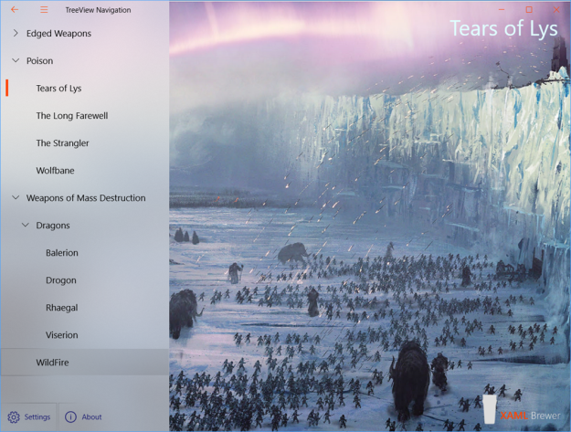
Here’s how that app looks like:
Building the User Experience
Here’s the main XAML content of the Shell page:
<!-- SplitView -->
<SplitView x:Name="ShellSplitView">
    <SplitView.Pane>
        <Grid x:Name="SplitViewPane">
            <Grid.RowDefinitions>
                <RowDefinition Height="*" />
                <RowDefinition Height="auto" />
            </Grid.RowDefinitions>
            <!-- Navigation Tree -->
            <TreeView x:Name="NavigationTree"
                        ItemInvoked="TreeView_ItemInvoked"
                        Style="{StaticResource TreeViewStyle1}" />
            <!-- Command Bar -->
            <CommandBar>
                <!-- AppBarButtons -->
            </CommandBar>
        </Grid>
    </SplitView.Pane>
    <SplitView.Content>
        <Grid>
            <!-- Does not seem to work. -->
            <ParallaxView Source="{Binding ElementName=NavigationTree}"
                            VerticalShift="100">
                <!-- Background Image -->
            </ParallaxView>

            <!-- Navigation Frame -->
            <Frame x:Name="SplitViewFrame"
                    Navigated="SplitViewFrame_OnNavigated"/>
        </Grid>
    </SplitView.Content>
</SplitView>

<!-- Title Bar -->
<TextBlock x:Name="AppTitle" />

<!-- Hamburger Button -->
<Button x:Name="HamburgerButton">
    <!-- ... -->
</Button>
SplitView
We used a classic SplitView control to host the main components: the TreeView on the left and a Frame to hold the current page on the right. The SplitView Pane can be opened or closed with a Hamburger button that sits on top of it (z-index wise).
A SplitView supports four display modes for the Pane, but the NavigationView only uses three display modes for the menu:
- Minimal: panel shows if needed and on top of content,
- Compact: panel shows a narrow band of icons, and
- Expanded: panel shows alongside the content.
We didn’t use icons in the TreeView’s ItemTemplate – and it would anyway be impossible to to show a multi-level tree in a narrow vertical band. So we decided to skip compact mode in the visual states. As a result the SplitView Pane has always the same width (when visible). It will just toggle between Inline and Expanded according to the app’s width.
Following the guidelines for Acrylic, we made the navigation pane background
- 60% in-app acrylic in overlay mode, and
- 60% background acrylic in side-by-side mode.
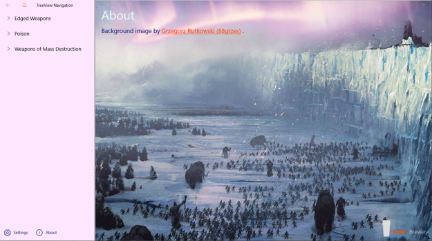
When using acrylic brushes in your app, don’t forget to provide a fallback color. It’s the solid color that is shown when the composition brushes are not used – i.e. when the app loses focus, or when the user settings or the machine hardware prevent it. Here’s a screenshot of the app when it does not have the focus:
Here’s the definition of the corresponding brushes:
<!-- Splitview Pane -->
<AcrylicBrush x:Key="SplitViewInlineBackgroundBrush"
                BackgroundSource="HostBackdrop"
                TintOpacity="0.6"
                FallbackColor="#ffe6ff" />
<AcrylicBrush x:Key="SplitViewOverlayBackgroundBrush"
                BackgroundSource="Backdrop"
                TintOpacity="0.6"
                FallbackColor="#ffe6ff" />
And here’s how they are declaratively applied in the Visual State Manager:
<!-- VisualState to be triggered when window width is >=1007 effective pixels -->
<VisualState x:Name="Expanded">
    <VisualState.StateTriggers>
        <AdaptiveTrigger MinWindowWidth="1007" />
    </VisualState.StateTriggers>
    <VisualState.Setters>
        <!-- SplitView pane shows as overlay -->
        <Setter Target="ShellSplitView.DisplayMode"
                Value="Inline" />
        <Setter Target="ShellSplitView.PaneBackground"
                Value="{StaticResource SplitViewInlineBackgroundBrush}" />
    </VisualState.Setters>
</VisualState>
The Shell page -including the SplitView and its content- is blended into the title area:
// Blends the app into the title bar.
var coreTitleBar = CoreApplication.GetCurrentView().TitleBar;
coreTitleBar.ExtendViewIntoTitleBar = true;
var titleBar = ApplicationView.GetForCurrentView().TitleBar;
titleBar.ButtonBackgroundColor = Colors.Transparent;
titleBar.ButtonInactiveBackgroundColor = Colors.Transparent;
titleBar.ButtonForegroundColor = (Color)Application.Current.Resources["TitlebarButtonForegroundColor"];
For more info on this code and its consequences, check the TitleBar Customization documentation.
TreeView
The TreeView control is the obvious candidate for displaying a hierarchical menu. It is also one of the UWP controls that comes with built-in Reveal highlight effect, a lighting effect that highlights interactive elements, such as command bar buttons, listview items, or treeview nodes when the user moves the pointer near them. Check the bottom left part of the first screenshot in this article for an impression.
We tweaked the TreeViewItem style a little bit to decorate the selected node with a thin vertical bar, just like the NavigationView does (but without an animation). Here’s what we changed :
<!-- Added -->
<Grid x:Name="SelectionGrid"
        Width="4"
        Margin="8"
        HorizontalAlignment="Left" />

<VisualState x:Name="Selected">
    <VisualState.Setters>
        <!-- Changed -->
        <Setter Target="SelectionGrid.Background"
                Value="{ThemeResource TreeViewItemBackgroundSelected}" />
        <Setter Target="ContentPresenter.Foreground"
                Value="{ThemeResource TreeViewItemForegroundSelected}" />
        <Setter Target="ContentPresenterGrid.BorderBrush"
                Value="{ThemeResource TreeViewItemBorderBrushSelected}" />
    </VisualState.Setters>
</VisualState>
As part of the process, we also changed the different accent colors so that we don’t rely on the user’s personal accent color:
<Application.Resources>
    <ResourceDictionary>
        <ResourceDictionary.ThemeDictionaries>
            <!-- AccentColor overrides -->
            <!-- Shades of OrangeRed -->
            <ResourceDictionary x:Key="Default">
                <Color x:Key="SystemAccentColor">#ff4500</Color>
                <Color x:Key="SystemAccentColorLight1">#ff4500</Color>
                <Color x:Key="SystemAccentColorLight2">#ff8f66</Color>
                <Color x:Key="SystemAccentColorLight3">#b33000</Color>
                <Color x:Key="SystemAccentColorDark1">#ff4500</Color>
                <Color x:Key="SystemAccentColorDark2">#ff8f66</Color>
                <Color x:Key="SystemAccentColorDark3">#b33000</Color>
            </ResourceDictionary>
            <!-- ... -->
Here’s how all of this looks like – before and after the template and color changes:
Notice that we also moved the whole TreeView control some pixels to the left, to vertically align the chevron icons with the Hamburger button.
Hamburger button
We decided to give the Hamburger button the same size and padding as the system buttons (minimize, maximize, and close) and place it into the title bar in the top left corner. If you place input controls in the title bar, then you should override the default interactive part of the title bar (the part that responds to dragging and double clicking) – otherwise your control will not be reachable.
Here’s the XAML for the top left corner:
<!-- Hamburger Button -->
<Button x:Name="HamburgerButton"
        Margin="0"
        Width="48"
        Height="32"
        <!-- ... -->

<!-- Title Bar -->
<Grid x:Name="AppTitleBar"
        Background="Transparent"
        Height="32"
        VerticalAlignment="Top"
        HorizontalAlignment="Stretch">
    <TextBlock x:Name="AppTitle"
                xmlns:appmodel="using:Windows.ApplicationModel"
                Text="{x:Bind appmodel:Package.Current.DisplayName}"
                Style="{StaticResource CaptionTextBlockStyle}"
                IsHitTestVisible="False"
                Margin="48 8 0 0" />
</Grid>
Here’s how the default title bar zone is overridden:
Window.Current.SetTitleBar(AppTitleBar);
The code behind the Hamburger button is straightforward. It just needs to toggle IsPaneOpen on the SplitView:
/// <summary>
/// Toggles the SplitView pane.
/// </summary>
private void HamburgerButton_Click(object sender, RoutedEventArgs e)
{
    ShellSplitView.IsPaneOpen = !ShellSplitView.IsPaneOpen;
}
Secondary commands
For the secondary commands at the bottom of the navigation panel, we opted for a CommandBar with regular app bar buttons. It’s one of the controls that comes with the Reveal effect built in, and it has the correct size. We considered buttons of the same dimensions as the Hamburger and the system buttons, but this size is to small for buttons that are used often and that have more complex icons.
Navigation
Our focus of the sample app was mainly on the user experience, so we kept the functional part -the navigation itself- as simple as possible. All the related code is placed directly in the Shell page, albeit in a partial class file. In a real-world app you would build a Navigation Service and then find and call it using singletons, dependency injection, service locator, or any other kind of blood magic. For more info, please check my older blog post on SplitView navigation.
To separate at least some of the concerns, we did create a NavigationMenuItem class that allows to define a hierarchic navigation structure (with the destination page type and parameter, and a Children collection):
Here’s a part of the logical navigation menu in the sample app:
private ObservableCollection<NavigationMenuItem> MainMenu =>
    new ObservableCollection<NavigationMenuItem>
        {
            new NavigationMenuItem
            {
                Text = "Edged Weapons",
                NavigationDestination = typeof(BladesPage),
                Children = new ObservableCollection<MenuItem>
                {
                    new NavigationMenuItem
                    {
                        Text = "Arakh",
                        NavigationDestination = typeof(BladesPage),
                        NavigationParameter = "Arakh"
                    },
                    new NavigationMenuItem
                    {
                        Text = "Dragonglass",
                        NavigationDestination = typeof(BladesPage),
                        NavigationParameter = "Dragonglass"
                    },
                    // ...
The Navigate method uses this information to … well … navigate:
/// <summary>
/// Navigates to the specified source page type.
/// </summary>
public bool Navigate(Type sourcePageType, object parameter = null)
{
    return SplitViewFrame.Navigate(sourcePageType, parameter);
}
When the app starts up, TreeView nodes are created from the menu structure – with a little help from a recursive extension method:
internal static TreeViewNode AsTreeViewNode(this NavigationMenuItem menuItem)
{
    var result = new TreeViewNode
    {
        Content = menuItem
    };

    foreach (NavigationMenuItem subItem in menuItem.Children)
    {
        result.Children.Add(subItem.AsTreeViewNode());
    }

    return result;
}
/// <summary>
/// Populates the TreeView from the Menu.
/// </summary>
private void PopulateTreeView()
{
    // Populate the tree.
    foreach (var item in MainMenu)
    {
        NavigationTree.RootNodes.Add(item.AsTreeViewNode());
    }
}
Each node in the TreeView now has a NavigationMenuItem as its Content, so it knows which page to load and with which parameter. Here’s what happens when a node is clicked:
/// <summary>
/// Navigates to the corresponding treeview selection.
/// </summary>
private void TreeView_ItemInvoked(TreeView sender, TreeViewItemInvokedEventArgs args)
{
    if (args.InvokedItem is TreeViewNode node)
    {
        if (node.Content is NavigationMenuItem menuItem)
        {
            var target = menuItem.NavigationDestination;
            if (target != null)
            {
                Navigate(menuItem.NavigationDestination, menuItem.NavigationParameter);
            }
        }
    }
}
The secondary command buttons call the same method, but without a parameter:
private void SettingsButton_Tapped(object sender, Windows.UI.Xaml.Input.TappedRoutedEventArgs e)
{
    Navigate(typeof(SettingsPage));
}
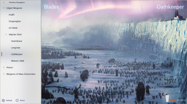
Just to prove that the parameter from the NavigationMenuItem is correctly passed to the Page, here’s how the different pages in the sample app update their subtitle in the top right corner:
protected override void OnNavigatedTo(NavigationEventArgs e)
{
    if (e.Parameter != null)
    {
        SubTitle.Text = e.Parameter.ToString();
    }

    base.OnNavigatedTo(e);
}
The Back Button
The hierarchical menu on the left -together with the secondary commands at the bottom- give the user immediate access to any page in the app. So personally we’re not in favor of providing a back button. But just for the sake of completeness, we also implemented it.
This implies a method to navigate back:
/// <summary>
/// Returns to the previous page.
/// </summary>
public void GoBack()
{
    if (SplitViewFrame.CanGoBack)
    {
        SplitViewFrame.GoBack();
    }
}
And you also need to make the system button visible:
/// <summary>
/// Shows the system back button.
/// </summary>
public void EnableBackButton()
{
    var navManager = SystemNavigationManager.GetForCurrentView();
    navManager.AppViewBackButtonVisibility = AppViewBackButtonVisibility.Visible;
    navManager.BackRequested -= (s, e) => GoBack();
    navManager.BackRequested += (s, e) => GoBack();
}
We placed the Hamburger button in the top left corner. When the system back button (dis)appears, we need to shift that button together with the text block holding the app title:
// Update the title bar when the back button (dis)appears or resizes.
Window.Current.CoreWindow.SizeChanged += (s, e) => UpdateAppTitle();
coreTitleBar.LayoutMetricsChanged += (s, e) => UpdateAppTitle();
/// <summary>
/// Updates the title bar when the back button (dis)appears or resizes.
/// </summary>
private void UpdateAppTitle()
{
    var full = (ApplicationView.GetForCurrentView().IsFullScreenMode);
    var left = (full ? 0 : CoreApplication.GetCurrentView().TitleBar.SystemOverlayLeftInset);
    HamburgerButton.Margin = new Thickness(left, 0, 0, 0);
    AppTitle.Margin = new Thickness(left + HamburgerButton.Width + 12, 8, 0, 0);
}
We also added the code to unselect the current TreeView node when the Back or a secondary command button is pressed. Since we weren’t successful in programmatically selecting and unselecting nodes, we applied the old trick of toggling the SelectionMode:
/// <summary>
/// Makes the TreeView lose its selection when there is no corresponding main menu item.
/// </summary>
/// <remarks>This works, but I don't know why...</remarks>
private void SplitViewFrame_OnNavigated(object sender, NavigationEventArgs e)
{
    NavigationTree.SelectionMode = TreeViewSelectionMode.None;
    NavigationTree.SelectionMode = TreeViewSelectionMode.Single;
}
We assumed it would be necessary to add some extra code to determine whether the navigation was triggered by the TreeView or not, before deciding to unselect the current node. It turns out that unconditionally toggling the selection mode seems to do the job already. But honestly: this feels like a coincidence.
NavigationTreeView, first of his name ?
We just created a great looking fluent design compatible TreeView based navigation UI. The development was easier than we expected, and the results look better than we expected. Some of you may be tempted to componentize all of this into a user experience just like the current NavigationView control. We think that this can be done with not too much extra effort, but personally we prefer the more granular control that we have in the sample app.
That sample app lives here on GitHub.
Enjoy!

