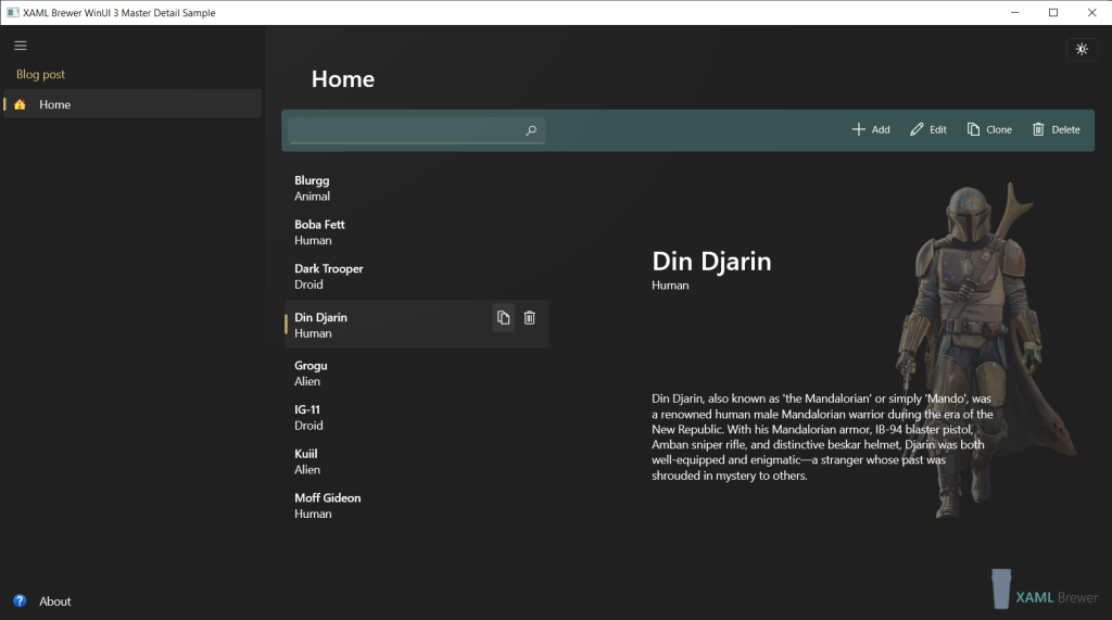
In this article we show how to build a Master-Detail page in a WinUI 3 Desktop application. The Master-Detail (a.k.a. List-Details) pattern that we’ll build is inspired by the popular mail client UI. It comes with
- a (filterable) list pane on the left,
- a details pane on the right,
- a command bar on top,
- a command bar on mouse-over within in the list item, and
- a dialog for editing and adding items.
We will make maximum use of the more recent WinUI 3 controls for the desktop, compiled bindings (x:Bind), and Microsoft MVVM Toolkit. If you’re already into Visual Studio 2022, then we propose go for the brand-new .NET Community Version of this MVVM Toolkit– it’s the same code but in a different namespace.
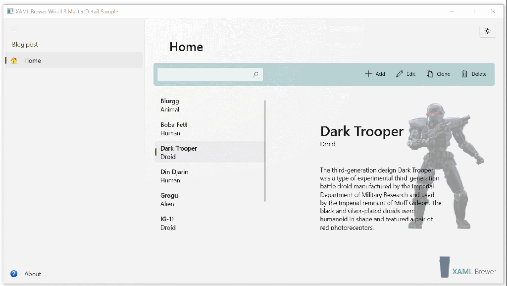
We built a small sample Win32 Desktop app, here’s how that looks like:
It uses Windows App SDK and MVVM Toolkit:
Here’s a class diagram of our pattern. We did not make any assumptions on the Model, also the generic ViewModel and the XAML structure of the View were designed with reusability in mind:
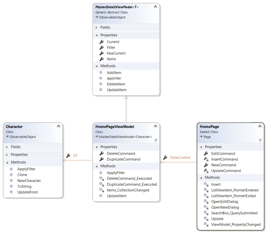
Model
The Model in our sample app implements INotifyPropertyChanged to facilitate data binding. It represents a character in a small screen series, it is called Character and it inherits from ObservableObject. We defined its fields and decorated them with ObservableProperty attributes. These attributes trigger the new MVVM source code generator for the properties – which also explains why the class is defined as partial:
public partial class Character : ObservableObject
{
    [ObservableProperty]
    private string name;

    [ObservableProperty]
    private string kind;

    [ObservableProperty]
    private string description;

    [ObservableProperty]
    private string imagePath;

    // ...
}
Our sample app uses the Name of the Character as identifier (primary key).
ViewModel
The pièce-de-résistance of our solution is a generic 100% reusable ViewModel class that pragmatically deals with most of the logic in a master-detail pattern. It hosts an ObservableCollection of Model instances and knows
- which one is selected,
- how to filter the list,
- how to add, remove, and update items, and
- it notifies all of this to its environment.
Here’s the part of its code that deals with the collection, maintaining the current selection, and filtering. We decided to expose only one Items collection and apply the filtering on that one – the Views can then remain bound to the Items property. The underlying field variable always refers to the unfiltered collection. Depending on your own use cases (e.g. if your View needs access to items that are filtered away), you may want to make the field protected instead of private.
The only thing that the generic base class does not know, is how to lookup items. That’s why ApplyFilter() is abstract:
public abstract partial class MasterDetailViewModel<T> : ObservableObject
{
    private readonly ObservableCollection<T> items = new();

    public ObservableCollection<T> Items =>
        filter is null
            ? items
            : new ObservableCollection<T>(items.Where(i => ApplyFilter(i, filter)));

    public T Current
    {
        get => current;
        set
        {
            SetProperty(ref current, value);
            OnPropertyChanged(nameof(HasCurrent));
        }
    }

    public string Filter
    {
        get => filter;
        set
        {
            var current = Current;

            SetProperty(ref filter, value);
            OnPropertyChanged(nameof(Items));

            if (current is not null && Items.Contains(current))
            {
                Current = current;
            }
        }
    }

    public bool HasCurrent => current is not null;

    public abstract bool ApplyFilter(T item, string filter);

    // ...

}
The base ViewModel hosts a set of virtual methods for adding, deleting, and replacing items. They work whether or not the collection is filtered, and all raise the CollectionChanged event so that the Views can update through databinding:
public virtual T AddItem(T item)
{
    items.Add(item);
    if (filter is not null)
    {
        OnPropertyChanged(nameof(Items));
    }

    return item;
}

public virtual T UpdateItem(T item, T original)
{
    var hasCurrent = HasCurrent;

    var i = items.IndexOf(original);
    items[i] = item; // Raises CollectionChanged.

    if (filter is not null)
    {
        OnPropertyChanged(nameof(Items));
    }

    if (hasCurrent && !HasCurrent)
    {
        // Restore Current.
        Current = item;
    }

    return item;
}

public virtual void DeleteItem(T item)
{
    items.Remove(item);

    if (filter is not null)
    {
        OnPropertyChanged(nameof(Items));
    }
}
The ViewModel in our sample app inherits from this MasterDetailViewModel<T> and overrides the ApplyFilter() method. When filtering Characters by a search string, we look it up in the Name, Kind, and Description properties. In most apps the search logic is independent from the View and its ViewModel, so it makes sense to implement it in the Model. We indeed pass the search logic to the Character:
public partial class HomePageViewModel : MasterDetailViewModel<Character>
{
    // ...

    public override bool ApplyFilter(Character item, string filter)
    {
        return item.ApplyFilter(filter);
    }

}
Here’s the ApplyFilter() method in the Model:
public bool ApplyFilter(string filter)
{
    return Name.Contains(filter, StringComparison.InvariantCultureIgnoreCase)
        || Kind.Contains(filter, StringComparison.InvariantCultureIgnoreCase)
        || Description.Contains(filter, StringComparison.InvariantCultureIgnoreCase);
}
The ViewModel is set as DataContext to the View:
<Page.DataContext>
    <viewmodels:HomePageViewModel x:Name="ViewModel" />
</Page.DataContext>
Let’s connect some more dots by taking a look at that View.
View
Our Master-Detail page consists of an AutoSuggestBox, a CommandBar, a ListView and a handful of Grid elements. If you’re on UWP, then you may consider bringing a ListDetailsView control in the equation.
On the left side lives a ListView which is bound to the Items and the Current of the ViewModel. For each item, the ‘master’ information (Name and Kind) is hosted in a RelativePanel. To allow compiled data binding within the data template, we specified the target class via x:DataType. The mouse-over status is monitored via PointerEntered and PointerExited event handlers:
<ListView x:Name="CharacterListView"
            ItemsSource="{x:Bind ViewModel.Items, Mode=OneWay}"
            SelectedItem="{x:Bind ViewModel.Current, Mode=TwoWay}">
    <ListView.ItemTemplate>
        <DataTemplate x:DataType="models:Character">
            <UserControl PointerEntered="ListViewItem_PointerEntered"
                         PointerExited="ListViewItem_PointerExited">
                <RelativePanel Background="Transparent">
                    <!-- more ... -->
Whenever the Current changes, we ensure it becomes visible:
private void ViewModel_PropertyChanged(
    object sender,
    System.ComponentModel.PropertyChangedEventArgs e)
{
    if (e.PropertyName == "Current" && ViewModel.HasCurrent)
    {
        CharacterListView.ScrollIntoView(ViewModel.Current);
    }
}
Use Cases
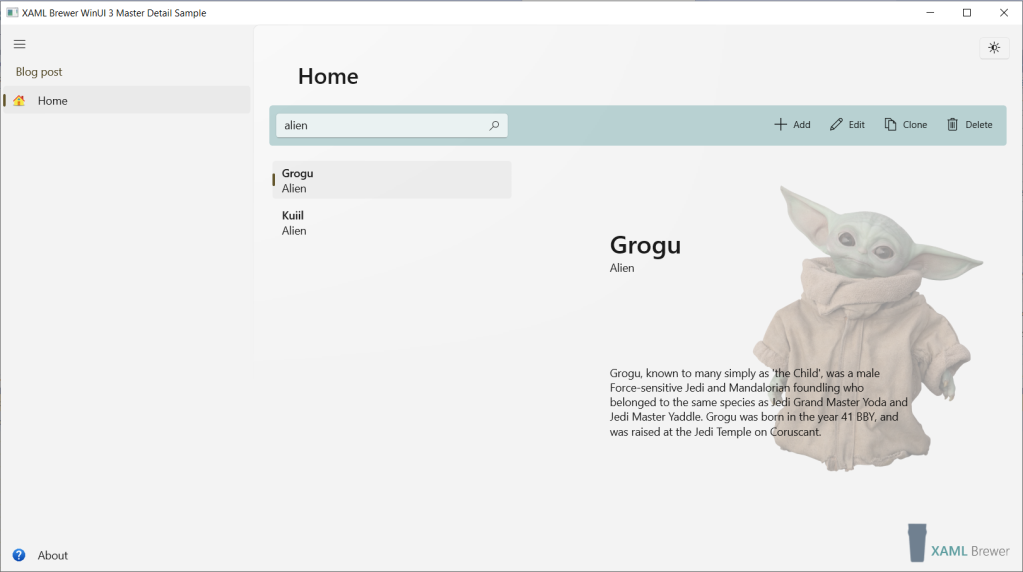
Filtering
We already covered the Model and ViewModel parts of filtering. The visual part is an AutoSuggestBox that we blended into the command bar on top:
<AutoSuggestBox x:Name="SearchBox"
                QuerySubmitted="SearchBox_QuerySubmitted"
                QueryIcon="Find" />
Its input is passed to the ViewModel:
private void SearchBox_QuerySubmitted(
    AutoSuggestBox sender,
    AutoSuggestBoxQuerySubmittedEventArgs args)
{
    ViewModel.Filter = args.QueryText;
}
You already know the rest of the story: the search logic is further passed to the Model, and the ViewModel’s Items collection becomes filtered:
public ObservableCollection<T> Items =>
    filter is null
        ? items
        : new ObservableCollection<T>(items.Where(i => ApplyFilter(i, filter)));
Here’s the app with a filter applied:
Commands
Our Master-Detail solution has a CommandBar on top, hosting the usual suspects (Add, Edit, Delete) but there’s also room for custom commands (like Duplicate). Some of these are always actionable, some only when there’s a Current. The data template of the items list on the left has also room for commands: commands that act on the list element that has mouse focus – whether or not it is the Current. These are grouped into a panel called HoverButtons, of which the visibility is managed by a VisualStateManager:
<RelativePanel>
    <VisualStateManager.VisualStateGroups>
        <VisualStateGroup x:Name="HoveringStates">
            <VisualState x:Name="HoverButtonsHidden" />
            <VisualState x:Name="HoverButtonsShown">
                <VisualState.Setters>
                    <Setter Target="HoverButtons.Visibility"
                            Value="Visible" />
                </VisualState.Setters>
            </VisualState>
        </VisualStateGroup>
    </VisualStateManager.VisualStateGroups>
    <!-- more ... -->
private void ListViewItem_PointerEntered(object sender, PointerRoutedEventArgs e)
{
    if (e.Pointer.PointerDeviceType is PointerDeviceType.Mouse or PointerDeviceType.Pen)
    {
        VisualStateManager.GoToState(sender as Control, "HoverButtonsShown", true);
    }
}

private void ListViewItem_PointerExited(object sender, PointerRoutedEventArgs e)
{
    VisualStateManager.GoToState(sender as Control, "HoverButtonsHidden", true);
}
Duplicate & Delete
The Duplicate and Delete commands appear in multiple places in the View. Thanks to the XamlUICommand and StandardUICommand classes, we were able to define these only once:
<Page.Resources>
    <XamlUICommand x:Name="DuplicateCommand"
                   Command="{x:Bind ViewModel.DuplicateCommand}"
                   Description="Create a clone of this character"
                   Label="Clone">
        <XamlUICommand.IconSource>
            <SymbolIconSource Symbol="Copy" />
        </XamlUICommand.IconSource>
        <XamlUICommand.KeyboardAccelerators>
            <KeyboardAccelerator Key="D"
                                 Modifiers="Control" />
        </XamlUICommand.KeyboardAccelerators>
    </XamlUICommand>
    <StandardUICommand x:Name="DeleteCommand"
                       Kind="Delete"
                       Command="{x:Bind ViewModel.DeleteCommand}"
                       Description="Remove this character" />
</Page.Resources>
Here’s how these UI commands are used in buttons on the top command bar, with the Current as parameter:
<AppBarButton Command="{StaticResource DuplicateCommand}"
              CommandParameter="{x:Bind ViewModel.Current.Name, Mode=OneWay}"
              IsEnabled="{x:Bind ViewModel.HasCurrent, Mode=OneWay}" />
<AppBarButton Command="{x:Bind DeleteCommand}"
              CommandParameter="{x:Bind ViewModel.Current.Name, Mode=OneWay}"
              IsEnabled="{x:Bind ViewModel.HasCurrent, Mode=OneWay}" />
Here are the same commands in the HoverButtons panel. They’re bound to the Model under the mouse cursor:
<StackPanel x:Name="HoverButtons"
            Orientation="Horizontal"
            Visibility="Collapsed">
    <AppBarButton IsCompact="True"
                  Command="{StaticResource DuplicateCommand}"
                  CommandParameter="{x:Bind Name}" />
    <AppBarButton IsCompact="True"
                  Command="{StaticResource DeleteCommand}"
                  CommandParameter="{x:Bind Name}" />
</StackPanel>
Inside the ViewModel the Delete and Duplicate commands are RelayCommand instances:
public ICommand DuplicateCommand => new RelayCommand<string>(DuplicateCommand_Executed);

public ICommand DeleteCommand => new RelayCommand<string>(DeleteCommand_Executed);
When they’re executed, they update the ViewModel’s collection via the helper methods:
private void DeleteCommand_Executed(string parm)
{
    if (parm is not null)
    {
        var toBeDeleted = Items.FirstOrDefault(c => c.Name == parm);
        DeleteItem(toBeDeleted);
    }
}

private void DuplicateCommand_Executed(string parm)
{
    var toBeDuplicated = Items.FirstOrDefault(c => c.Name == parm);
    var clone = toBeDuplicated.Clone();
    AddItem(clone);
    if (Items.Contains(clone))
    {
        Current = clone;
    }
}
Here’s an animation that shows these commands in action. We duplicate an item that’s not the Current, then select the clone and scroll it into view:
Insert & Update
The Insert and Update scenarios require some extra UI: the View has a ContentDialog that’s opened for entering a new Character, or for editing an existing one. RelativePanel is a great host for this type of content:
<ContentDialog x:Name="EditDialog"
                PrimaryButtonText="Update"
                CloseButtonText="Cancel">
    <RelativePanel HorizontalAlignment="Stretch">
        <TextBox x:Name="Name"
                    Header="Name"
                    Text="{Binding Name, Mode=TwoWay}" />
        <TextBox x:Name="Kind"
                    Header="Kind"
                    Text="{Binding Kind, Mode=TwoWay}"
                    RelativePanel.RightOf="Name"
                    RelativePanel.AlignRightWithPanel="True" />
        <TextBox x:Name="ImagePath"
                    Header="Path to Image"
                    Text="{Binding ImagePath, Mode=TwoWay}"
                    RelativePanel.Below="Name"
                    RelativePanel.AlignLeftWith="Name"
                    RelativePanel.AlignRightWith="Kind" />
        <TextBox x:Name="Description"
                    Header="Description"
                    Text="{Binding Description, Mode=TwoWay}"
                    TextWrapping="Wrap"
                    RelativePanel.Below="ImagePath"
                    RelativePanel.AlignLeftWith="ImagePath"
                    RelativePanel.AlignRightWith="ImagePath" />
    </RelativePanel>
</ContentDialog>
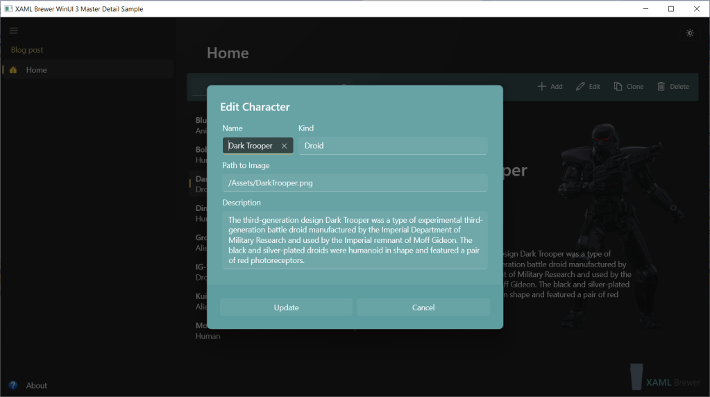
Here’s how the dialog looks like. We know: there’s room for improvement in the color scheme:
It should not come as a surprise that we’re using RelayCommands again:
public ICommand NewCommand => new AsyncRelayCommand(OpenNewDialog);

public ICommand EditCommand => new AsyncRelayCommand(OpenEditDialog);
Both commands configure and open the context dialog, which is bound to a Character that’s not in the official Items collection – to prevent side effects and facilitate the Cancel operation:
private async Task OpenNewDialog()
{
    EditDialog.Title = "New Character";
    EditDialog.PrimaryButtonText = "Insert";
    EditDialog.PrimaryButtonCommand = InsertCommand;
    EditDialog.DataContext = new Character();
    await EditDialog.ShowAsync();
}

private async Task OpenEditDialog()
{
    EditDialog.Title = "Edit Character";
    EditDialog.PrimaryButtonText = "Update";
    EditDialog.PrimaryButtonCommand = UpdateCommand;
    var clone = ViewModel.Current.Clone();
    clone.Name = ViewModel.Current.Name;
    EditDialog.DataContext = clone;
    await EditDialog.ShowAsync();
}
Another set of RelayCommands is bound to the Close button of the dialog, and update ViewModel’s items collection:
private void Update()
{
    ViewModel.UpdateItem(EditDialog.DataContext as Character, ViewModel.Current);
}

private void Insert()
{
    var character = ViewModel.AddItem(EditDialog.DataContext as Character);
    if (ViewModel.Items.Contains(character))
    {
        ViewModel.Current = character;
    }
}
Reusability
Here are the steps to take if you want to apply the proposed Master-Detail implementation in your own MVVM app:
- Copy/paste the generic MasterDetailViewModel.
- Make your own subclass of it, with your own Model.
- Use the XAML structure and bindings of our View, but applied to your own Model.
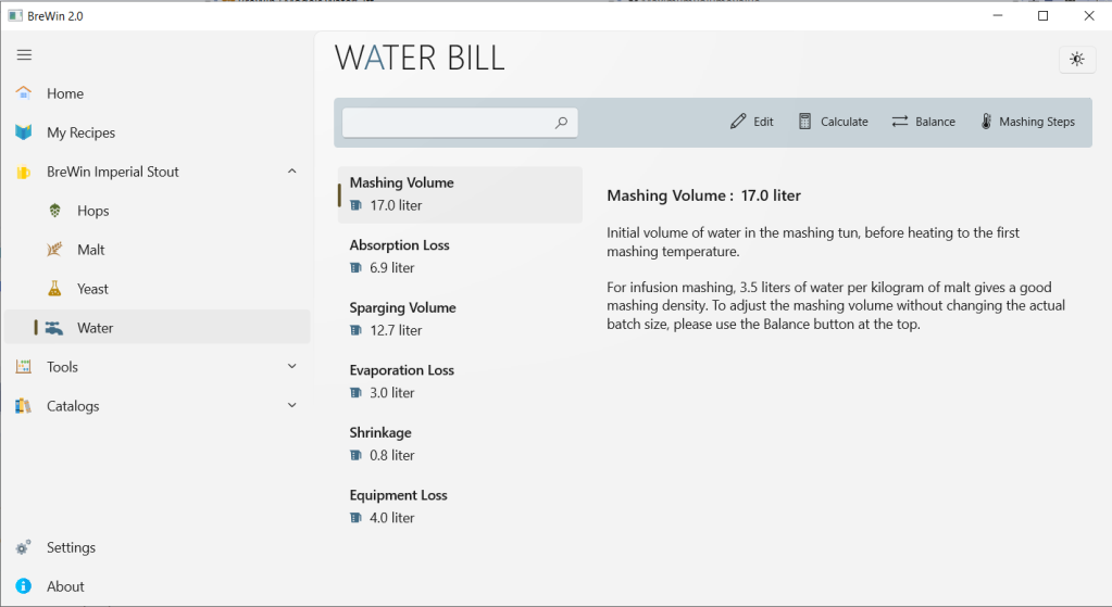
That’s all. We successfully did this exercise a couple of times in a relatively big app, with a few variations in the scenario, such as a read-only collection, no search, and insert only via selection from another list. Here’s how that app looks like:
It took a few iterations, but we’re pretty confident that this pattern and its component are reusable.
Our sample app lives here on GitHub.
Enjoy!
 XAML Brewer, by Diederik Krols
Fantastic article, easy to read, easy to learn, and really helpful is showing practical use of items not usually covered by others – highlights for me were:
-use of a generic collection for later reusability.
– use of Visual State groups.
– shared commands via StandardUICommand and AppBarButton.
– use of dataTemplate.
– use of IsEnabled property rather than an ICommand with canExecute.
I definitely like your writing style, and like the way you extend our knowledge past the basics.
WinUI3 can definitely do with more of these types of examples
LikeLike