In this article we showcase the latest and greatest version of the Radial Gauge control in a WinUI 3 Desktop Application. This version is part of a near-future release of Windows Community Toolkit – a release that will provide single-codebase components for WinUI 2, WinUI 3, as well as Uno Platform. It’s not yet exposed via official NuGet packages, so we borrowed some source code from the initial pull request. We just commented out some preprocessor directives, and imported the new set of theme resources.
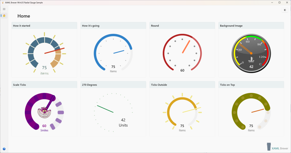
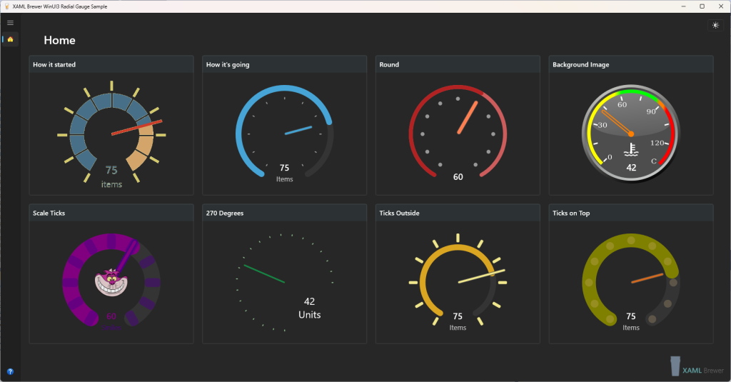
Here’s how our sample app looks like, it hosts a set of Radial Gauge controls with different configurations:
Things are relatively quiet in the WinUI 3 eco system (yes: that’s an understatement). However, improvements in Windows Community Toolkit are not the only upcoming change. In the incubation labs we detect
- a Shimmer control, to indicate that a part of the screen is loading, and
- a TransitionHelper, assisting in creating sophisticated animations or morphs.
In the near future you may also expect some new core controls – not open source. A recent WinUI Community Call and the backlog of the WinUI Gallery repo announce
- a new ItemsView (replacing ListView and GridView) and
- an AnnotatedScrollBar.
If you can’t wait for that last one: there’s a nice ScrollBar Annotations Extension in AndrewKeepCoding’s AK.Toolkit.
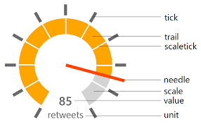
For now, let’s go back to Radial Gauge – which is actually older than Windows Community Toolkit itself. Here’s an overview of the control and its properties:
The UWP/WinUI 2 version of Radial Gauge was one of the first Community Toolkit controls to support theming and accessibility. Two years ago (time flies!) we demonstrated a WinUI 3 version of it. We made a Radial Gauge that
- had no dependencies on WinUI 2–only features of the toolkit, and
- came with a fresh Windows 10–ish design.
Here’s a screenshot that illustrates visual changes we proposed:
We’ve been using this spin-off version in some WinUI 3 apps for a while now. We’ll replace it with the new ‘official’ toolkit version as soon as it hits the streets.
Lately, the Windows Community Toolkit team has been very busy with making its core (i.e. UWP) classes compatible with WinUI 3 and the Uno platform. At the same time, some of the older controls got a more modern UI. Radial Gauge was one of the first to get pimped.
The control got some extra properties. In our own WinUI 3 version we already replaced the pointy, opaque, rectangular SpriteVisual instances by CompositionRoundedRectangleGeometry with an Opacity, and rounded scale segment’s corners. The Community Toolkit team elaborated on this, and further added borders and parameterized the CornerRadius.
Radial Gauge has a lot of dependency properties. Since regions became an antipattern, these properties are now grouped into their own partial class. There’s no need to explain the new ones – all the property names are well chosen:
- ScaleLength,
- ScaleTickCornerRadius,
- NeedleBorderBrush,
- NeedleBorderThickness,
- TickCornerRadius,
- TickPadding.
Here’s how the new UI looks like, compared to the ‘classic’ one (an image from the Pull Request):
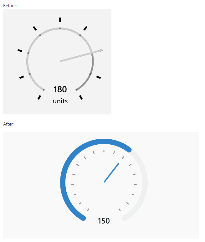
We especially like the new TickPadding property. Its default value places the ticks inside the scale – they used to be on the outside. With this new UI, the control looks less like a Swiss station clock. TickPadding allows you to place the Ticks anywhere, including inside the scale segment (that’s where the ScaleTicks are drawn – so these are becoming obsolete). Another nice improvement is the better vertical alignment of the value and unit texts. The control definitely looks better that its ancestors.
Radial Gauge has frequently been a topic in our blog posts, so it’s not our intention to create yet another deep dive into its implementation. We just created a gallery page with some instances of the new edition. Here’s how it looks like in dark mode:
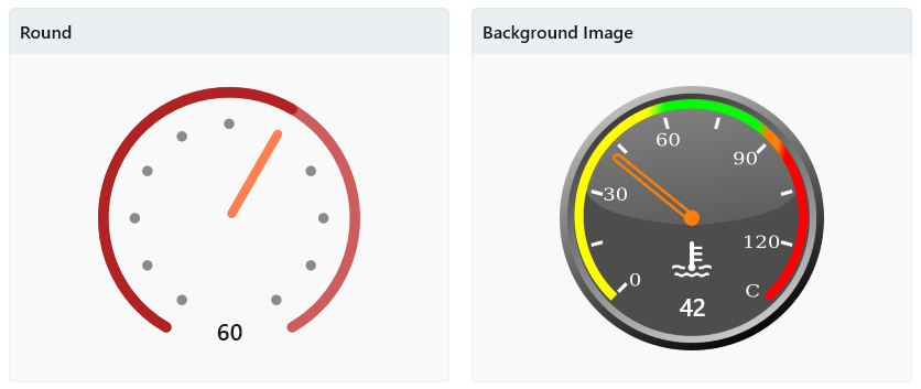
As an example, here are some of the control definitions in our gallery. All of the controls in our sample app have IsInteractive to true, to allow you reposition the needle with touch or mouse:
<controls:RadialGauge Minimum="0"
                        Maximum="100"
                        StepSize="5"
                        Value="60"
                        TickSpacing="10"
                        TickLength="8"
                        TickWidth="8"
                        TickCornerRadius="4"
                        ScaleWidth="8"
                        NeedleWidth="8"
                        NeedleLength="78"
                        TrailBrush="Firebrick"
                        NeedleBrush="Coral"
                        ScaleBrush="IndianRed"
                        IsInteractive="True" />

<controls:RadialGauge Height="240"
                        Width="240"
                        Margin="10"
                        NeedleBrush="Transparent"
                        NeedleBorderBrush="#FF7F00"
                        NeedleBorderThickness="2"
                        NeedleWidth="5"
                        Minimum="0"
                        Maximum="135"
                        Value="42"
                        Unit=" "
                        Foreground="White"
                        IsInteractive="True"
                        TickBrush="Transparent"
                        TrailBrush="Transparent"
                        ScaleTickBrush="Transparent"
                        ScaleBrush="Transparent"
                        NeedleLength="75"
                        MinAngle="-135"
                        MaxAngle="135"
                        VerticalAlignment="Center"
                        HorizontalAlignment="Center" />
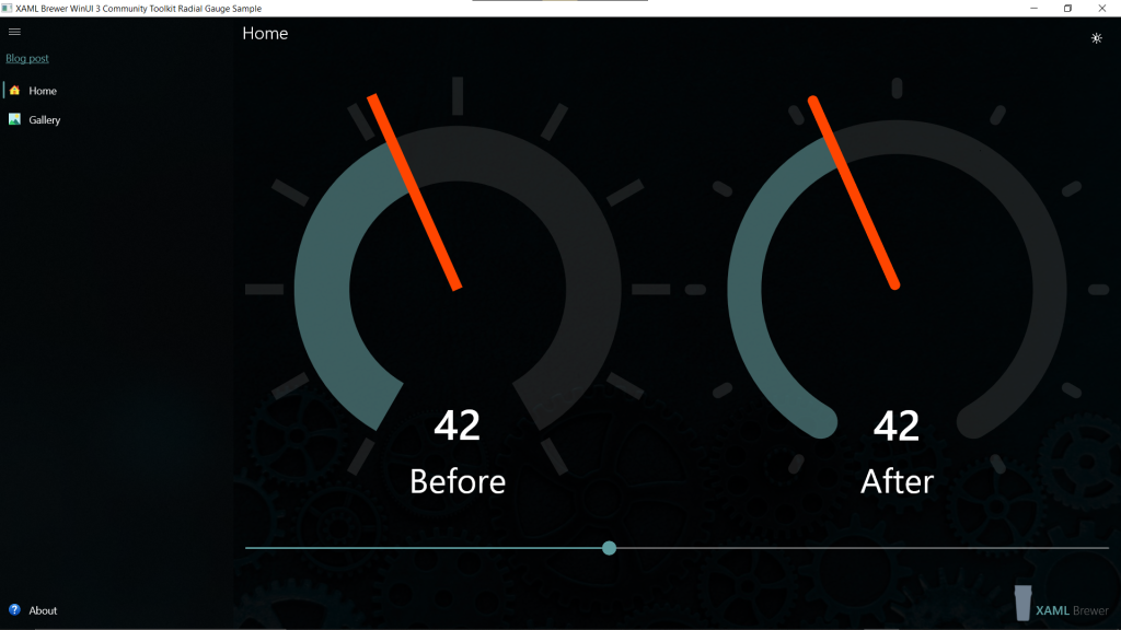
It’s the source for these two gauges:
We definitely like the improvements in the WinUI Gallery Radial Gauge control. Our sample gallery app proves that it works in WinUI 3, that it looks good, and that it can easily adapt to your own app’s look-and-feel.
Our sample app lives here on GitHub.
Enjoy!
 XAML Brewer, by Diederik Krols