Category Archives: User Controls

Hello new Radial Gauge

In this article we showcase the latest and greatest version of the Radial Gauge control in a WinUI 3 Desktop Application. This version is part of a near-future release of Windows Community Toolkit – a release that will provide single-codebase components for WinUI 2, WinUI 3, as well as Uno Platform. It’s not yet exposed via official NuGet packages, so we borrowed some source code from the initial pull request. We just commented out some preprocessor directives, and imported the new set of theme resources.

Here’s how our sample app looks like, it hosts a set of Radial Gauge controls with different configurations:

Things are relatively quiet in the WinUI 3 eco system (yes: that’s an understatement). However, improvements in Windows Community Toolkit are not the only upcoming change. In the incubation labs we detect

  • a Shimmer control, to indicate that a part of the screen is loading, and
  • a TransitionHelper, assisting in creating sophisticated animations or morphs.

In the near future you may also expect some new core controls – not open source. A recent WinUI Community Call and the backlog of the WinUI Gallery repo announce

  • a new ItemsView (replacing ListView and GridView) and
  • an AnnotatedScrollBar.

If you can’t wait for that last one: there’s a nice ScrollBar Annotations Extension in AndrewKeepCoding’s AK.Toolkit.

For now, let’s go back to Radial Gauge – which is actually older than Windows Community Toolkit itself. Here’s an overview of the control and its properties:

The UWP/WinUI 2 version of Radial Gauge was one of the first Community Toolkit controls to support theming and accessibility. Two years ago (time flies!) we demonstrated a WinUI 3 version of it. We made a Radial Gauge that

  • had no dependencies on WinUI 2–only features of the toolkit, and
  • came with a fresh Windows 10–ish design.

Here’s a screenshot that illustrates visual changes we proposed:

We’ve been using this spin-off version in some WinUI 3 apps for a while now. We’ll replace it with the new ‘official’ toolkit version as soon as it hits the streets.

Lately, the Windows Community Toolkit team has been very busy with making its core (i.e. UWP) classes compatible with WinUI 3 and the Uno platform. At the same time, some of the older controls got a more modern UI. Radial Gauge was one of the first to get pimped.

The control got some extra properties. In our own WinUI 3 version we already replaced the pointy, opaque, rectangular SpriteVisual instances by CompositionRoundedRectangleGeometry with an Opacity, and rounded scale segment’s corners. The Community Toolkit team elaborated on this, and further added borders and parameterized the CornerRadius.

Radial Gauge has a lot of dependency properties. Since regions became an antipattern, these properties are now grouped into their own partial class. There’s no need to explain the new ones – all the property names are well chosen:

  • ScaleLength,
  • ScaleTickCornerRadius,
  • NeedleBorderBrush,
  • NeedleBorderThickness,
  • TickCornerRadius,
  • TickPadding.

Here’s how the new UI looks like, compared to the ‘classic’ one (an image from the Pull Request):

We especially like the new TickPadding property. Its default value places the ticks inside the scale – they used to be on the outside. With this new UI, the control looks less like a Swiss station clock. TickPadding allows you to place the Ticks anywhere, including inside the scale segment (that’s where the ScaleTicks are drawn – so these are becoming obsolete). Another nice improvement is the better vertical alignment of the value and unit texts. The control definitely looks better that its ancestors.

Radial Gauge has frequently been a topic in our blog posts, so it’s not our intention to create yet another deep dive into its implementation. We just created a gallery page with some instances of the new edition. Here’s how it looks like in dark mode:

As an example, here are some of the control definitions in our gallery. All of the controls in our sample app have IsInteractive to true, to allow you reposition the needle with touch or mouse:

<controls:RadialGauge Minimum="0"
                        Maximum="100"
                        StepSize="5"
                        Value="60"
                        TickSpacing="10"
                        TickLength="8"
                        TickWidth="8"
                        TickCornerRadius="4"
                        ScaleWidth="8"
                        NeedleWidth="8"
                        NeedleLength="78"
                        TrailBrush="Firebrick"
                        NeedleBrush="Coral"
                        ScaleBrush="IndianRed"
                        IsInteractive="True" />

<controls:RadialGauge Height="240"
                        Width="240"
                        Margin="10"
                        NeedleBrush="Transparent"
                        NeedleBorderBrush="#FF7F00"
                        NeedleBorderThickness="2"
                        NeedleWidth="5"
                        Minimum="0"
                        Maximum="135"
                        Value="42"
                        Unit=" "
                        Foreground="White"
                        IsInteractive="True"
                        TickBrush="Transparent"
                        TrailBrush="Transparent"
                        ScaleTickBrush="Transparent"
                        ScaleBrush="Transparent"
                        NeedleLength="75"
                        MinAngle="-135"
                        MaxAngle="135"
                        VerticalAlignment="Center"
                        HorizontalAlignment="Center" />

It’s the source for these two gauges:

We definitely like the improvements in the WinUI Gallery Radial Gauge control. Our sample gallery app proves that it works in WinUI 3, that it looks good, and that it can easily adapt to your own app’s look-and-feel.

Our sample app lives here on GitHub.

Enjoy!

Fun with Bindable Squares in UWP

In the previous article we introduced some bindable Composition-drawn Path controls for UWP. In this article we will extend the list of controls with Rectangle and Square shapes, and introduce some optimizations in the framework. But above all: we’re going to have fun recreating some famous optical illusions with squares.

Bindable Rectangle

For starters, we created a Rectangle control, inspired by its SVG definition. Our base class already exposed a start point, and the necessary stroke and fill properties, so our new Rectangle subclass only required a height and a width. Semantically this new Rectangle control refers to ‘a panel that contains a rectangle figure somewhere in it’, so it did not make sense to reuse the inherited Height and Width properties. Instead we created SideX and SideY dependency properties.

Rendering a rectangle with a CanvasPathBuilder is quite obvious:

  • move to the start point with BeginFigure,
  • draw three lines with AddLine, and
  • close the figure with EndFigure (it will add the missing fourth line).

Here’s the full Render code:

protected override void Render()
{
    var canvasPathBuilder = GetCanvasPathBuilder();

    // Figure
    canvasPathBuilder.BeginFigure(new Vector2((float)StartPointX, (float)StartPointY));
    canvasPathBuilder.AddLine(
        new Vector2((float)(SideX + StartPointX), (float)(StartPointY)));
    canvasPathBuilder.AddLine(
        new Vector2((float)(SideX + StartPointX), (float)(SideY + StartPointY)));
    canvasPathBuilder.AddLine(
        new Vector2((float)(StartPointX), (float)(SideY + StartPointY)));
    canvasPathBuilder.EndFigure(CanvasFigureLoop.Closed);

    Render(canvasPathBuilder);
}

Observe that most of the rendering (creating the CanvasPathBuilder, creating and manipulating the CanvasGeometry, the SpriteShape, and the ShapeVisual) is common to all shapes, so we moved that to the base class.

Of course we created a small page to test the new control and its binding capabilities. Here how it looks like:

Rectangle

Bindable Square

Next in this series of bindable path controls comes a Square with a center point and a side – all implemented as dependency properties. Here’s the obvious rendering code:

protected override void Render()
{
    var canvasPathBuilder = GetCanvasPathBuilder();

    // Move starting point.
    StartPointX = CenterPointX - (Side / 2);
    StartPointY = CenterPointY - (Side / 2);

    // Figure
    canvasPathBuilder.BeginFigure(new Vector2((float)StartPointX, (float)StartPointY));
    canvasPathBuilder.AddLine(
        new Vector2((float)(Side + StartPointX), (float)(StartPointY)));
    canvasPathBuilder.AddLine(
        new Vector2((float)(Side + StartPointX), (float)(Side + StartPointY)));
    canvasPathBuilder.AddLine(
        new Vector2((float)(StartPointX), (float)(Side + StartPointY)));
    canvasPathBuilder.EndFigure(CanvasFigureLoop.Closed);

    Render(canvasPathBuilder);
}

Here’s the sample page:

Square

It already contains the elements to test some properties that we’ll define later in this article.

Here’s the XAML for the test square:

<controls:Square x:Name="Square"
                    Stroke="LightSlateGray"
                    CenterPointX="150"
                    CenterPointY="250"
                    Side="100"
                    Height="400"
                    Width="400" />

Let’s start the fun

To discover new requirements and optimizations the framework, we decided to reenact some famous optical illusions involving only squares.

Most of the pages start with just an empty canvas like this:

<Viewbox>
    <Canvas x:Name="Canvas"
            Height="1000"
            Width="1500"
            Background="Transparent" />
</Viewbox>

We’ll draw most of the squares programmatically.

The first one is the Café Wall Illusion (a.k.a. the shifted chessboard), a 2D geometrical-optical illusion where parallel lines appear to be sloped. Here’s how our bindable shape implementation looks like:

CafeWall

Believe it or not, all these horizontal lines are parallel.

Here’s how a square is added to the canvas:

var blackSquare = new Square
{
    Side = side,
    Fill = Colors.LightSlateGray,
    Height = Canvas.Height,
    Width = Canvas.Width,
    CenterPointX = (240 * i),
    CenterPointY = 120 + (240 * j)
};
Canvas.Children.Add(blackSquare);

This first test case did not reveal new requirements, but allowed us to demonstrate the programmatic instantiation of our new controls – and we had a lot of fun.

Optimizing for quantity

Our second test case is the Bulging Checkerboard Illusion, a 3D geometrical-optical illusion that makes a checkerboard to look like bulging out of the screen, just by adding small squares (or circles) in it:

Checkerboard

When we rendered the image, we noticed that it took an unacceptably long time. Our first attempt to solve this, was to drastically reducing the number of calls to the core rendering code (a technique that we borrowed from some of the WinRT XAML Toolkit Controls). Every change of every dependency property triggers rendering, so that’s a lot of calls when the control is loading. So we added a DelayRendering property to the base class an made sure not to call the core logic as long as the property is set to false:

public CompositionPathHost(bool delayRendering) : this()
{
    _delayRendering = delayRendering;
}
protected static void Render(DependencyObject d, DependencyPropertyChangedEventArgs e)
{
    var path = (CompositionPathHost)d;
    if (path._delayRendering || path.Container.ActualWidth == 0)
    {
        return;
    }

    path.Render();
}
public bool DelayRendering
{
    get
    {
        return _delayRendering;
    }

    set
    {
        _delayRendering = value;
        if (!_delayRendering)
        {
            Render();
        }
    }
}

Of course this has an impact on the drawing code on the client side. We have to make sure that the property is assigned before any other (in a constructor), and have to reset is after all the other properties have their value:

var blackSquare = new Square(true)
{
    Side = side,
    Fill = Colors.LightSlateGray,
    Height = Canvas.Height,
    Width = Canvas.Width,
    CenterPointX = i * 100 + 50,
    CenterPointY = j * 100 + 50
};
Canvas.Children.Add(blackSquare);
blackSquare.DelayRendering = false;

Unfortunately we were underwhelmed by the impact of this code on the rendering time of all squares. So we started looking into other ways to speed up the process, by looking at opportunities to share ‘expensive’ objects – probably in the Win2D space. From the home page of CompositionProToolkit we learned that a CanvasDevice can be shared between CanvasPathBuilder instances, so we created a static device and reused it:

protected static CanvasDevice CanvasDevice = new CanvasDevice();

protected CanvasPathBuilder GetCanvasPathBuilder()
{
    var canvasPathBuilder = new CanvasPathBuilder(CanvasDevice);
    // ...

    return canvasPathBuilder;
}

The difference in rendering time is quite significant, and there is no impact on the client code. So it’s another successful test case!

Adding bindable Rotation properties

Our third test case (and personal favorite) is the hypnotizing Square Circe Spiral Illusion, an intertwining illusion where a set of concentric circles made of squares appear to spiral and intersect:

Intertwining

The effect is caused by selecting appropriate colors and by applying a rotation scheme to the squares. The latter is missing in our current API. Since it’s quite common to apply a rotation to shapes, we added the necessary dependency properties to the base class: RotationCenterX, RotationCenterY, and RotationAngle. We then only had to update the shared part of the rendering code to use these new properties:

shapeVisual.CenterPoint = new Vector3((float)RotationCenterX, (float)RotationCenterY, 0f);
shapeVisual.RotationAxis = new Vector3(0f, 0f, 1f);
shapeVisual.RotationAngle = (float)RotationAngle;

Et voilà: free rotation capabilities for all bindable shapes. Here’s a code snippet from the sample page:

var square = new Square
{
    Side = side,
    Stroke = i % 2 == 0 ? Colors.WhiteSmoke : Colors.LightSlateGray,
    StrokeThickness = 6,
    Height = Canvas.Height,
    Width = Canvas.Width,
    CenterPointX = (size / 2) + Math.Sin(Math.PI * 2 * i / squares) * radius,
    CenterPointY = (size / 2) + Math.Cos(Math.PI * 2 * i / squares) * radius,
    RotationCenterX = (size / 2) + Math.Sin(Math.PI * 2 * i / squares) * radius,
    RotationCenterY = (size / 2) + Math.Cos(Math.PI * 2 * i / squares) * radius,
    RotationAngle = (90d - i * (360d / squares) + rot * 15d) * Math.PI / 180
};
Canvas.Children.Add(square);

Adding animation

The fourth test case required animation: in the Breathing Square Illusion a spinning rectangle seems to grow and shrink, but it’s actually just rotating without any size change.

BreathingSquare

There is no way to expose animation behavior by just adding dependency properties. Instead we decided to expose the rendered ShapeVisual to the client of the control – not as a dependency property however, since the visual is recreated at each Render call. The shape visual is exposed via an Event on the control, so we first declared an argument:

public class RenderedEventArgs : EventArgs
{
    public ShapeVisual ShapeVisual { get; set; }
}

And then used it in a Rendered event:

public event EventHandler<RenderedEventArgs> Rendered;

protected virtual void OnRendered(RenderedEventArgs e)
{
    Rendered?.Invoke(this, e);
}

protected void Render(CanvasPathBuilder canvasPathBuilder)
{
    // ...
    root.Children.InsertAtTop(shapeVisual);
    OnRendered(new RenderedEventArgs { ShapeVisual = shapeVisual });
}

Here’s the definition of the square in the back:

var backSquare = new Square
{
    Side = 600,
    Fill = Colors.LightSteelBlue,
    Height = Canvas.Height,
    Width = Canvas.Width,
    CenterPointX = 500,
    CenterPointY = 500,
    RotationCenterX = 500,
    RotationCenterY = 500
};
backSquare.Rendered += BackSquare_Rendered;
Canvas.Children.Add(backSquare);

And here’s the handler for the Rendered event. It starts a ScalarKeyFrameAnimation with a LinearEasingFunction on the RotationAngleInDegrees:

private void BackSquare_Rendered(object sender, RenderedEventArgs e)
{
    // Start animation
    var shape = e.ShapeVisual;
    var compositor = Window.Current.Compositor;
    var animation = compositor.CreateScalarKeyFrameAnimation();
    var linear = compositor.CreateLinearEasingFunction();
    animation.InsertKeyFrame(1f, 360f, linear);
    animation.Duration = TimeSpan.FromSeconds(8);
    animation.Direction = AnimationDirection.Normal;
    animation.IterationBehavior = AnimationIterationBehavior.Forever;
    shape.StartAnimation(nameof(shape.RotationAngleInDegrees), animation);
}

Each time that the Square control is Rendered (when a dependency property changed), the shape visual is exposed via the event, and the rotation is started.

With these few –but fun- test cases, we were able to extend the base class of the Bindable Path API with nice features and improvements. This is how it now looks like:

ClassDiagram1

Note: there are more subclasses than just Square …

Look Mom, all XAML

Most of the test cases created the ‘bindable’ path controls programmatically, so we decided to add one entirely in XAML, to finish it off. Here’s how the Motion Binding Illusion looks like:

MotionBinding

At first sight there is nothing common in the movement of the four bars, except that they seem to move in pairs. Again this illusion is entirely made up of squares. The four bars are the sides of a 45° rotated square of which the corners are hidden by four smaller (and also rotated) square. The center square is making a circular motion.

Here’s how these five squares are defined in XAML – we now surely wish we had added a RotationInDegrees property:

<Canvas x:Name="Canvas"
        Height="1000"
        Width="1000"
        Background="LightSteelBlue">
    <controls:Square x:Name="Square"
                        Stroke="LightSlateGray"
                        StrokeThickness="16"
                        CenterPointX="500"
                        CenterPointY="500"
                        Side="540"
                        Height="1000"
                        Width="1000"
                        RotationCenterX="500"
                        RotationCenterY="500"
                        RotationAngle=".785"
                        Canvas.Left="-50"
                        Canvas.Top="-50">

    </controls:Square>
    <controls:Square Fill="LightSteelBlue"
                        StrokeThickness="0"
                        CenterPointX="500"
                        CenterPointY="142"
                        Side="200"
                        Height="1000"
                        Width="1000"
                        RotationCenterX="500"
                        RotationCenterY="142"
                        RotationAngle=".785" />
    <controls:Square Fill="LightSteelBlue"
                        StrokeThickness="0"
                        CenterPointX="500"
                        CenterPointY="858"
                        Side="200"
                        Height="1000"
                        Width="1000"
                        RotationCenterX="500"
                        RotationCenterY="858"
                        RotationAngle=".785" />
    <controls:Square Fill="LightSteelBlue"
                        StrokeThickness="0"
                        CenterPointX="142"
                        CenterPointY="500"
                        Side="200"
                        Height="1000"
                        Width="1000"
                        RotationCenterX="142"
                        RotationCenterY="500"
                        RotationAngle=".785" />
    <controls:Square Fill="LightSteelBlue"
                        StrokeThickness="0"
                        CenterPointX="858"
                        CenterPointY="500"
                        Side="200"
                        Height="1000"
                        Width="1000"
                        RotationCenterX="858"
                        RotationCenterY="500"
                        RotationAngle=".785" />
</Canvas>

The circular motion of the is done through a storyboarded animation on the Canvas.Top and Canvas.Left attached properties – both DoubleAnimations with a SineEase easing function in ‘EaseInOut’ mode (slow-fast-slow). To end up with a circular motion, one animation should follow a cosine function while the follows a sine function. This is solved by delaying the start of one animation with one second (half the full duration of the 180° animation).

Here’s the whole XAML: 

<Storyboard x:Name="myStoryboard"
            RepeatBehavior="Forever">
    <DoubleAnimation Storyboard.TargetName="Square"
                        Storyboard.TargetProperty="(Canvas.Left)"
                        From="-50"
                        To="50"
                        Duration="0:0:2"
                        AutoReverse="True"
                        RepeatBehavior="Forever">
        <DoubleAnimation.EasingFunction>
            <SineEase EasingMode="EaseInOut" />
        </DoubleAnimation.EasingFunction>
    </DoubleAnimation>
    <DoubleAnimation Storyboard.TargetName="Square"
                        Storyboard.TargetProperty="(Canvas.Top)"
                        From="-50"
                        To="50"
                        BeginTime="0:0:1"
                        Duration="0:0:2"
                        AutoReverse="True"
                        RepeatBehavior="Forever">
        <DoubleAnimation.EasingFunction>
            <SineEase EasingMode="EaseInOut" />
        </DoubleAnimation.EasingFunction>
    </DoubleAnimation>
</Storyboard>

Want some more?

There are a lot more optical illusions right here. Our sample project lives on GitHub.

Enjoy!

Creating Bindable Path Controls in UWP

In this article we’ll show some ways to create a bindable arc segment for UWP. We’ve been using elliptical arc elements relatively often. In most cases these where parts inside of user controls such as the percentage ring, the radial range indicator, and the radial gauge. We noticed that every time we used elliptical arcs, the hosting control’s code rapidly became cluttered with path calculation and drawing routines, making its core functionality unnecessarily hard to debug and extend. So we started looking for ways to abstract the calculation and drawing routines out of the user controls and into some reusable pattern.

Here’s a screenshot of the sample app that was created during the process:
CircleSegment

We targeted to implement the full Elliptical Arc SVG definition, including start and end point, radii, rotation angle, sweep direction, and a large arc indicator. Not only does this provide a mathematical context, it could also allow us to achieve compatibility with the SVG path syntax itself (e.g. for serialization). [Spoiler: We did not implement this in the sample app, because such a parser already exists in the CompositionProToolkit.]

For starters, here’s how a non-bindable elliptical arc path looks like in XAML (straight from the excellent documentation):

<Path Stroke="Black" StrokeThickness="1"  
  Data="M 10,100 A 100,50 45 1 0 200,100" />

XAML solution

The ‘classic’ way to draw an elliptical arc in UWP goes back to WPF, and is also implemented in the user controls that we just mentioned: in your XAML, place an ArcSegment as part of PathFigure in a Path control. The Path provides the Stroke properties (color, thickness, pattern), the PathFigure provides the start position, and the Arcsegment provides the rest.

Here’s how the XAML for a fixed arc segment looks like. It’s the exact same arc as the one in the previous code snippet, but without using the SVG mini-language:

<Path Stroke="Black" StrokeThickness="1">
  <Path.Data>
    <PathGeometry>
      <PathGeometry.Figures>
        <PathFigureCollection>
          <PathFigure StartPoint="10,100">
            <PathFigure.Segments>
              <PathSegmentCollection>
                <ArcSegment Size="100,50" RotationAngle="45" IsLargeArc="True" SweepDirection="CounterClockwise" Point="200,100" />
              </PathSegmentCollection>
            </PathFigure.Segments>
          </PathFigure>
        </PathFigureCollection>
      </PathGeometry.Figures>
    </PathGeometry>
  </Path.Data>
</Path>

This XAML structure looks a lot more binding-friendly than the Data string of the first Path definition. All we need to do is create an appropriate ViewModel for it, preferably one that implements INotifyPropertyChanged and exposes the properties through data types that are easy to bind to. Instead of Point or Vector instances for start position, end position, and radius, the ViewModel exposes numeric properties with the individual coordinates:

public class EllipticalArcViewModel : BindableBase
{
    public int RadiusX
    {
        get { return _radiusX; }
        set
        {
            SetProperty(ref _radiusX, value);
            OnPropertyChanged(nameof(Radius));
        }
    }

    public int RadiusY
    {
        get { return _radiusY; }
        set
        {
            SetProperty(ref _radiusY, value);
            OnPropertyChanged(nameof(Radius));
        }
    }

    public Size Radius => new Size(_radiusX, _radiusY);

    // ...
}

The enumerations for PenLineCap and SweepDirection are accessible through Boolean properties:

public bool IsClockwise
{
    get { return _isClockwise; }
    set
    {
        SetProperty(ref _isClockwise, value);
        OnPropertyChanged(nameof(SweepDirection));
    }
}

public SweepDirection SweepDirection => 
	_isClockwise ? SweepDirection.Clockwise : SweepDirection.Counterclockwise;

Here’s the class diagram for the first iteration of our ‘bindable arc’. The new ViewModel is on the left, and the XAML elements to which we will bind, are on the right:

EllipticalArcViewModel

The hosting page exposes an instance of the ViewModel in its code behind:

private EllipticalArcViewModel _viewModel = new EllipticalArcViewModel
{
    StartPointX = 10,
    StartPointY = 100,
    RadiusX = 100,
    RadiusY = 50,
    RotationAngle = 45,
    EndPointX = 200,
    EndPointY = 100
};

public EllipticalArcViewModel ViewModel => _viewModel;

And in the XAML we added {x:Bind} bindings to the elements:

<Path Stroke="{x:Bind ViewModel.Stroke, Mode=OneWay}"
        Height="400"
        Width="400"
        StrokeThickness="{x:Bind ViewModel.StrokeThickness, Mode=OneWay}"
        StrokeStartLineCap="{x:Bind ViewModel.StrokeLineCap, Mode=OneWay}"
        StrokeEndLineCap="{x:Bind ViewModel.StrokeLineCap, Mode=OneWay}">
    <Path.Data>
        <PathGeometry>
            <PathGeometry.Figures>
                <PathFigureCollection>
                    <PathFigure StartPoint="{x:Bind ViewModel.StartPoint, Mode=OneWay}">
                        <PathFigure.Segments>
                            <PathSegmentCollection>
                                <ArcSegment RotationAngle="{x:Bind ViewModel.RotationAngle, Mode=OneWay}"
                                            IsLargeArc="{x:Bind ViewModel.IsLargeArc, Mode=OneWay}"
                                            SweepDirection="{x:Bind ViewModel.SweepDirection, Mode=OneWay}"
                                            Point="{x:Bind ViewModel.EndPoint, Mode=OneWay}"
                                            Size="{x:Bind ViewModel.Radius, Mode=OneWay}" />
                            </PathSegmentCollection>
                        </PathFigure.Segments>
                    </PathFigure>
                </PathFigureCollection>
            </PathGeometry.Figures>
        </PathGeometry>
    </Path.Data>
</Path>

The ViewModel implements change propagation, so we can use Sliders (or other input controls) to modify its properties, and this will update the XAML elements:

<Slider Header="Rotation Angle"
        Value="{x:Bind ViewModel.RotationAngle, Mode=TwoWay}"
        Maximum="360" />
<ToggleSwitch Header="Sweep Direction"
                IsOn="{x:Bind ViewModel.IsClockwise, Mode=TwoWay}"
                OnContent="Clockwise"
                OffContent="Counterclockwise" />

Here’s how the corresponding page in the sample app looks like. It draws an ArcSegment with bindings to all of its SVG properties. Slider and ToggleSwitch controls allow you to modify the elliptical arc through the ViewModel:
ArcSegment

It’s relatively easy to make this solution more reusable by turning it into a user control. If you’re looking for an example of this, just check the code for the PieSlice and RingSlice controls from WinRT XAML Toolkit.

Composition solution

The last couple of years, we’ve seen an exciting increase in functionality and ease of use of the UWP Composition API. It has come to a point were apps can now relatively easy draw (and/or animate) anything directly in the Visual layer, a layer that is much closer to the fast DirectX drivers than the traditional XAML layer:
layers-win-ui-composition

The Visual Layer allows for fast drawing off the UI thread. Its API was recently enhanced with capabilities to draw paths. This makes it a logical next step in our attempt to create bindable paths.

In this second iteration, we packaged a ‘bindable arc’ as a user control. Its only XAML element is an empty grid which is only there to establish the link between the Visual (composition) Layer and the Framework (XAML) layer. Here’s that XAML:

<UserControl x:Class="XamlBrewer.Uwp.Controls.EllipticalArc">
    <Grid x:Name="Container" />
</UserControl>

Unsurprisingly, the new EllipticalArc control exposes the same list of properties as the EllipticalArcViewModel. Only this time they’re implemented as Dependency Properties:

public sealed partial class EllipticalArc : UserControl
{
    public static readonly DependencyProperty StartPointXProperty =
        DependencyProperty.Register(nameof(StartPointX), 
                                    typeof(int), 
                                    typeof(EllipticalArc), 
                                    new PropertyMetadata(0, new PropertyChangedCallback(Render)));

    public static readonly DependencyProperty StartPointYProperty =
        DependencyProperty.Register(nameof(StartPointY), 
                                    typeof(int), 
                                    typeof(EllipticalArc), 
                                    new PropertyMetadata(0, Render));

    public int EndPointX
    {
        get { return (int)GetValue(EndPointXProperty); }
        set { SetValue(EndPointXProperty, value); }
    }

    public int EndPointY
    {
        get { return (int)GetValue(EndPointYProperty); }
        set { SetValue(EndPointYProperty, value); }
    }

    // ...

}

Here’s the full API:

EllipticalArcControl

Every time a property changes, the Render method is called, to redraw the elliptical arc. It uses classes from the Composition API and Win2D (available through a NuGet package). Here are the key classes and their responsibility in that method:

Class Responsibility
Compositor Creates all Composition objects
Win2D CanvasPathBuilder Holds the path figure definitions
Win2D CanvasGeometry Draws geometric shapes in DirectX
CompositionPath Links the geometric shape to the Visual Layer
CompositionSpriteShape Holds the stroke and fill definitions
ShapeVisual Links the Visual Layer to the Framework Layer

Here’s the full Render method:

private static void Render(DependencyObject d, DependencyPropertyChangedEventArgs args)
{
    var arc = (EllipticalArc)d;
    if (arc.Container.ActualWidth == 0)
    {
        return;
    }

    var root = arc.Container.GetVisual();
    var compositor = Window.Current.Compositor;
    var canvasPathBuilder = new CanvasPathBuilder(new CanvasDevice());

    // Figure
    canvasPathBuilder.BeginFigure(new Vector2(arc.StartPointX, arc.StartPointY));
    canvasPathBuilder.AddArc(
        new Vector2(arc.EndPointX, arc.EndPointY),
        arc.RadiusX,
        arc.RadiusY,
        (float)(arc.RotationAngle * Math.PI / 180),
        arc.IsClockwise ? CanvasSweepDirection.Clockwise : CanvasSweepDirection.CounterClockwise,
        arc.IsLargeArc ? CanvasArcSize.Large : CanvasArcSize.Small);
    canvasPathBuilder.EndFigure(arc.IsClosed ? CanvasFigureLoop.Closed : CanvasFigureLoop.Open);

    // Path
    var canvasGeometry = CanvasGeometry.CreatePath(canvasPathBuilder);
    var compositionPath = new CompositionPath(canvasGeometry);
    var pathGeometry = compositor.CreatePathGeometry();
    pathGeometry.Path = compositionPath;
    var spriteShape = compositor.CreateSpriteShape(pathGeometry);
    spriteShape.FillBrush = compositor.CreateColorBrush(arc.Fill);
    spriteShape.StrokeThickness = (float)arc.StrokeThickness;
    spriteShape.StrokeBrush = compositor.CreateColorBrush(arc.Stroke);
    spriteShape.StrokeStartCap = arc.IsStrokeRounded ? CompositionStrokeCap.Round : CompositionStrokeCap.Flat;
    spriteShape.StrokeEndCap = arc.IsStrokeRounded ? CompositionStrokeCap.Round : CompositionStrokeCap.Flat;

    // Visual
    var shapeVisual = compositor.CreateShapeVisual();
    shapeVisual.Size = new Vector2((float)arc.Container.ActualWidth, (float)arc.Container.ActualHeight);
    shapeVisual.Shapes.Add(spriteShape);
    root.Children.RemoveAll();
    root.Children.InsertAtTop(shapeVisual);
}

Here’s how to use the control on a XAML page:

<controls:EllipticalArc x:Name="EllipticalArc"
                        StartPointX="10"
                        StartPointY="100"
                        RotationAngle="45"
                        RadiusX="100"
                        RadiusY="50"
                        EndPointX="200"
                        EndPointY="100"
                        Height="400"
                        Width="400" />

It supports two-way bindings, so you can update its properties through other controls – or through ViewModels if you prefer an MVVM approach:

<Slider Header="Rotation Angle"
        Value="{Binding RotationAngle, ElementName=EllipticalArc, Mode=TwoWay}"
        Maximum="360" />
<ToggleSwitch Header="Sweep Direction"
                IsOn="{Binding IsClockwise, ElementName=EllipticalArc, Mode=TwoWay}"
                OnContent="Clockwise"
                OffContent="Counterclockwise" />

Here’s how the corresponding page looks like in the sample app – it’s identical to the XAML version:
Composition

Reusable solution

The experiment with the light weight user control inspired us to move one step further, and create an easy-to-use circle segment control as part of a ‘reusable generic bindable path drawing framework for UWP’ (a.k.a. an abstract base class).

This circle segment control is intended for use inside (the template of) other controls – think of percentage ring, radial gauge, pie chart, and doughnut chart. All the common ‘bindable path’ members (such as stroke properties, start position, and closed figure indicator) are factored out into an abstract base class, while the CircleSegment itself only comes with a center, a radius, start end sweep angles. We also added a Boolean property to specify whether to add extra lines to the center and give it a pie slice shape. [We know: mathematically this property should have been called IsSector instead of IsPie.]

Here’s the class diagram for the last ‘bindable arc’ iteration:

CircleSegmentClassDiagram

As in the previous EllipticalArc, the user control’s only XAML element is a Grid to hook the composition drawings to the Visual Tree:

<UserControl
    x:Class="XamlBrewer.Uwp.Controls.CompositionPathHost">
    <Grid x:Name="Host" />
</UserControl>

On top of the property definitions, the control comes with an abstract Render method which is triggered on load and on property changes:

public static readonly DependencyProperty StartPointXProperty =
	DependencyProperty.Register(
		nameof(StartPointX), 
		typeof(double), 
		typeof(CompositionPathHost), 
		new PropertyMetadata(0d, new PropertyChangedCallback(Render)));

public double StartPointX
{
    get { return (double)GetValue(StartPointXProperty); }
    set { SetValue(StartPointXProperty, value); }
}

// ...

private void CompositionPathHost_Loaded(object sender, RoutedEventArgs e)
{
    Render(this, null);
}

protected static void Render(DependencyObject d, DependencyPropertyChangedEventArgs e)
{
    var path = (CompositionPathHost)d;
    if (path.Container.ActualWidth == 0)
    {
        return;
    }

    path.Render();
}

protected abstract void Render();

The new CircleSegment control inherits from this abstract base class, and adds its own properties;

public class CircleSegment : CompositionPathHost
{
  public static readonly DependencyProperty CenterPointYProperty =
      DependencyProperty.Register(
		nameof(CenterPointY), 
		typeof(double), 
		typeof(CircleSegment), 
		new PropertyMetadata(0d, Render));

  public double CenterPointX
  {
    get { return (double)GetValue(CenterPointXProperty); }
    set { SetValue(CenterPointXProperty, value); }
  }

  // ...

}

And of course provides its own implementation of the Render method. It’s a specialized version of the one in EllipticalArc that’s based on a more convenient AddArc overload with a center point and start and sweep angles. The start point coordinates of the underlying figure are determined by the IsPie property. The figure starts at the circle’s center for a pie slice shape (sector), or at the beginning of the arc for a simple segment:

protected override void Render()
{
    var root = Container.GetVisual();
    var compositor = Window.Current.Compositor;
    var canvasPathBuilder = new CanvasPathBuilder(new CanvasDevice());
    if (IsStrokeRounded)
    {
        canvasPathBuilder.SetSegmentOptions(CanvasFigureSegmentOptions.ForceRoundLineJoin);
    }
    else
    {
        canvasPathBuilder.SetSegmentOptions(CanvasFigureSegmentOptions.None);
    }

    // Figure
    if (IsPie)
    {
        StartPointX = CenterPointX;
        StartPointY = CenterPointY;
    }
    else
    {
        StartPointX = Radius * Math.Cos(StartAngle * Degrees2Radians) + CenterPointX;
        StartPointY = Radius * Math.Sin(StartAngle * Degrees2Radians) + CenterPointY;
    }

    canvasPathBuilder.BeginFigure(new Vector2((float)StartPointX, (float)StartPointY));

    canvasPathBuilder.AddArc(
        new Vector2((float)CenterPointX, (float)CenterPointY),
        (float)Radius,
        (float)Radius,
        (float)(StartAngle * Degrees2Radians),
        (float)(SweepAngle * Degrees2Radians));

    canvasPathBuilder.EndFigure(IsClosed || IsPie ? CanvasFigureLoop.Closed : CanvasFigureLoop.Open);

    // Path
    var canvasGeometry = CanvasGeometry.CreatePath(canvasPathBuilder);
    var compositionPath = new CompositionPath(canvasGeometry);
    var pathGeometry = compositor.CreatePathGeometry();
    pathGeometry.Path = compositionPath;
    var spriteShape = compositor.CreateSpriteShape(pathGeometry);
    spriteShape.FillBrush = compositor.CreateColorBrush(Fill);
    spriteShape.StrokeThickness = (float)StrokeThickness;
    spriteShape.StrokeBrush = compositor.CreateColorBrush(Stroke);
    spriteShape.StrokeStartCap = IsStrokeRounded ? CompositionStrokeCap.Round : CompositionStrokeCap.Flat;
    spriteShape.StrokeEndCap = IsStrokeRounded ? CompositionStrokeCap.Round : CompositionStrokeCap.Flat;

    // Visual
    var shapeVisual = compositor.CreateShapeVisual();
    shapeVisual.Size = new Vector2((float)Container.ActualWidth, (float)Container.ActualHeight);
    shapeVisual.Shapes.Add(spriteShape);
    root.Children.RemoveAll();
    root.Children.InsertAtTop(shapeVisual);
}

Please observe we switched from integers to doubles for all coordinate properties. The calculation of the starting point revealed the rounding errors when using integers.

For a screenshot of the corresponding page in the sample app, scroll back to the beginning of this article. It’s basically the same as all the previous ones, only with better code behind. We also brought up the old SquareOfSquares control to host some CircleSegment instances with different sizes and random properties:

SquareOfSquares

Last but not least, we added an inspiring gallery page to demonstrate some potential usages of the control:

Gallery

All the code

The sample app lives here on GitHub.

Enjoy!

Improving the accessibility of a UWP control

In this article we’ll show some techniques to improve the accessibility of a custom control in UWP. We’ll focus on three aspects:

  • Support for High Contrast themes,
  • Narrator compatibility, and
  • Keyboard input capability.

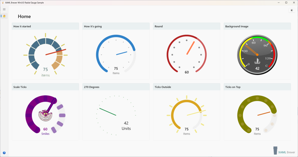
We’ll use the Radial Gauge control from Windows Community Toolkit as an example – the High Contrast and Narrator code in this article was recently merged into the source.

Supporting High Contrast themes

Adding Theme Dictionaries

With Settings –> Ease of access –> High Contrast, a Windows user can switch his color scheme to a small palette of contrasting colors. There may be medical reasons for this (like cataract or diabetic retinopathy) but it could also be set as to deal with working conditions (like direct sunlight on the screen, or insufficient lighting).

In a UWP app, all of the built-in native controls (the “XAML Common Controls”) respect this user setting and will update their UI. As an app developer you have to make sure

  • not to override that behavior of the native controls that you use, and
  • to provide a similar behavior for the XAML elements that you write yourself: pages and custom controls.

Basically this boils down to never hard coding colors.

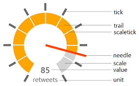
When building a custom control, you should create a ThemeDictionary that includes an entry for ‘High Contrast’. Here’s a XAML snippet from the previous style definition from the Radial Gauge control. It came with direct assignment of colors:

<Style TargetType="local:RadialGauge"> 
   <Setter Property="NeedleBrush" 
           Value="{ThemeResource SystemControlBackgroundAccentBrush}" /> 
   <Setter Property="TrailBrush" 
           Value="{ThemeResource SystemControlBackgroundAccentBrush}" />  
   <Setter Property="TickBrush" 
           Value="{ThemeResource SystemControlForegroundBaseHighBrush}" />  
   <Setter Property="ScaleTickBrush" 
           Value="Transparent" /> 
   <!-- ... --/>
</Style>

The brushes were pulled from theme resources to support Light an Dark themes. That’s a good start, but it doesn’t cover the High Contrast scenario. You should stick to a restricted palette of only 8 system colors in the High Contrast section of the theme dictionary:

Key Initial default
SystemColorButtonFaceColor #FFF0F0F0
SystemColorButtonTextColor #FF000000
SystemColorGrayTextColor #FF6D6D6D
SystemColorHighlightColor #FF3399FF
SystemColorHighlightTextColor #FFFFFFFF
SystemColorHotlightColor #FF0066CC
SystemColorWindowColor #FFFFFFFF
SystemColorWindowTextColor #FF000000

To support High Contrast in the Radial Gauge, an extra layer of abstraction was added in the color brush assignments by means of a resource dictionary:

<ResourceDictionary.ThemeDictionaries>
    <ResourceDictionary x:Key="Default">
        <SolidColorBrush x:Key="RadialGaugeNeedleBrush"
                         Color="{ThemeResource SystemChromeHighColor}" />
        <SolidColorBrush x:Key="RadialGaugeTrailBrush"
                         Color="{ThemeResource SystemChromeHighColor}" />
        <SolidColorBrush x:Key="RadialGaugeScaleBrush"
                         Color="{ThemeResource SystemBaseMediumLowColor}" />
        <SolidColorBrush x:Key="RadialGaugeScaleTickBrush"
                         Color="{ThemeResource SystemBaseMediumLowColor}" />
        <SolidColorBrush x:Key="RadialGaugeTickBrush"
                         Color="{ThemeResource SystemBaseHighColor}" />
        <SolidColorBrush x:Key="RadialGaugeForeground"
                         Color="{ThemeResource SystemBaseHighColor}" />
    </ResourceDictionary>
    <ResourceDictionary x:Key="Light">
        <!-- ... -->
    </ResourceDictionary>
    <ResourceDictionary x:Key="Dark">
        <!-- ... -->
    </ResourceDictionary>
    <ResourceDictionary x:Key="HighContrast">
        <!-- ... -->
    </ResourceDictionary>
</ResourceDictionary.ThemeDictionaries>

The default style of the control was updated to refer to resources from that dictionary:

<Style TargetType="local:RadialGauge">
    <Setter Property="NeedleBrush"
            Value="{ThemeResource RadialGaugeNeedleBrush}" />
    <Setter Property="TrailBrush"
            Value="{ThemeResource RadialGaugeTrailBrush}" />
    <Setter Property="ScaleBrush"
            Value="{ThemeResource RadialGaugeScaleBrush}" />
    <Setter Property="ScaleTickBrush"
            Value="{ThemeResource RadialGaugeScaleTickBrush}" />
    <Setter Property="TickBrush"
            Value="{ThemeResource RadialGaugeTickBrush}" />
    <Setter Property="Foreground"
            Value="{ThemeResource RadialGaugeForeground}" />
    <!-- ... -->
</Style>

The resource dictionary has an entry for ‘High Contrast’ with only brushes out of the limited set of system colors:

<ResourceDictionary x:Key="HighContrast">
    <SolidColorBrush x:Key="RadialGaugeNeedleBrush"
                     Color="{ThemeResource SystemColorHotlightColor}" />
    <SolidColorBrush x:Key="RadialGaugeTrailBrush"
                     Color="{ThemeResource SystemColorHotlightColor}" />
    <SolidColorBrush x:Key="RadialGaugeScaleBrush"
                     Color="{ThemeResource SystemColorWindowColor}" />
    <SolidColorBrush x:Key="RadialGaugeScaleTickBrush"
                     Color="{ThemeResource SystemColorWindowColor}" />
    <SolidColorBrush x:Key="RadialGaugeTickBrush"
                     Color="{ThemeResource SystemColorWindowTextColor}" />
    <SolidColorBrush x:Key="RadialGaugeForeground"
                     Color="{ThemeResource SystemColorWindowTextColor}" />
</ResourceDictionary>

The control now supports High contrast themes, and we didn’t even need to change the code behind.

Ignoring local properties

When a developer places our control on a page, he can locally assign brushes to the control’s color settings – after all that’s why we decorated it with properties. It makes sense for the control to ignore these assignments when a High Contrast theme is applied. For that we need to detect whether we’re in High contrast mode or not, and find a way to get notified when the user enables or disables the feature.

This is were the AccessibilitySettings class enters the picture, with a HighContrast property and a HighContrastChanged event. When the app starts, and whenever the event fires, we update the color scheme if necessary. We first create an instance of the class:

private static readonly AccessibilitySettings ThemeListener = new AccessibilitySettings();

And then register an event handler. That handler may force a redraw of the control –to update the colors- so the control’s Visual Tree should be assembled (but not yet displayed) when we register it. That makes the OnApplyTemplate event the best choice to host this code:

ThemeListener.HighContrastChanged += ThemeListener_HighContrastChanged;

Let’s take a look at the code to change the color scheme. When the app starts, we create a cache to remember the local values for the different colors. All the brushes are defined as dependency properties. To detect whether a dependency property is locally overridden (in XAML or C#, but not by a theme dictionary), we can use ReadLocalValue. It returns the local value or the so-called UnSetValue that indicates that no value was assigned:

private SolidColorBrush _needleBrush;
private Brush _trailBrush;
private Brush _scaleBrush;
// More brushes ...
_needleBrush = ReadLocalValue(NeedleBrushProperty) as SolidColorBrush;
_trailBrush = ReadLocalValue(TrailBrushProperty) as SolidColorBrush;
_scaleBrush = ReadLocalValue(ScaleBrushProperty) as SolidColorBrush;
// More assignments ...

When we enter a High Contrast theme, we unbind the local values from the dependency properties so that the entries of the theme dictionary are used. And when we enter a non High Contrast theme, we reassign the local values from the cache to reinstall the original color scheme:

private void OnColorsChanged()
{
    if (ThemeListener.HighContrast)
    {
        // Apply High Contrast Theme.
        ClearBrush(_needleBrush, NeedleBrushProperty);
        ClearBrush(_trailBrush, TrailBrushProperty);
        ClearBrush(_scaleBrush, ScaleBrushProperty);
        // More of these ...
    }
    else
    {
        // Apply User Defined or Default Theme.
        RestoreBrush(_needleBrush, NeedleBrushProperty);
        RestoreBrush(_trailBrush, TrailBrushProperty);
        RestoreBrush(_scaleBrush, ScaleBrushProperty);
        // More of these ...
    }

    // ...
}

To clear and restore the brushes, we use ClearValue and SetValue respectively:

private void ClearBrush(Brush brush, DependencyProperty prop)
{
    if (brush != null)
    {
        ClearValue(prop);
    }
}

private void RestoreBrush(Brush source, DependencyProperty prop)
{
    if (source != null)
    {
        SetValue(prop, source);
    }
}

For a deeper dive into Dependency Properties, check this documentation.

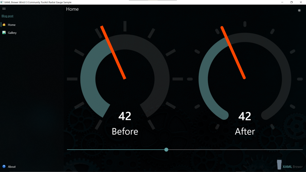
In the small sample app that I wrote, I encapsulated all accessibility related code behind (there’s more to come further in this article) in a separate partial class file:

FileStructure

To get these file under the xaml.cs file in Visual Studio’s explorer, I tweaked the project file:

ProjectFile

That sample app has a page with three radial gauge controls. The one in the middle has a local assignment for some colors:

<controls:RadialGauge Unit="Mississippi"
                      Value="20"
                      NeedleBrush="MediumOrchid"
                      TrailBrush="Indigo"
/>

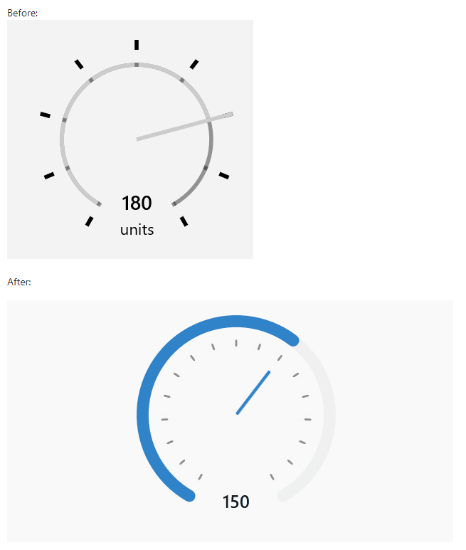
Here’s how that page looks like in a non High Contrast theme. On the left side of the screen there’s the Settings app; the right side is main page of the sample app:

HighContrast_Off

Here’s the app in High Contrast mode. Observe the limited color palette, and the fact that we successfully ignored the local colors for the middle gauge:

HighContrast

The UI Automation API

Another way to improve the accessibility of a custom UWP control is to provide screen reader support. Narrator lets you use your device to complete common tasks without mouse or touch input. It reads and interacts with elements on the screen, like text and buttons. Of course that only works if you stick to a protocol. That protocol is Microsoft UI Automation, an API in Windows that enables your apps to provide (and consume) programmatic information about its user interface. Providing programmatic access to most UI elements on the desktop enables assistive technology products, such as Narrator and Magnifier, to provide this information to the end users, e.g. by speech.

One of the most important components of Windows Automation is the so-called UI Automation Tree. This is the hierarchical representation of your desktop window, its child elements (open windows) and their UI components (menus, buttons, lists, …). The UI Automation Tree makes a difference between Control elements (interactive) and Content elements, but it makes no difference in technology: it works against all stacks: WinForms, Web, XAML, …

Supporting Narrator

Creating and registering an Automation Peer

An Automation Peer is a class that helps exposing the content of a UI element class to Windows UI Automation. It ensures that the UI Automation Tree does not have to rely on high-level assumptions, so it improves the service of components like Narrator and Magnifier.

To create an automation peer for a class, you just create a descendant from AutomationPeerFrameworkAutomationPeer is a good parent for a XAML control- and specify the described class (the ‘owner’) in the constructor:

public class RadialGaugeAutomationPeer : FrameworkElementAutomationPeer
{
    public RadialGaugeAutomationPeer(RadialGauge owner)
        : base(owner)
    { }

    // ...
}

To activate the automation peer, you also have to override the OnCreateAutomationPeer in the owner class (RadialGauge in our case):

protected override AutomationPeer OnCreateAutomationPeer()
{
    return new RadialGaugeAutomationPeer(this);
}

Basic overrides

There are two methods that you would probably override in every automation peer. The first one is GetChildrenCore(). It returns the list of child elements that you want to expose to UI Automation. In the case of the RadialGauge, we want to expose the control to as a single element and hide its details. So the override returns no children:

protected override IList<AutomationPeer> GetChildrenCore()
{
    return null;
}

The second important automation peer method is GetNameCore() which returns the main description of the component. If you want more than the fully qualified class name, then you should override it. Here’s what we did in the RadialGauge to make it return the class name and unit measure:

protected override string GetNameCore()
{
    var gauge = (RadialGauge)Owner;
    return "radial gauge. " + (string.IsNullOrWhiteSpace(gauge.Unit) ? "no unit specified. " : "unit " + gauge.Unit + ". ");
}

Tip: provide punctuation and pauses (blanks) in the result string to create a natural description. When Narrator reads the screen, it respects all of these.

After the name, Narrator tells the type of control. Custom is the default return value for GetAutomationControlTypeCore(), so this is actually an obsolete override:

protected override AutomationControlType GetAutomationControlTypeCore()
{
    return AutomationControlType.Custom;
}

I just want to point out that the type comes from the AutomationControlType enumeration. So you can not add your own here, but you can still expose a lot more details of your control.

Refining the Automation Peer

To find out more details about your control, Windows Automation will call GetPatternCore() a few times to see if it supports some protocols. One of these protocols is RangeValue which describes the controls that have a Value that is between a Minimum and a Maximum, controls such as … the RadialGauge.

To fulfill the protocol we have to implement the IRangeValueProvider interface:

public class RadialGaugeAutomationPeer :
    FrameworkElementAutomationPeer,
    IRangeValueProvider
{
    // ...
}
public double Value => ((RadialGauge)Owner).Value;
public double Minimum => ((RadialGauge)Owner).Minimum;
public double SmallChange => ((RadialGauge)Owner).StepSize;
public bool IsReadOnly => !((RadialGauge)Owner).IsInteractive;
// ...

Then we have to override GetPatternCore() to return a reference for each protocol that we implemented:

protected override object GetPatternCore(PatternInterface patternInterface)
{
    if (patternInterface == PatternInterface.RangeValue)
    {
        // Expose RangeValue properties.
        return this;
    }

    return base.GetPatternCore(patternInterface);
}

That’s is! Narrator will now say the description of our control, followed by the ValueRange information (Value, Minimum and Maximum). If you activate Narrator (in Settings) and TAB to the different gauges in the sample app, they will be nicely described. Here’s a –silent- screenshot:

Narrator

You can use the Inspect tool from the Windows SDK to discover and visualize all the information that Windows Automation is able to extract from your control:

Inspect_Narrator

Supporting keyboard input

A lot of users don’t use the mouse or a touch screen to interact with their computer, but only the keyboard. So it makes sense for a UWP control to accept keyboard input when it has the focus. The RadialGauge has a handler for the KeyDown event. Its value can be increased and decreased with the right and left arrow keys respectively. The Control key makes the difference between a large change of 5 units and a small change of 1:

private void RadialGauge_KeyDown(object sender, KeyRoutedEventArgs e)
{
    var step = 1;
    var ctrl = Window.Current.CoreWindow.GetKeyState(VirtualKey.Control);
    if (ctrl.HasFlag(CoreVirtualKeyStates.Down))
    {
        step = 5;
    }

    if (e.Key == VirtualKey.Left)
    {
        Value = Math.Max(Minimum, Value - step);
        e.Handled = true;
        return;
    }

    if (e.Key == VirtualKey.Right)
    {
        Value = Math.Min(Maximum, Value + step);
        e.Handled = true;
    }
}

This article described three techniques to improve the accessibility of a UWP Custom Control. If you want to know more on this topic, check this excellent starting page on the DevCenter.  You’ll quickly learn that spending some time and effort on accessibility makes your controls and apps better for everyone.

If you want to play with the code, the small sample app with the accessible RadialGauge lives here on GitHub.

Enjoy!

A Fluent Button Flyout for UWP

In this article we describe how to build an elegantly designed and animated fluent ToggleButton-Popup combination for use in UWP apps as an alternative for the less fluent Button Flyout. The code is not mine, I merely reused code and components from the Continuity framework by Justin Liu. This frameworks contains a lot of helpers for implementing Fluent Design in your apps without needing Windows 10 Fall Creators Update.

The ToggleButton-Popup combo is an excellent widget to display extra information such as a help text.

Here’s how all of this may look like (styling is up to you of course). It starts with a stand-alone round ‘more’ button, with hover animations. When pressed, the button rotates toward the opening flyout, while changing its shape to look like a ‘close’ button that becomes connected to the content that was just revealed. In the mean time, the flyout itself opens with a scale animation as if it grew out of the button:

FluentFlyoutButton

Closing the button and dismissing the flyout come with reverse animations.

I’ve been looking for ways to animate opening and closing Flyout or ContentDialog instances. I went through many of the XAML animations techniques, but could not find a way. Flyout and ContentDialog don’t come with Visual States, so Visual Transitions are not an option. Although its name seems promising, PopInThemeAnimation is not applicable. And if it were, it doesn’t come with a scale animation (only opacity and translation).

I almost gave up, and tried to to accept that flyouts would always open and close like this:

DefaultFlyoutButton

Frankly, I don’t like the animations. But what’s worse: you can not even see which of the buttons was actually pressed…

Then I came across this sample Kliva design with exactly the user experience I was looking for:

ContinuityPanel

I decided to copy the relevant code into my own solution under Features/Continuity to get some Fluent-As-A-Service:

ContinuityClasses

The Kliva demo is not using a Button with its Flyout, but a ToggleButton with ‘just’ a Grid. My only mission was to replace the Grid with a Popup. After a few iterations, I came up with the following setup, which even allows the Popup to have IsLightDismissEnabled on.:

  • A toggle button with storyboarded animations is placed in a container
  • A Popup is placed next to it with
  • The content of the Popup (not the Popup itself) is given implicit Show and Hide Composition API animations.

Here’s the corresponding XAML definition:

<!-- Toggle Button -->
<continuity:CircularToggleButton x:Name="TheToggle"
                                    CheckedBackground="{StaticResource HighlightBrush}"
                                    CheckedCornerRadius="6 0 0 6"
                                    FontFamily="Segoe UI">
    <continuity:CircularToggleButton.CheckedContent>
        <ContentControl Margin="3"
                        Style="{StaticResource IconCloseStyle}" />
    </continuity:CircularToggleButton.CheckedContent>
    <ContentControl Style="{StaticResource IconMoreStyle}" />
</continuity:CircularToggleButton>
<!-- 'Flyout' -->
<Popup x:Name="ThePopup"
        IsOpen="{Binding IsChecked, ElementName=TheToggle, Mode=TwoWay}"
        IsLightDismissEnabled="False"
        HorizontalOffset="{Binding ActualWidth, ElementName=TheToggle}"
        VerticalOffset="-20">
    <Grid x:Name="TheGrid"
            Visibility="{Binding IsOpen, ElementName=ThePopup}">
        <!-- Content -->
    </Grid>
</Popup>

That’s it! Let’s dive into some details.

An animated circular toggle button

The CircularToggleButton adds a few dependency properties to ToggleButton, like content, background color and corner radius for the different states:

public sealed class CircularToggleButton : ToggleButton
{
    public static readonly DependencyProperty CheckedContentProperty =
        DependencyProperty.Register(
            "CheckedContent",
            typeof(object),
            typeof(CircularToggleButton),
            new PropertyMetadata(null));

    public object CheckedContent
    {
        get => GetValue(CheckedContentProperty);
        set => SetValue(CheckedContentProperty, value);
    }

    // ..
}

It also comes with a circular custom style and some nice visual effects and animations.

Here’s how the PointerOver VisualState pumps up the size of the content using a RenderTransform with a CompositeTransform on ScaleX and ScaleY:

<VisualState x:Name="PointerOver">
    <VisualState.Setters>
        <Setter Target="CheckedContentPresenter.(UIElement.RenderTransform).(CompositeTransform.ScaleX)"
                Value="1.1" />
        <Setter Target="CheckedContentPresenter.(UIElement.RenderTransform).(CompositeTransform.ScaleY)"
                Value="1.1" />
        <Setter Target="UncheckedContentPresenter.(UIElement.RenderTransform).(CompositeTransform.ScaleX)"
                Value="1.1" />
        <Setter Target="UncheckedContentPresenter.(UIElement.RenderTransform).(CompositeTransform.ScaleY)"
                Value="1.1" />
        <Setter Target="BackgroundVisual.Opacity"
                Value="0.9" />
    </VisualState.Setters>
</VisualState>

Here’s the VisualTransition with the StoryBoard on CornerRadius that turns the round button into its ‘connected’ shape when checked:

<VisualTransition GeneratedDuration="0:0:0.25"
                    To="Checked">
    <Storyboard>
        <ObjectAnimationUsingKeyFrames Storyboard.TargetProperty="(Border.CornerRadius)"
                                        Storyboard.TargetName="BackgroundVisual">
            <DiscreteObjectKeyFrame KeyTime="0"
                                    Value="{Binding CheckedCornerRadius, RelativeSource={RelativeSource TemplatedParent}}" />
        </ObjectAnimationUsingKeyFrames>
    </Storyboard>
</VisualTransition>

If you want to know more about storyboarded animations, this circular toggle button style definition is a nice tutorial. Storyboarded animations are a way to change a dependency property over time. When there’s a visual impact of this, the animation may or may not require the UI thread. While the SDK’s evolve, more and more of these animations are internally rewritten to run on the composition thread. So there’s no need for you give up readable declarative Storyboards in XAML in favor of dark imperative code against the Composition API. But for the second part of this article, we’ll use the latter…

An animated Popup

The Popup control is a XAML container that allows you to place content on top of other content. You can not animate the Popup itself but fortunately you can animate its content. As promised we’ll use Composition animations for this. These are 60-frames-per-second animations that run independent of the UI thread. They’re a bit harder to write, but there are a lot of helpers available, like these from UWP Community Toolkit.

Here’s the Continuity helper that starts it all:

TheGrid.EnableFluidVisibilityAnimation(
    centerPoint: new Vector3(0.0f, 40.0f, 0.0f), 
    showFromScale: 0.2f, 
    hideToScale: 0.2f, 
    showDuration: 400, 
    hideDuration: 400);

Here’s part of its implementation.

A time based Composition API animation of the type Vector2KeyFrameAnimation is created with the Scale of the Visual as Target:

if (!showFromScale.Equals(1.0f))
{
    showeScaleAnimation = compositor.CreateVector2KeyFrameAnimation();
    showeScaleAnimation.InsertKeyFrame(0.0f, new Vector2(showFromScale));
    showeScaleAnimation.InsertKeyFrame(1.0f, Vector2.One);
    showeScaleAnimation.Duration = TimeSpan.FromMilliseconds(showDuration);
    showeScaleAnimation.DelayTime = TimeSpan.FromMilliseconds(showDelay);
    showeScaleAnimation.Target = "Scale.XY";
}

The different animations (scale, position, opacity, …) are placed together in an AnimationGroup (one for hide and one for show):

var showAnimationGroup = compositor.CreateAnimationGroup();
// ...
if (showeScaleAnimation != null)
{
    showAnimationGroup.Add(showeScaleAnimation);
}

These animation groups are then implicitly hooked to the Popup’s content, using SetImplicitShowAnimation and SetImplicitHideAnimation:

ElementCompositionPreview.SetImplicitShowAnimation(element, showAnimationGroup);

Under the hood, a lot of different animation techniques were used to create this user experience, but I love the result! And while it’s probably possible to forge this into a single custom control, I’m not sure if it would add much value….

The code

The ‘fluent button flyout’ sample lives here on Github, the inspiring Continuity by Justin Liu is right here.

Enjoy!

An Adaptive Menu Bar for UWP

This article demonstrates how to build an adaptive page header for UWP apps. The header contains a title, a horizontal tab-like menu bar, and an optional logo. On a wide screen all of these elements are positioned next to each other. When the screen narrows, the sizes of the title and the menu are fluidly scaled down. When the screen becomes too narrow, the tab control moves underneath the title in a fluid animation. Warning: there’s no rocket science involved, just some restyling and composition black magic.

Main menu and navigation

There is a consensus that he main navigation UI in a UWP app should be vertical menu on the left. Some time ago I wrote a blog post on how to build such navigation based on the SplitView control. Windows 10 Fall Creators Update introduces a new control for this: the NavigationView. It brings all of the top level navigation look-and-feel (menu, hamburger button, link to Settings, navigation service) in one control. For a good example on how to use it, create a Windows Template Studio Navigation Pane project and look at its source code.

In the sample project that I built for this article, I have reused the main menu UI and the Navigation service from the mentioned blog post: the so-called Shell page has a main menu on the left and a Frame that hosts the active user page on the right.

Secondary navigation

For commanding and secondary navigation UWP apps generally use horizontal menus or command bars. Some candidates for this are controls such as the different app bars, the UWP Toolkit Menu (which also supports vertical orientation), a future Ribbon that was promised in a recent Windows Community Standup and a lot of other controls that you may find in the field.

I decided to brew my own control: a light-weight horizontal menu that looks like the familiar Tab control. I put it together with the page title and an optional logo in a UserControl to be used as page header. The same header will appear on top of each content page that belongs to the same top level menu item. I did not introduce another Frame control and stayed close to the Pane-Header-Content paradigm of the already mentioned NavigationView.

Sample app

I built a small sample app with 12 content pages, unevenly spread over two main menu items. Here’s how the page header looks like with a title, 7 menu items (that’s what I target as a maximum) and no fixed logo:

AnimalsPage

Here’s a page with its title, a 5-items tab and a fixed logo at the right – that’s the default configuration in most of the apps that I’m currently building:

OthersPage
 

Building a lightweight tab control

The Tab control is nothing more than a styled ListView: a horizontal list of items, of which one can be selected:

<ListView x:Name="Menu"
            SelectionChanged="Menu_OnSelectionChanged"
            Style="{StaticResource MenuListViewStyle}"
            ItemContainerStyle="{StaticResource MenuListViewItemStyle}"
            ItemTemplate="{StaticResource MenuItemTemplate}"
            HorizontalAlignment="Left"
            Margin="20 10 10 0" />

In its custom Style we visually attach the tabs (items) to the content below by aligning the WrapGrid in the ItemsPanelTemplate to the bottom.

<Style x:Key="MenuListViewStyle"
        TargetType="ListView">
    <Setter Property="ItemsPanel">
        <Setter.Value>
            <ItemsPanelTemplate>
                <WrapGrid Orientation="Horizontal"
                            HorizontalAlignment="Right"
                            VerticalAlignment="Bottom" />
            </ItemsPanelTemplate>
        </Setter.Value>
    </Setter>
</Style>

Through the custom ItemContainerStyle we ensure that background colors of selected and non-selected tabs correspond to the background colors of header and content.

<Style x:Key="MenuListViewItemStyle"
        TargetType="ListViewItem">
    <Setter Property="Template">
        <Setter.Value>
            <ControlTemplate TargetType="ListViewItem">
                <ListViewItemPresenter SelectedBackground="{StaticResource PageBackgroundBrush}"
                                        SelectedPointerOverBackground="{StaticResource TenPercentLighterBrush}"
                                        PointerOverBackground="{StaticResource TenPercentDarkerBrush}"
                                        ContentTransitions="{TemplateBinding ContentTransitions}"
                                        HorizontalContentAlignment="{TemplateBinding HorizontalContentAlignment}"
                                        VerticalContentAlignment="{TemplateBinding VerticalContentAlignment}"
                                        ContentMargin="{TemplateBinding Padding}" />
            </ControlTemplate>
        </Setter.Value>
    </Setter>
</Style>

Finally the ItemTemplate makes the items look like menu buttons, with an SVG icon (of any size, unlike the standard AppBarButton) and a text:

<DataTemplate x:Key="MenuItemTemplate">
    <StackPanel Orientation="Vertical"
                Height="72"
                Width="80"
                Padding="4 4 4 0">
        <Border Background="Transparent"
                ToolTipService.ToolTip="{Binding Text}">
            <Path x:Name="Glyph"
                    Data="{Binding Glyph}"
                    VerticalAlignment="Center"
                    HorizontalAlignment="Center"
                    Height="40"
                    Width="40"
                    Fill="{StaticResource PageForegroundBrush}"
                    Stretch="Uniform" />
        </Border>
        <TextBlock Text="{Binding Text}"
                    Margin="0 4 0 0"
                    Foreground="{StaticResource PageForegroundBrush}"
                    VerticalAlignment="Center"
                    HorizontalAlignment="Center" />
    </StackPanel>
</DataTemplate>

This results in a clean UI that looks more or less like the familiar Tab control, but only works for a limited (<8) number of menu items. It you want more options in the same space, then I would suggest to restyle an instance of the UWP Toolkit Carousel to make a ‘rolling tab control’.

Let’s dive into the behavior. When you click a menu item, the selection changed event handler calls the navigation service in the exact same way as in the left hand main menu:

private void Menu_OnSelectionChanged(
	object sender, 
	SelectionChangedEventArgs e)
{
    if (e.AddedItems.First() is MenuItem menuItem 
	&& menuItem.IsNavigation)
    {
        Navigation.Navigate(menuItem.NavigationDestination);
    }
}

You navigate within the content frame to a new content page. That page contains the same page header (or another!). On the menu in the page header, the appropriate tab is selected:

/// <summary>
/// Highlights the (first) menu item that corresponds to the page.
/// </summary>
/// <param name="pageType">Type of the page.</param>
public void SetTab(Type pageType)
{
    // Lookup destination type in menu(s)
    var item = (from i in Menu.Items
                where (i as MenuItem).NavigationDestination == pageType
                select i).FirstOrDefault();
    if (item != null)
    {
        Menu.SelectedItem = item;
    }
    else
    {
        Menu.SelectedIndex = -1;
    }
}

Here’s the Tab Control in action:

TabNavigation


Making it Adaptive and Fluid

Initially, the title and the tab control each get half of the width of the page (minus the logo). This positions the first tab of the menu always at the same place, which gives a nice consistent UI. For a reasonable title and a submenu with a reasonable number of items, half the screen width should suffice. To deal with less reasonable content, each control is wrapped in a ViewBox that will stretch (only) down if needed.

<!-- Title -->
<GridViewItem VerticalAlignment="Stretch"
                VerticalContentAlignment="Center"
                HorizontalAlignment="Stretch"
                HorizontalContentAlignment="Left">
    <Viewbox x:Name="Title"
                Stretch="Uniform"
                StretchDirection="DownOnly"
                HorizontalAlignment="Left"
                VerticalAlignment="Center">
        <TextBlock Foreground="{StaticResource PageForegroundBrush}"
                    FontSize="48"
                    FontWeight="Light"
                    VerticalAlignment="Top"
                    HorizontalAlignment="Left"
                    Margin="48 8 0 0">
            <Run Text="Others" />
        </TextBlock>
    </Viewbox>
</GridViewItem>

<!-- Navigation -->
<GridViewItem HorizontalAlignment="Stretch"
                HorizontalContentAlignment="Stretch"
                VerticalAlignment="Stretch"
                VerticalContentAlignment="Bottom"
                Margin="0"
                Padding="0">
    <Viewbox x:Name="MenuBar"
                Stretch="Uniform"
                StretchDirection="DownOnly"
                HorizontalAlignment="Right"
                VerticalAlignment="Bottom"
                Margin="0">
        <ListView x:Name="Menu"
                    SelectionChanged="Menu_OnSelectionChanged"
                    Style="{StaticResource MenuListViewStyle}"
                    ItemContainerStyle="{StaticResource MenuListViewItemStyle}"
                    ItemTemplate="{StaticResource MenuItemTemplate}"
                    HorizontalAlignment="Left"
                    Margin="20 10 10 0" />
    </Viewbox>
</GridViewItem>

When the screen becomes too narrow, the elements are placed underneath each other. Most implementations for this scenario rely on a Visual State Trigger that changes the Orientation of a StackPanel. Unfortunately a StackPanel is not good in stretching its children, and I’m not sure whether its orientation change can be animated (Maybe it can, I just didn’t try it out). Instead we decided to place the title and menu as GridViewItems in a GridView with a WrapGrid as ItemsPanelTemplate. You can hook implicit animations to these items when their offset changes – more details in this blog post. The stretching and positioning of the GridView’s items are controlled by aligning the ItemWidth of the inner WrapGrid to theGridView’s own ActualWidth. I decided to use a SizeChanged event handler for this, but this might also be done through an element binding.

private void GridView_SizeChanged(object sender, SizeChangedEventArgs e)
{
    if (_itemsPanel == null)
    {
        return;
    }

    // Only react to change in Width.
    if (e.NewSize.Width != e.PreviousSize.Width)
    {
        AdjustItemTemplate();
    }
}

private void ItemsPanel_Loaded(object sender, RoutedEventArgs e)
{
    // Avoid walking the Visual Tree on each Size change.
    _itemsPanel = sender as WrapGrid;

    // Initialize item template.
    AdjustItemTemplate();
}

private void AdjustItemTemplate()
{
    if (ActualWidth > 800)
    {
        // Two rows.
        _itemsPanel.ItemWidth = ActualWidth / 2;
        _itemsPanel.MinWidth = ActualWidth;
        MenuBar.Margin = new Thickness(0, 0, 64, 0);
        Title.Margin = new Thickness(0);
    }
    else
    {
        // One row.
        _itemsPanel.ItemWidth = ActualWidth;
        _itemsPanel.Width = ActualWidth;
        MenuBar.Margin = new Thickness(0);
        Title.Margin = new Thickness(0, 0, 64, 0);
    }
}

By using a GridView to host the UI elements, I was able to reuse the animation from a previous blog post. [Well, almost: I removed the rotation, because you don’t want the tab control to look like a prancing pony when the screen resizes.]  Using the Composition API, we define an ImplicitAnimationCollection for the Offset, and apply it to the Visual for each of the GridView’s items:

        public static void RegisterImplicitAnimations(this ItemsControl itemsControl)
        {
            var compositor = ElementCompositionPreview.GetElementVisual(itemsControl as UIElement).Compositor;

            // Create ImplicitAnimations Collection. 
            var elementImplicitAnimation = compositor.CreateImplicitAnimationCollection();

            // Define trigger and animation that should play when the trigger is triggered. 
            elementImplicitAnimation["Offset"] = CreateOffsetAnimation(compositor);

            foreach (SelectorItem item in itemsControl.Items)
            {
                var elementVisual = ElementCompositionPreview.GetElementVisual(item);
                elementVisual.ImplicitAnimations = elementImplicitAnimation;
            }
        }

        private static CompositionAnimationGroup CreateOffsetAnimation(Compositor compositor)
        {
            // Define Offset Animation for the Animation group
            Vector3KeyFrameAnimation offsetAnimation = compositor.CreateVector3KeyFrameAnimation();
            offsetAnimation.InsertExpressionKeyFrame(1.0f, "this.FinalValue");
            offsetAnimation.Duration = TimeSpan.FromSeconds(.2);

            // Define Animation Target for this animation to animate using definition. 
            offsetAnimation.Target = "Offset";

            // Add Animation to Animation group. 
            CompositionAnimationGroup animationGroup = compositor.CreateAnimationGroup();
            animationGroup.Add(offsetAnimation);

            return animationGroup;
        }

The Menu’s constructor declares the default menu items (the hosting page can override this, if needed) and registers the animations:

public OthersMenu()
{
    this.InitializeComponent();

    // Populate Menu.
    Menu.Items.Add(new MenuItem() {
        Glyph = Icon.GetIcon("AquariusIcon"),
        Text = "Aquarius",
        NavigationDestination = typeof(AquariusPage) });
    // More menu items ...

    // Animate Menu.
    GridView.RegisterImplicitAnimations();
}

That’s it! The content page should only host the user control in it’s XAML and does not need any code behind.

Here’s what all of this looks like in action:

MenuAnimation

The sample project lives here on GitHub.

Enjoy!

A subtle(r) TextBox for UWP

I’m not a huge fan of the standard text input control in most platforms. Not in Windows Forms, not in HTML, not on any of the XAML platforms. The UWP TextBox control is not an exception. In its default style, a TextBox is a huge, sterile bunch of white pixels staring at you. It waits for your input, and even after you provided a value, it remains a a huge, sterile bunch of white pixels staring at you. When a TextBox asks for your name and you type ‘Tim Smith’, it still keeps enough bordered white space to hold ‘Hubert Blaine Wolfeschlegelsteinhausenbergerdorff, Sr.’ When a TextBox asks for your city and you type ‘Rome’ or ‘Paris’, it still keeps enough bordered white space to hold ‘Llanfairpwllgwyngyllgogerychwyrndrobwllllantysiliogogogoch’.

Enough philosophy, I think I made my point: let’s build a better TextBox.

This article presents the SubtleTextBox control (pending registration). It’s a TextBox control for UWP that looks like a regular TextBox (white and bordered) when it has the focus, but looks more subtle (hence its name) when the user is paying attention to other controls on the view. When the SubtleTextBox does not have the focus, it looks more (or entirely) like a TextBlock – with a transparent background and no border. When the user is moving through the input controls in ‘slow’ mode -by clicking or pressing the tab key- the transition between the two states is smoothly animated. In ‘fast’ mode -hovering the mouse- the transition goes without animation to give immediate feedback to the user. Here’s how the control looks like in a small sample app. This app displays some views with different types of textboxes. The ones that fade away smoothly when losing focus are SubtleTextBox instances:
SubtleTextBoxFull

Building the SubtleTextBox

Here’s how SubtleTextBox was built. I started with deriving a class from TextBox, adding a field to hold its current state:

/// <summary>
/// TextBox that looks like a TextBlock when not editing.
/// </summary>
public class SubtleTextBox : TextBox
{
    private bool isInTextBlockMode = false;

    // ...
}

The difference between TextBox-Style and TextBlock-Style lies in the Opacity of the control’s Background and BorderBrush. The Opacity of these elements in TextBoxStyle is 1, which is hardcoded as HighOpacity. The Opacity of these elements in pure TextBlockStyle is 0, but you may want to configure this to any value between 1 and 0, to apply a faded style. I created a dependency property called LowOpacity for this. That’s not the world’s best name for it -since it reveals implementation details- but it’s still better than the semantically correct ‘ReverseSubtleness’:

/// <summary>
/// Registers the LowOpacity dependency property.
/// </summary>
public static readonly DependencyProperty LowOpacityProperty = DependencyProperty.Register(
    "LowOpacity", 
    typeof(double), 
    typeof(SubtleTextBox), 
    new PropertyMetadata(0.0));

/// <summary>
/// Gets or sets the lowest opacity for border and background.
/// </summary>
/// <value>The low opacity.</value>
/// <remarks>This is the value used in TextBlock mode.</remarks>
public double LowOpacity
{
    get { return (double)GetValue(LowOpacityProperty); }
    set { SetValue(LowOpacityProperty, value); }
}

When the control is Loaded, we make sure to give the control its own SolidColorBrush instance of Background and BorderBrush. Otherwise we’ll simultaneously animate ALL text boxes (subtle and regular ones) on the view. If you want to see that show, just put the assignments in comment…

When the control appears on screen, it will look like a regular TextBox -to hint the user that it’s for input- and then it fades away to its TextBlock state:

/// <summary>
/// Initializes a new instance of the <see cref="SubtleTextBox"/> class.
/// </summary>
public SubtleTextBox()
{
    Loaded += SubtleTextBox_Loaded; ;
    timer.Interval = TimeSpan.FromSeconds(2);
    timer.Tick += Timer_Tick;
}

Here are the internal methods to switch visual state:

/// <summary>
/// Makes the control look like a read-only TextBlock.
/// </summary>
public void ApplyTextBlockStyle()
{
    if (isInTextBlockMode)
    {
        return;
    }

    isInTextBlockMode = true;
    Animate(HighOpacity, LowOpacity);
}

/// <summary>
/// Makes the control look like a regular TextBox.
/// </summary>
public void ApplyTextBoxStyle()
{
    if (!isInTextBlockMode)
    {
        return;
    }

    isInTextBlockMode = false;
    Animate(LowOpacity, HighOpacity);
}

They are called when the control retrieves and loses focus:

protected override void OnGotFocus(RoutedEventArgs e)
{
    timer.Stop();
    ApplyTextBoxStyle();
    base.OnGotFocus(e);
}

protected override void OnLostFocus(RoutedEventArgs e)
{
    ApplyTextBlockStyle();
    base.OnLostFocus(e);
}

The transition is made of two simultaneous DoubleAnimations (Opacity of Background and Opacity of BorderBrush) in a StoryBoard. Typically story boards are defined in XAML. If you create these programmatically you can hook them in the visual tree with Storyboard.SetTarget and Storyboard.SetTargetProperty. Also don’t forget to activate EnableDependentAnimation, or you’ll see nothing:

private void Animate(double from, double to)
{
    var storyboard = new Storyboard();

    var animation = new DoubleAnimation
    {
        From = from,
        To = to,
        Duration = new Duration(TimeSpan.FromMilliseconds(Duration)),
        EnableDependentAnimation = true
    };
    Storyboard.SetTarget(animation, BorderBrush);
    Storyboard.SetTargetProperty(animation, nameof(BorderBrush.Opacity));
    storyboard.Children.Add(animation);

    animation = new DoubleAnimation
    {
        From = from,
        To = to,
        Duration = new Duration(TimeSpan.FromMilliseconds(Duration)),
        EnableDependentAnimation = true
    };
    Storyboard.SetTarget(animation, Background);
    Storyboard.SetTargetProperty(animation, nameof(Background.Opacity));
    storyboard.Children.Add(animation);

    storyboard.Begin();
}

I could have manipulated and animated the controls ‘official’ VisualStates, but these are not supposed to be animated.

Here’s how to use SubtleTextBox in XAML:

<controls:SubtleTextBox PlaceholderText="Subtle TextBox 0 %" />
<controls:SubtleTextBox PlaceholderText="Subtle TextBox 10 %" 
                        LowOpacity=".1" />

Here’s how it looks like in the sample app:

SubtleTextBoxShort

I use the SubtleTextBox in some of my views to host the non-mandatory input fields. But there’s also another use case:

Extending a Slider

A long time ago in a galaxy far away –called Windows 8- I wrote an ‘EnhancedSlider‘ control. It was a Slider that came with a TextBox to allow the user to manually adjust its value. I used it successfully in some apps. Today, the need for such a control is even higher: on the Windows 10 Universal Platform we can not make any assumption anymore on screen sizes. The user (or the hardware) may make a view so narrow that any Slider control would become inaccurate. A Slider can still be used to get in close range of the intended value, but it makes sense to allow keyboard input to let the user enter the exact final  value.

I actually created SubtleTextBox for this purpose. It comes with a behavior that I didn’t mention yet. The control it can ‘flash’: it can switch to TextBox mode and get back to TextBlock mode to get the attention of the user. That way it can be used as an extension to input controls such as a Slider, or a RadialGauge in interactive mode.

When the value of the slider has changed (through manipulation or two-way binding), we can call the SuggestInput method to indicate the user that there is an alternative input control bound to the same value.

Here’s how the method is implemented:


private DispatcherTimer timer = new DispatcherTimer();

/// <summary>
/// Briefly makes the control look like a regular TextBox.
/// </summary>
public void SuggestInput()
{
    ApplyTextBoxStyle();
    timer.Start();
}

private void Timer_Tick(object sender, object e)
{
    timer.Stop();
    ApplyTextBlockStyle();
}

Here’s how the controls are hooked to each other in a sample view:

<controls:SubtleTextBox x:Name="ValueBox"
                        Text="{x:Bind Model.SomeValue, Mode=TwoWay}"
                        LowOpacity=".1"
                        InputScope="Number"
                        HorizontalAlignment="Right"
                        TextAlignment="Right"
                        Margin="0 40 0 0" />
<Slider x:Name="ValueSlider"
        Maximum="500"
        Value="{x:Bind Model.SomeValue, Mode=TwoWay}"
        ValueChanged="ValueSlider_ValueChanged" />
private void ValueSlider_ValueChanged(object sender, RangeBaseValueChangedEventArgs e)
{
    ValueBox.SuggestInput();
}

Here’s how this looks like in the sample app – the TextBox that decorates the top Slider is a regular one, the two others are of the subtle flavor:
SubtleTextBoxSlider

Please consider that all controls in this sample view are bound to the same value in the ViewModel. So the two subtle textboxes flash together, which is not very … subtle. In a real app, it looks a lot better. Here’s an example. The textbox that decorates the slider, and the textbox for the optional notes are ‘subtle’ versions:
SubtleTextBoxInReal

The SubtleTextBox and its sample app live here on GitHub.

Enjoy!

A Strength Indicator control for UWP

In this article we present a lightweight, flexible UWP XAML control that’s specialized in visually representing a ‘strength’ – a number from 0 to 5. By default it looks like the well-known 5-vertical-bar indicators that display WIFI or any other network strength. But this one is fully configurable: its colors, shapes, and maximum value can be set declaratively and programmatically.

Here’s a screenshot from a sample client app. The image on the left is the control in its default style, the image on the right uses custom colors and shapes. Each controls’ Value can be changed by using the sliders underneath:

MainPage

The control is intended to look crisp at any size, although I presume it will be displayed in a small size in most use cases. It relies on the Path control – the  XAML representation of vector graphics that looks nice in any resolution and size. Based on its Value, the StrenghtIndicator will display one Path instance either out of a list you provide it with, or out of its default list.

It comes with the following dependency properties:

Maximum int Gets or sets the highest possible Value.
Value int Gets or sets the current Value. Constrained to the range from 0 to Maximum.
Fill Brush Gets or sets the Fill property for the displayed paths.
Stroke Brush Gets or sets the Stroke property for the displayed paths.

The list of Paths that you want to display is provided through a regular property:

Paths PathCollection Gets or sets the list of Path Data strings to display.

StrengthIndicator is implemented as a UserControl. Its XAML part is nothing more than a Path control embedded in a ViewBox;


<UserControl x:Class="XamlBrewer.Uwp.Controls.StrengthIndicator"
             ...
             d:DesignHeight="200"
             d:DesignWidth="200">
    <Viewbox HorizontalAlignment="Stretch"
             VerticalAlignment="Stretch">
        <Path Height="200"
              Width="200"
              x:Name="Shape"
              Fill="{x:Bind Fill, Mode=OneWay}"
              Stroke="{x:Bind Stroke, Mode=OneWay}"
              VerticalAlignment="Stretch"
              HorizontalAlignment="Stretch"
              Stretch="Uniform" />
    </Viewbox>
</UserControl>

To make it easy to provide the list of vector images through XAML, I created a separate (empty) class to host the list of Data elements for the paths:

public class PathCollection : List<string> { }

When the control is instantiated, it loads its default set of images that correspond to its default Value range from 0 to 5. That’s just to make sure that there is always an image available. After the control is Loaded (constructed, added to the object tree, declarative bindings resolved, and ready for interaction), we run through the ValueChanged routine to give it its initial look:


public StrengthIndicator()
{
    InitializeComponent();
    Paths = DefaultPaths;
    Loaded += StrengthIndicator_Loaded;
}

private void StrengthIndicator_Loaded(object sender, RoutedEventArgs e)
{
    OnValueChanged(this);
}

private static PathCollection DefaultPaths
{
    get
    {
        return new PathCollection
        {
            "m 72.772,54.758 ... data omitted ...0,2 z",
            "m 67.784,67.871 ... data omitted ... 2.288 z",
            "m 67.784,67.871 ... data omitted ... 2.288 z",
            "m 67.784,67.871 ... data omitted ... 2.288 z",
            "m 67.784,67.871 ... data omitted ... 2.288 z",
            "m 67.784,67.871 ... data omitted ... 2.288 z"
        };
    }
}

When the value changes, we first make sure that it stays within the range, and then load new path data in the controls’ core Path. That control is found by navigating with the VisualTreeHelper. Feeding the path data is not so straightforward, since the control expects a Geometry and we’re providing just a string. There are some frameworks available to parse a Geometry to and from a String, but as a lazy developer I decided to delegate this work the the XAML binding engine. To update the path, we create a new Binding, assign the Data as a string to its Source, and use SetBinding to hook it to the controls’ Data dependency property.

Here’s the whole routine:

public static readonly DependencyProperty ValueProperty = DependencyProperty.Register(
    "Value", 
    typeof(int), 
    typeof(StrengthIndicator), 
    new PropertyMetadata(0, OnValueChanged));

private static void OnValueChanged(DependencyObject d)
{
    var indicator = d as StrengthIndicator;

    if (indicator == null) return;

    if (indicator.Value > indicator.Maximum)
    {
        indicator.Value = indicator.Maximum;
    }

    if (indicator.Value < Minimum)
    {
        indicator.Value = Minimum;
    }

    // var shape = (indicator.Content as Viewbox).Child; // Straightforward version.
    var shape = indicator.FindChild<Windows.UI.Xaml.Shapes.Path>("Shape");

    if (shape == null) return;

    var binding = new Binding
    {
        Source = indicator.Paths[indicator.Value + indicator._pathIndex]
    };

    BindingOperations.SetBinding(shape, Windows.UI.Xaml.Shapes.Path.DataProperty, binding);
}

To use the StrenghtIndicator in XAML, start with adding the namespace:

<Page xmlns:controls="using:XamlBrewer.Uwp.Controls" />

Then drop the element in a host of your choice. All properties have a default value, you probably just need to define a binding to its Value. Here’s the definition of the left control on the main page of the sample app:

<controls:StrengthIndicator Value="{Binding Path=Value, ElementName=Slider, Mode=TwoWay}" />

Here’s how to declaratively assign values to the colors (Fill and Stroke) and the list of shapes. Just make sure that the number of images equals the Maximum value plus one, because there’s no internal validation for this (yet):

<controls:StrengthIndicator Value="{Binding Path=Value, ElementName=Slider2, Mode=TwoWay}"
                            Fill="#8882A8"
                            Stroke="#141426">
    <controls:StrengthIndicator.Paths>
        <controls:PathCollection>
            <x:String>M83.4,20.7c0-8.5-2 ... data omitted ...</x:String>
            <x:String>M89.8,21.8c0.1-0.4 ... data omitted ...</x:String>
            <x:String>M89.8,21.8c0.1-0.4 ... data omitted ...</x:String>
            <x:String>M89.8,21.8c0.1-0.4 ... data omitted ...</x:String>
            <x:String>M84.9,21.1c0.1-0.4 ... data omitted ...</x:String>
            <x:String>M84.3,21.8c0.1-0.4 ... data omitted ...</x:String>
        </controls:PathCollection>
    </controls:StrengthIndicator.Paths>
</controls:StrengthIndicator>

If you want to reuse a set of shapes (like I did in the thumbnail controls at the bottom of the page) then you can store a path collection in a resource dictionary:

<Page.Resources>
    <controls:PathCollection x:Key="GlassPaths">
        <x:String>M83.4,20.7c0-8.5-2 ... data omitted ...</x:String>
        <x:String>M89.8,21.8c0.1-0.4 ... data omitted ...</x:String>
        <x:String>M89.8,21.8c0.1-0.4 ... data omitted ...</x:String>
        <x:String>M89.8,21.8c0.1-0.4 ... data omitted ...</x:String>
        <x:String>M84.9,21.1c0.1-0.4 ... data omitted ...</x:String>
        <x:String>M84.3,21.8c0.1-0.4 ... data omitted ...</x:String>
    </controls:PathCollection>
</Page.Resources>

You can then refer to this resource in multiple StrengthIndicator instances:

<controls:StrengthIndicator Value="5"
                            Paths="{StaticResource GlassPaths}"
                            Fill="#8882A8"
                            Stroke="#141426" />

Here’s a screenshot of the Gallery page of the sample app. It shows some more ‘advanced’ usages:

GalleryPage

The indicator on the left changes colors: it evolves from green to red when its value increases. All it takes is a custom ValueConverter:

<controls:StrengthIndicator Value="{Binding Path=Value, ElementName=Slider, Mode=TwoWay}" 
                            Stroke="{Binding Path=Value, ElementName=Slider, Converter={StaticResource IntToBrushConverter}}" 
                            Fill="{Binding Path=Value, ElementName=Slider, Converter={StaticResource IntToBrushConverter}}" />

The control on the right has interactive behavior: you can change its value by swiping left or right on it. There’s a Grid on top of it with the appropriate ManipulationMode. Here’s the XAML for this compact Rating Control:

<Grid ManipulationMode="TranslateX" 
      ManipulationCompleted="StrengthIndicator_ManipulationCompleted" 
      Background="Transparent"> 
    <controls:StrengthIndicator x:Name="InteractiveIndicator" 
                                Paths="{StaticResource DicePaths}" 
                                Fill="#8882A8" 
                                Stroke="#141426" /> 
</Grid> 

And here’s the implementation of ManipulationCompleted:


private void StrengthIndicator_ManipulationCompleted(object sender, Windows.UI.Xaml.Input.ManipulationCompletedRoutedEventArgs e)
{
    if (e.Cumulative.Translation.X > 30)
    {
        InteractiveIndicator.Value++;
    }
    else if (e.Cumulative.Translation.X < -30)
    {
        InteractiveIndicator.Value--;
    }
}

Since the control has a more or less square shape, I added a page with the SquareOfSquares test container, so you can see the StrenghtIndicator in different sizes and colors:

SquaresPage

This page also demonstrates how to programmatically create instances of the StrenghtIndicator control:

square.Content = new XamlBrewer.Uwp.Controls.StrengthIndicator()
{
    Height = square.ActualHeight - 8,
    Width = square.ActualWidth - 8,
    Margin = new Windows.UI.Xaml.Thickness(4),
    Stroke = new SolidColorBrush(square.RandomColor()),
    Fill = new SolidColorBrush(square.RandomColor()),
    Value = random.Next(0, 6),
    Paths = new PathCollection
    {
        "M83.4,20.7c0-8.5-25.6-9.1-33.4-... data omitted ...",
        "M89.8,21.8c0.1-0.4,0.2-0.7,0.2-... data omitted ...",
        "M89.8,21.8c0.1-0.4,0.2-0.7,0.2-... data omitted ...",
        "M89.8,21.8c0.1-0.4,0.2-0.7,0.2-... data omitted ...",
        "M84.9,21.1c0.1-0.4,0.2-0.8,0.2-... data omitted ...",
        "M84.3,21.8c0.1-0.4,0.2-0.7,0.2-... data omitted ..."
    }
};

For the sake of completeness, here’s a screenshot of the control inside a templated column of a RadDataGrid (look at the Flocculaton column) :

RadGridPage

StrenghtIndicator is a UWP control, so it should run perfectly on all Windows 10 devices. I can confirm it runs smoothly on my phone…

The control and its sample client live here on GitHub.

Enjoy!

A Radial Range Indicator control for UWP

In this article we present a Radial Range Indicator control for use in XAML-based UWP apps. RadialRangeIndicator is a circular control for graphically displaying a Range of values (from a minimum to a maximum) inside a scale, e.g. in a Dashboard. Circular and square controls are excellent citizens of adaptive user interfaces, since they scale easily and are independent of the screen orientation. RadialRangeIndicator is derived from PercentageRing and RadialGauge.

Here’s how a RadialRangeIndicator looks like:

RadialRangeIndicator

Its main constituents are

  • the scale, i.e. the background arc,
  • the range, i.e. the foreground arc, and
  • the text.

All properties are implemented as dependency properties so you can bind to these in every way you like. Every change is immediately reflected in the UI. The control does not crash on unexpected values: it survives assignments like a maximum angle over 360 degrees, or any minimum value that is greater than its corresponding maximum. [note to self: add exception handling to the string.Format call that generates the Text Smile]

Here’s the list of configurable properties:


Scale related
ScaleMinimum double Gets or sets the minimum value of the scale.
ScaleMaximum double Gets or sets the maximum value of the scale.
ScaleWidth double Gets or sets the width of the scale, in percentage of the radius.
ScaleMinimumAngle int Gets or sets the start angle of the scale, which corresponds with the ScaleMinimum value, in degrees.
ScaleMaximumAngle int Gets or sets the end angle of the scale, which corresponds with the ScaleMaximum value, in degrees.
ScaleBrush Brush Gets or sets the brush for the scale.
ScaleStartCap PenLineCap Gets or sets the StrokeStartCap for the Scale.
ScaleEndCap PenLineCap Gets or sets the StrokeEndCap for the Scale.
Range related    
RangeMinimum double Gets or sets the minimum value for the range.
RangeMaximum double Gets or sets the maximum value for the range.
RangeStepSize double Gets or sets the rounding interval for the range values. If the StepSize is zero, no rounding is applied.
RangeBrush Brush Gets or sets the brush for the range.
RangeStartCap PenLineCap Gets or sets the StrokeStartCap for the Range.
RangeEndCap PenLineCap Gets or sets the StrokeEndCap for the Range.
Text related    
TextBrush Brush

Gets or sets the brush for the displayed value range.

TextStringFormat string Gets or sets the text string format. Use {0} and {1} to display range minimum and maximum.

The core of the control’s default style template is a ViewBox with two Path instances with configurable PenLineCaps:

<ControlTemplate TargetType="local:RadialRangeIndicator">
    <Border Background="{TemplateBinding Background}"
            BorderBrush="{TemplateBinding BorderBrush}"
            BorderThickness="{TemplateBinding BorderThickness}">
        <Viewbox>
            <Grid x:Name="PART_Container"
                    Height="200"
                    Width="200"
                    Background="Transparent">

                <!-- Scale -->
                <Path Name="PART_Scale"
                        Stroke="{TemplateBinding ScaleBrush}"
                        StrokeThickness="{TemplateBinding ScaleWidth}"
                        StrokeStartLineCap="{TemplateBinding ScaleStartCap}"
                        StrokeEndLineCap="{TemplateBinding ScaleEndCap}" />

                <!-- Range -->
                <Path Name="PART_Range"
                        Stroke="{TemplateBinding RangeBrush}"
                        StrokeThickness="{TemplateBinding ScaleWidth}"
                        StrokeStartLineCap="{TemplateBinding RangeStartCap}"
                        StrokeEndLineCap="{TemplateBinding RangeStartCap}" />

                <!-- Value -->
                <StackPanel VerticalAlignment="Center"
                            HorizontalAlignment="Center">
                    <TextBlock Name="PART_Text"
                                Foreground="{TemplateBinding TextBrush}"
                                FontSize="20"
                                FontWeight="SemiBold"
                                TextAlignment="Center" />
                </StackPanel>
            </Grid>
        </Viewbox>
    </Border>
</ControlTemplate>

The code-behind populates each of these Paths with an ArcSegment in a PathGeometry or a full circle EllipseGeometry. Here’s the code for the Range:

if (radialRangeIndicator.RangeMaximumValueAngle - radialRangeIndicator.NormalizedMinAngle == 360)
{
    // Draw full circle.
    var eg = new EllipseGeometry
    {
        Center = new Point(Radius, Radius),
        RadiusX = Radius - (radialRangeIndicator.ScaleWidth / 2)
    };

    eg.RadiusY = eg.RadiusX;
    range.Data = eg;
}
else
{
    range.StrokeStartLineCap = radialRangeIndicator.RangeStartCap;
    range.StrokeEndLineCap = radialRangeIndicator.RangeEndCap;

    // Draw arc.
    var pg = new PathGeometry();
    var pf = new PathFigure
    {
        IsClosed = false,
        StartPoint = radialRangeIndicator.ScalePoint(radialRangeIndicator.RangeMinimumValueAngle, middleOfScale)
    };

    var seg = new ArcSegment
    {
        SweepDirection = SweepDirection.Clockwise,
        IsLargeArc = radialRangeIndicator.RangeMaximumValueAngle > (180 + radialRangeIndicator.RangeMinimumValueAngle),
        Size = new Size(middleOfScale, middleOfScale),
        Point =
            radialRangeIndicator.ScalePoint(
                Math.Min(radialRangeIndicator.RangeMaximumValueAngle, radialRangeIndicator.NormalizedMaxAngle), middleOfScale)
    };

    pf.Segments.Add(seg);
    pg.Figures.Add(pf);
    range.Data = pg;
}

For more info on the algorithms and calculations, please read the article on the Percentage Ring. After all, this Radial Range Indicator is the very same control, but with a variable start point for the Range.

The Gallery page of the sample app shows some more advanced usages and styles of the RadialRangeIndicator:

Gallery

On the left, you see that a series of Radial Gauge Indicators can be used perfectly to indicate ranges inside (or outside) the scale of a Radial Gauge.

In the middle you see how to define a custom string format for the Text:

<controls:RadialRangeIndicator ScaleMinimumAngle="-150"
                                ScaleMaximumAngle="150"
                                ScaleBrush="Silver"
                                TextStringFormat="{}{0}-{1} Å"
                                TextBrush="{StaticResource PageForegroundBrush}" />

The instance in the middle also demonstrates how a DropShadowPanel control can be used inside a control’s template. There’s a white one around the Scale to smoothen the entire control, and a yellow one to add a glow effect to the Range:

<!-- Scale -->
<toolkit:DropShadowPanel Color="White">
    <Path Name="PART_Scale"
            Stroke="{TemplateBinding ScaleBrush}"
            StrokeThickness="{TemplateBinding ScaleWidth}"
            StrokeStartLineCap="{TemplateBinding ScaleStartCap}"
            StrokeEndLineCap="{TemplateBinding ScaleEndCap}" />
</toolkit:DropShadowPanel>

<!-- Range -->
<toolkit:DropShadowPanel Color="Yellow"
                            BlurRadius="20">
    <Path Name="PART_Range"
            Stroke="{TemplateBinding RangeBrush}"
            StrokeThickness="{TemplateBinding ScaleWidth}"
            StrokeStartLineCap="{TemplateBinding RangeStartCap}"
            StrokeEndLineCap="{TemplateBinding RangeStartCap}" />
</toolkit:DropShadowPanel>

Here’s an example of Radial Range Indicators in a more realistic app. They have a DropShadowPanel around the Scale, and a BackDrop underneath the Text to blur the background:

HopDetails

I also added a page with Radial Range Indicators inside a Simple Perfect Square. This gives an overview of the control in many different sizes and configurations, and allows to assess the performance when having multiple instances of it on the same page. On top of that, it’s also colorful and fun to look at:

SquareOfSquares

If you want to start using the control, it’s available on NuGet. If you want to dive in its source code, it’s on GitHub.

Enjoy!

A Percentage Ring control for UWP

In this article we present a XAML PercentageRing control for UWP. We started with a  stripped down version of the RadialGauge control from the UWP Community Toolkit and then added some extra properties. PercentageRing is an interactive circular control to display and select a value between 0 and 100. Here’s how it looks like in the sample app:

PercentageRing

The names of the properties were also borrowed from the RadialGauge control, so

  • the Scale is the background arc, and
  • the Trail is the foreground arc.

The default start and end position of the arc is the top, but you can change it by providing different values for MinAngle and MaxAngle. These same properties also allow you to draw half a circle or any other segment. So PercentageArc would have been a more appropriate name for the control. Anyway, here’s the full list of dependency properties:

IsInteractive bool, default false Whether or not the control accepts setting its value through interaction.
MinAngle int, default 0 Start angle of the scale (value 0), in degrees.
MaxAngle int, default 360 End angle of the scale (value 100), in degrees.
ScaleBrush Brush, default dark grey Brush for the scale.
ScaleEndCap PenLineCap, default Triangle End cap style for the scale.
ScaleStartCap PenLineCap, default Round Start cap style for the scale.
ScaleWidth double, default 25 Width of the scale, relative to the radius of the control.
StepSize double, default 0 Rounding interval for the Value. 0 means ‘no rounding’.
TrailBrush Brush, default orange Brush for the trail.
TrailEndCap PenLineCap, default Triangle End cap style for the trail.
TrailStartCap PenLineCap, default Round Start cap style for the trail.
Value double, default 0 The value.
ValueBrush Brush, default black Brush for the value.
ValueStringFormat string, default ’0 %’ StringFormat applied to the value.

Here’s the default style template for the control: a ViewBox that hosts two Path controls, and a TextBlock at the bottom to display the value:

<Style TargetType="local:PercentageRing">
    <Setter Property="Template">
        <Setter.Value>
            <ControlTemplate TargetType="local:PercentageRing">
                <Border Background="{TemplateBinding Background}"
                        BorderBrush="{TemplateBinding BorderBrush}"
                        BorderThickness="{TemplateBinding BorderThickness}">
                    <Viewbox>
                        <Grid x:Name="PART_Container"
                                Height="200"
                                Width="200"
                                Background="Transparent">

                            <!-- Scale -->
                            <Path Name="PART_Scale"
                                    Stroke="{TemplateBinding ScaleBrush}"
                                    StrokeThickness="{TemplateBinding ScaleWidth}"
                                    StrokeStartLineCap="{TemplateBinding ScaleStartCap}"
                                    StrokeEndLineCap="{TemplateBinding ScaleEndCap}" />

                            <!-- Trail -->
                            <Path Name="PART_Trail"
                                    Stroke="{TemplateBinding TrailBrush}"
                                    StrokeThickness="{TemplateBinding ScaleWidth}"
                                    StrokeStartLineCap="{TemplateBinding TrailStartCap}"
                                    StrokeEndLineCap="{TemplateBinding TrailStartCap}" />

                            <!-- Value -->
                            <StackPanel VerticalAlignment="Bottom"
                                        HorizontalAlignment="Center">
                                <TextBlock Name="PART_ValueText"
                                            Foreground="{TemplateBinding ValueBrush}"
                                            FontSize="20"
                                            FontWeight="SemiBold"
                                            Text="{TemplateBinding Value}"
                                            TextAlignment="Center" />
                            </StackPanel>
                        </Grid>
                    </Viewbox>
                </Border>
            </ControlTemplate>
        </Setter.Value>
    </Setter>
</Style>

The code behind will then populate the Path controls with an ArcSegment in a PathGeometry or a full circle EllipseGeometry.

The start and end style of scale and trail are configurable PenLineCap values, so they can be flat, round, triangular or square. The only reason to retemplate the control, is when you want to display the value in another place, or when you want to do fancy things with the arc segment, like overriding StrokeDashArray and StrokeDashCap. The control on the left of the gallery page of the sample app has a custom style template (the others don’t need one): 

Gallery

Here’s the overridden trail section in the custom template:

<!-- Trail -->
<Path Name="PART_Trail"
        Stroke="{TemplateBinding TrailBrush}"
        StrokeThickness="{TemplateBinding ScaleWidth}"
        StrokeStartLineCap="Round"
        StrokeEndLineCap="Round"
        StrokeDashArray="0 2"
        StrokeDashCap="Round" />

For more details on the implementation, check this article and skip the Composition API stuff (or not).

I did make one major improvement in the code: the control accepts any value for MinAngle and MaxAngle. The values that are assigned to these properties –programmatically or through binding- are normalized so

  • the MinValue in all calculations is between -180° and +180°, and
  • the MaxValue in all calculations is greater than the MinValue

The normalization algorithm required the calculation of the Modulus. This is NOT the C# % operator, which actually calculates the Remainder. [Read this to find out more.] Here’s my implementation of the Modulus:

private static double Mod(double number, double divider)
{
    var result = number % divider;
    result = result < 0 ? result + divider : result;
    return result;
}

For testing the UI and the performance, I packed a SquareOfSquares container with 21 interactive percentage rings. This is how it looks like:

Squares

All rings respond nicely, even on ‘lesser hardware’. Here’s how the whole sample app looks like on my phone:

PercentageRing_Phone Gallery_Phone Squares_Phone

The PercentageRing control is available on GitHub (if you’re interested in the source) and on NuGet (if you want to use it straightaway).

Enjoy!