In this article we show how to use LiveCharts2 in a WinUI3 desktop app. LiveCharts2 is an open source, Skia-based, cross-platform package for charts, maps, and gauges in .NET. We will cover
- the canonical Hello World sample,
- running the entire sample gallery,
- theming, and
- how to plot functions.
LiveCharts2 serves all the charts and diagrams you’ll ever need, and some radial gauges and maps. Their online gallery lives here. Compared to other packages, its built-in animations are definitely impressive. It runs on most -if not all- .NET ecosystems, comes with nice documentation for each platform (here’s the WinUI 3 version), an API explorer, and available source code.
Getting Started
When looking for LiveCharts2 on NuGet, remember to check the ‘include prerelease’ box since the package is currently still in Release Candidate state. The NuGet package’s only dependency is SkiaSharp for WinUI3. All examples -starting with ‘Hello World’- apply the MVVM pattern via MVVM Toolkit. This is not mandatory in your own apps, but it’s a good practice and we’ll stick to it.
Hello World
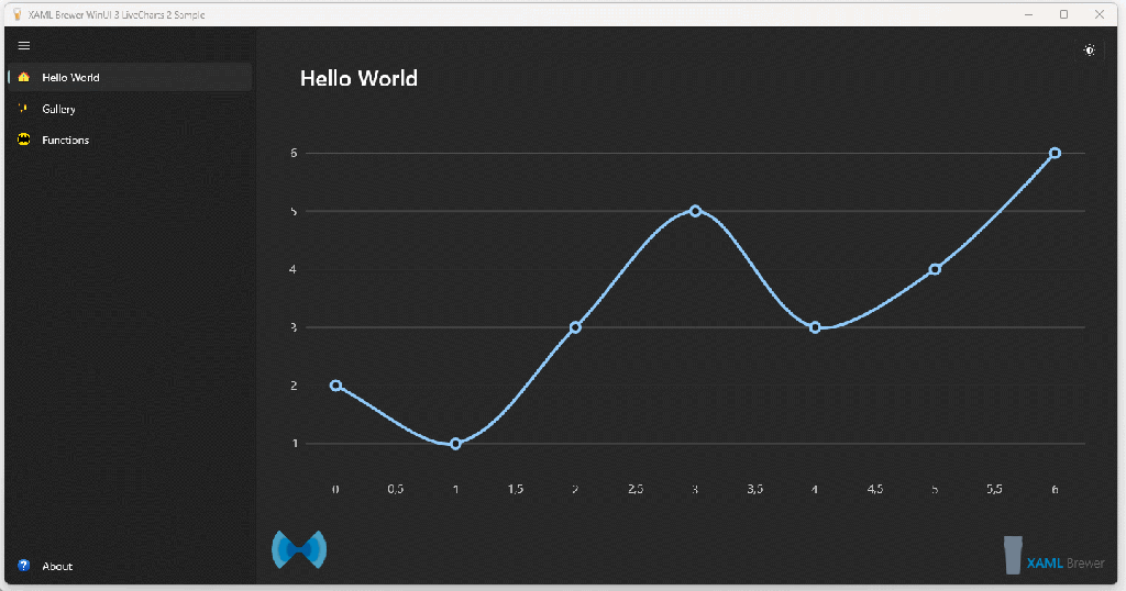
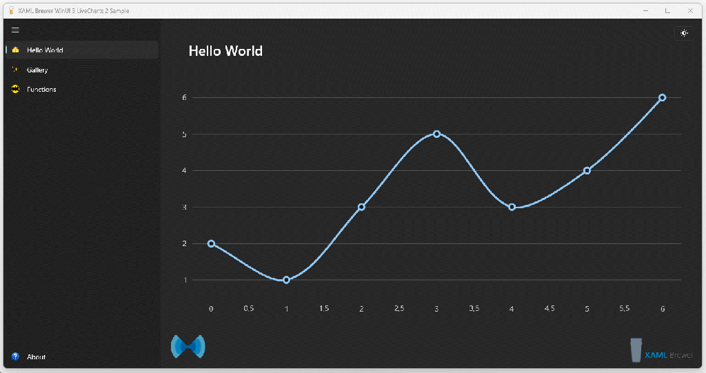
The Hello World sample starts with a ViewModel holding the data for a single line series of double values in an ISeries:
public class HelloWorldViewModel
{
    public ISeries[] Series { get; set; }
        = new ISeries[]
        {
            new LineSeries<double>
            {
                Values = new double[] { 2, 1, 3, 5, 3, 4, 6 },
                Fill = null
            }
        };
}
This ViewModel is used as DataContext for the page:
<Page.DataContext>
    <vm:HelloWorldViewModel />
</Page.DataContext>
The array of ISeries is visually presented via a CartesianChart:
<lvc:CartesianChart x:Name="Chart"
                    Series="{Binding Series}" />
At runtime, this line chart appears:
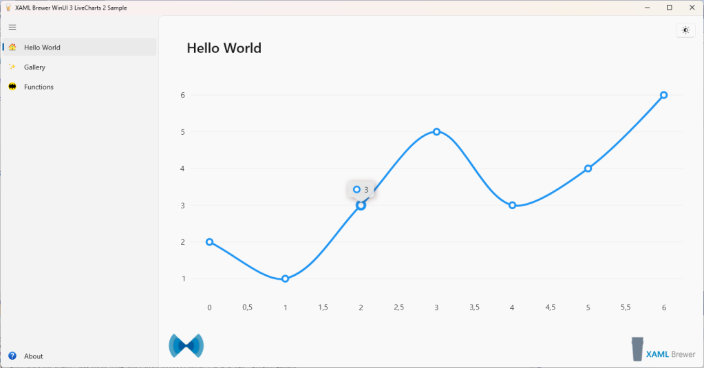
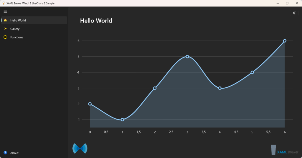
When you remove the Fill property from the ViewModel, the series gets a default fill brush that turns it into an area chart:
By default, when hovering over the chart, an animated ToolTip appears over the closest point. As any other feature of LiveCharts2, this is fully customizable.
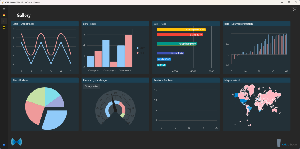
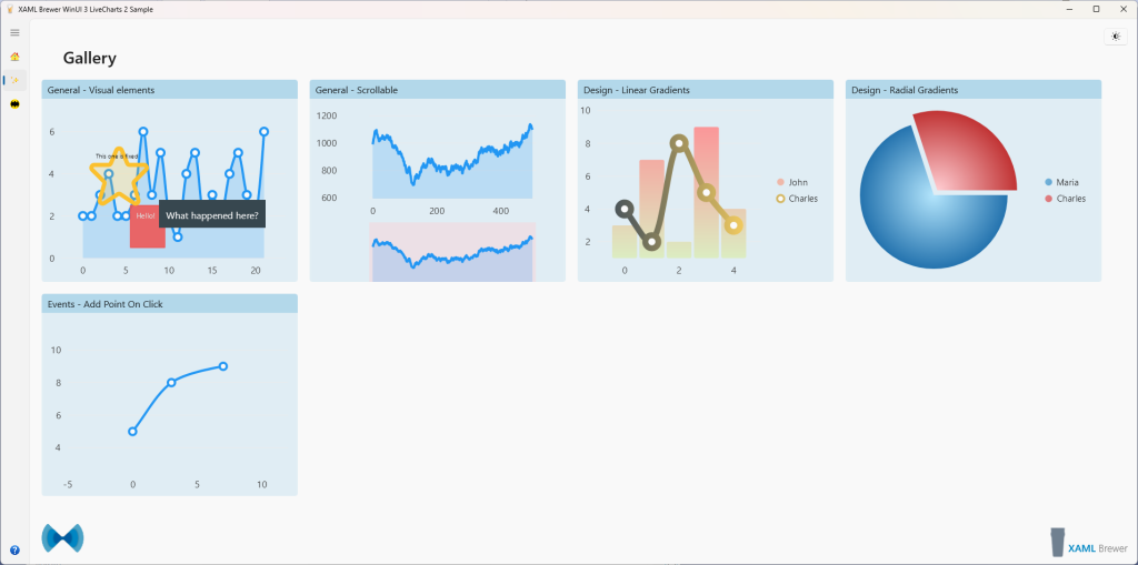
The Gallery
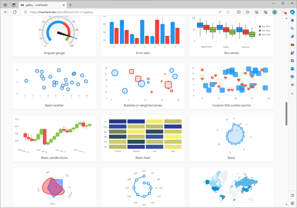
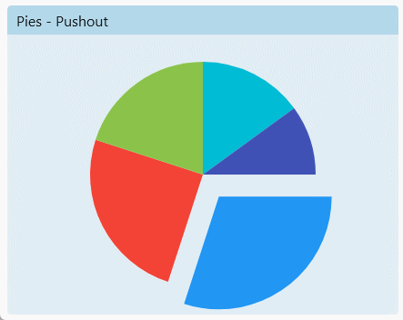
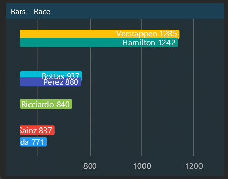
For every supported .NET stack, LiveCharts2 exposes a gallery demonstrating all plots, animations, events, interactions, and more. Find the WinUI gallery right here. Here’s how it looks like in the browser:
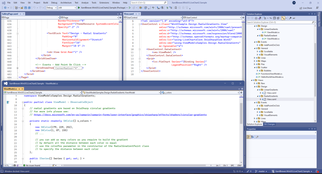
Every sample is nicely documented, and implements the same MVVM architecture. In our sample WinUI3 desktop app, we created a gallery page with a GridView and imported the samples that we were interested in.
The Views and ViewModels were straightforward copy-pasted [well, that’s not entirely true: we fixed the name of some Formula 1 drivers 😉], and each got its View embedded inside a GridViewItem, like this:
Here’s how the whole page looks like:
Since static screenshots fail to show the very nice animations, here are some animated ones:
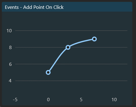
One of the samples allows adding points to a series by clicking on the chart. It demonstrates API members that we did not encounter in too many other packages. Here’s the View, it listens for PointerPressed:
<lvc:CartesianChart x:Name="chart"
                    Series="{Binding SeriesCollection}"
                    PointerPressedCommand="{Binding PointerDownCommand}"
                    TooltipPosition="Hidden">
</lvc:CartesianChart>
The series keeps some distance from the edge of the chart, with DataPadding:
new LineSeries<ObservablePoint>
{
    Values = new ObservableCollection<ObservablePoint>
    {
        new(0, 5),
        new(3, 8),
        new(7, 9)
    },
    Fill = null,
    DataPadding = new LiveChartsCore.Drawing.LvcPoint(5, 5)
}
In the PointerPressed event handler, the clicked UI coordinate is translated to a chart value, and added to the series:
[RelayCommand]
public void PointerDown(PointerCommandArgs args)
{
    var chart = (ICartesianChartView<SkiaSharpDrawingContext>)args.Chart;
    var values = (ObservableCollection<ObservablePoint>)SeriesCollection[0].Values!;

    // scales the UI coordinates to the corresponding data in the chart.
    var scaledPoint = chart.ScalePixelsToData(args.PointerPosition);

    // finally add the new point to the data in our chart.
    values.Add(new ObservablePoint(scaledPoint.X, scaledPoint.Y));
}
For the sake of completeness, the API also host calculations in the other direction (chart value to coordinate). Here’s how the sample looks like at runtime – and again admire the animations:
Drawing Functions
Copy-pasting samples is fun, but we wanted of course to also create a demo from scratch. Here’s how to draw mathematical functions, ‘y=f(x)’ style. From the ‘Specify Both X And Y’ sample we learned that ObservablePoint is the class to use if you want to … well … specify both X and Y.
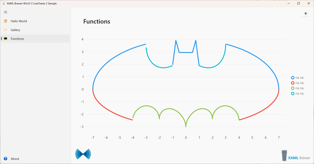
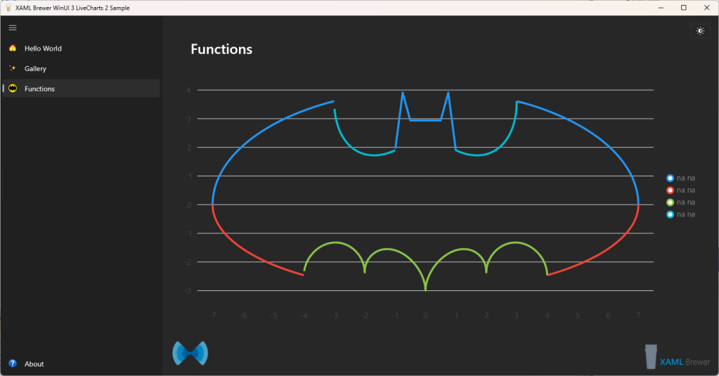
Our favorite set of functions for this kind of demo are the ‘bat functions’. Don’t worry if you don’t know these yet, it will soon become clear what this trigonometric voodoo stands for:

We started with a helper function to return Y values for a range of X:
private static IEnumerable<ObservablePoint> FunctionValues(Func<double, double> function, double x0, double x1, double dx)
{
    for (double x = x0; x < x1; x += dx)
    {
        var y = function(x);
        yield return new ObservablePoint(x, double.IsNaN(y) ? null : y);
    }
}
When there’s no Y-value for an X, we return an empty coordinate. This enables gaps in the chart (as we learned in the Gaps/Null Points sample).
Here’s how we populate our line series:
Series = new ISeries[]
{
    new LineSeries<ObservablePoint>
        {
            Values = FunctionValues(batFunction1, -7, +7, .01),
            GeometrySize = 0,
            Fill = null,
            Name = "na na"
        },
    // ...
    new LineSeries<ObservablePoint>
        {
            Values = FunctionValues(batFunction4, -7, +7, .01),
            GeometrySize = 0,
            Fill = null,
            Name = "na na"
        }
    };
}
For the sake of completeness, here’s the View – no surprises:
<lvc:CartesianChart x:Name="Chart"
                    Series="{Binding Series}" />
Here’s how the bat-functions look like at runtime:
As its name implies, ObservablePoint propagates its dynamic changes by implementing INotifyPropertyChanged. When drawing functions with just static X and Y values, you don’t need this overhead. So we created a ‘lighter’ version based on tuples, with Tuple<double, double> instead of ObservablePoint. Here’s the new helper function – a nice candidate extension method:
private static IEnumerable<(double, double?)> FunctionValues2(Func<double, double> function, double x0, double x1, double dx)
{
    for (double x = x0; x < x1; x += dx)
    {
        var y = function(x);
        yield return (x, double.IsNaN(y) ? null : y);
    }
}
LiveCharts2 does not know how to draw Tuples in an ISeries, so we have to tell it by adding a Mapper from Tuple<double, double> to Coordinate. Here’s how to do this:
new LineSeries<(double x, double? y)>
    {
        Values =  FunctionValues2(batFunction1, -7, +7, .01),
        GeometrySize = 0,
        Fill = null,
        Name = "na na",
        Mapping = (functionValue, chartPoint) =>
        {
            chartPoint.Coordinate = functionValue.y.HasValue ? new(functionValue.x, functionValue.y.Value) : Coordinate.Empty;
        },
}
Theming
As with other Skiasharp-based solutions, theming -and especially instant theme switches- is a bit of a burden. It’s still a work in progress. Outside the XAML world, theme resources are not automagically applied. Light theme is the default in LiveCharts2. Things like legends and some chart types (Bubble) just don’t look good when switching to Dark theme:
With AddLightTheme and AddDarkTheme you can set the theme at runtime, e.g. in an ActualThemeChanged event:
<lvc:CartesianChart x:Name="Chart"
                    Series="{Binding Series}"
                    ActualThemeChanged="Chart_ActualThemeChanged" />
private void Chart_ActualThemeChanged(FrameworkElement sender, object args)
{
    if ((Application.Current as App).Settings.IsLightTheme)
    {
        LiveCharts.Configure(config => config.AddLightTheme());
    }
    else
    {
        LiveCharts.Configure(config => config.AddDarkTheme());
    }
}
In the current release, this will change the background of the chart and the axis colors – nothing more (the corresponding source code is relatively simple). The background of the values’ geometry (by default a small circle) is not changed instantly. You need to go to another page and then come back to see the change. Observe how the dots initially remain black when switching from Dark to Light:
There’s no way to force a full redraw (with an Invalidate*() or so). A series is only redrawn when the data changes, not the theme. We found a workaround for this by clearing the series and then resetting the binding. Here’s the full code for this, we implemented it in the Hello World sample:
private void Chart_ActualThemeChanged(FrameworkElement sender, object args)
{
    if ((Application.Current as App).Settings.IsLightTheme)
    {
        LiveCharts.Configure(config => config.AddLightTheme());
    }
    else
    {
        LiveCharts.Configure(config => config.AddDarkTheme());
    }

    // Invalidate chart.
    Chart.Series = new List<ISeries>();
    Chart.SetBinding(CartesianChart.SeriesProperty, new Binding { Source = ViewModel.Series });
}
Here’s how that looks like:
This method still does not update the text color of legends. Of course you could change it to a color that suits both themes. That’s what we did in the Functions sample, in the ViewModel:
public static SolidColorPaint LegendTextPaint => new(SKColors.Gray);
And in the XAML:
<lvc:CartesianChart x:Name="Chart"
                    Series="{Binding Series}"
                    LegendPosition="Right"
                    LegendTextPaint="{Binding LegendTextPaint}" />
We did not find a way to do this declaratively, since a lot of the core types cannot be expressed in XAML (mostly because they lack a parameterless constructor). Anyway, the legends look good this way:
Conclusion
We had a lot of fun working with LiveCharts2 for WinUI. If you want to have charts or gauges in your app, you definitely should consider it. It has all the charts you probably need, it is highly configurable, and the animations are top-notch.
Our sample app lives here on GitHub.
Enjoy!
